Search

GEOGRAPHY EDUCATION

Supporting geography educators everywhere with current digital resources.

Author

sethdixon

I am a geography professor at Rhode Island College.

World Population Prospects

Seth Dixon‘s insight:

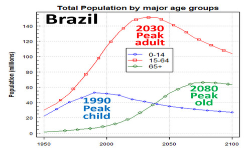
The United Nations Department of Economic and Social Affairs produces easy-to-use population charts and graphs (including population pyramids).  This image (courtesy of Hans Rosling) shows the impending changes on Brazilian society based on changing fertility rates. How is this chart an example of population momentum and of the Demographic Transition Model? 

Tags: population, demographic transition model, declining population, models, Brazil.

See on esa.un.org

Shifting post-colonial economic geographies

“Changes in relationships can be hard to take. The economic bond between Latin America and Spain, its biggest former colonial power, is shifting as the region’s economies mature. Despite some ruffled feathers, the evolution is positive.  After two decades in which Spain amassed assets worth €145 billion ($200 billion) in Latin America, last year was the first in which Latin American companies spent more on acquiring their Spanish counterparts than the other way around.”

Seth Dixon‘s insight:

I am hesitant to use the term post-colonial since there are theoretical constructs that use that term to embody cultural hegemonic power structures.  I’m simply using it to mean “after colonialism” because the power paradigm is shifting to the former colonies. 

TagsLatin AmericaSouth America. economic, development, Spain, historical, colonialism.

See on www.economist.com


Cultural Critique of the #SochiProblems Meme

” #SochiProblems is more of an embarrassment for America than it Is for Russia….So this is my plea: @SochiProblems, whining journalists and social media fiends, have just a bit more respect for Russians when ridiculing what is to you the Olympics and what is to them everyday life. Their government might have just spent $51 billion on possibly the most corrupt Olympic games ever, but most of them are just along for the ride.”

See on www.policymic.com

Mapping Where People Run

“Inspired by a 2011 project that mapped popular running routes in a few European cities, Nathan Yau at FlowingData has done the same for 22 major cities, including 18 in the U.S.   To make these maps, Lau simply grabbed public data from the exercise-tracking app RunKeeper. While these visualizations are not representative of all runners in a city, they do offer useful information on urban spaces. For one, we see that people really do love running near water and in parks.  Here’s a selection of Yau’s work. See the rest here.”

See on www.theatlanticcities.com

Watch the Earth Warm Since 1880

“It can be difficult to conceive of the long process that’s led the world to having its nine hottest years on record all after 2000. That’s why it’s nice that NASA has generated this nifty animation, which shows temperature abnormalities for every month of the past 13 decades. Watch reddish warm zones spread over the globe as time rolls past, like a virulent fever covering the body of a sick host.”

See on www.theatlanticcities.com

Infant Mortality Rates

Are All Mothers Created Equal? From the State of the World’s Mothers 2012 report see how mothers locations have an impact on the life and death of their children.

See on www.savethechildren.org

And for the United States?  Well, our infant mortality rate can be considered a national embarrassment.


Exploring Mexico through Dynamic Web Maps

“One of the people I regard most highly here at Esri has created an online atlas of Mexico.  The maps can be accessed in many different ways, such as an ArcGIS Online presentation with a description here, as an iPad iBook, but I think most importantly, as a series of story maps.  Each of these separate story maps contains 1 to 6 thematically related maps on the following topics:

See on blogs.esri.com

“Natural” Foods?

“The False Advertising Industry reveals the shocking truth about what is allowed in ‘Natural’ food. Only the USDA Organic Seal guarantees your food contains no Genetically Modified Organisms, no toxic pesticides, and no growth hormones or antibiotics.”

Seth Dixon‘s insight:

This funny video shows how meaningless the word “natural” is when it is only used as a buzzword or slogan.  Many food companies are trying to show their “natural” roots these days–some with a new label and others are trying to legitimately clean up their production line.  In fact, McDonald’s has gone to great lengths to show their costumers where the food is coming from and to personalize the food producers to alleviate their fears.  They have created a Track my Maccas iPhone App which used several geospatial technologies to explore the commodity chain of McDonalds items (keep in mind that this is the companies own promotional tool). 

Tags: agriculture, GMOs, food production, mapping, geospatial.

See on www.youtube.com

World of Change

“Earth is constantly changing. Some changes are a natural part of the climate system, such as the seasonal expansion and contraction of the Arctic sea ice pack. The responsibility for other changes, such as the Antarctic ozone hole, falls squarely on humanity’s shoulders. Our World of Change series documents how our planet’s land, oceans, atmosphere, and Sun are changing over time.”

Seth Dixon‘s insight:

This article from NASA’s Earth Observatory highlights 25 classroom-ready examples of environmental change that can readily detected with satellite imagery. 

Tags: remote sensing, land use, environment, geospatial, environment modify, unit 1 Geoprinciples.

See on earthobservatory.nasa.gov

AralSea

Blog at WordPress.com.

Up ↑