Search

GEOGRAPHY EDUCATION

Supporting geography educators everywhere with current digital resources.

Tag

visualization

Tools for Student Projects

In many geography classes, teachers will assign students a country to help them gain some depth about one particular country as a way to explore economic, demographic, cultural, political, and environmental issues.  These are some data visualization tools that deals with big data; the listed tools are some of my favorite in part because they can easily to incorporated to an ArcGIS StoryMap (especially in the Map Journal template).

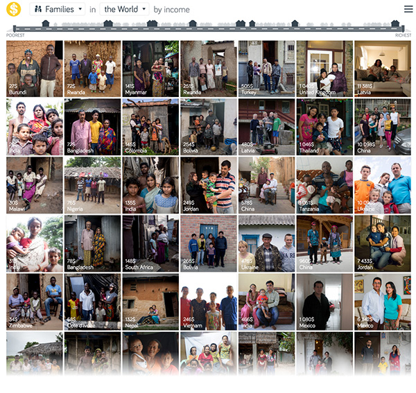
  1. Economic (introductory data): Dollar Street from Gapminder

The best comparison and the most relatable thing for students to see in other countries is real people, leading regular lives.  Dollar Street brings the economic realities of other places without some of the of the negative stereotypes or romanticizing far-away places.

DollarStreet

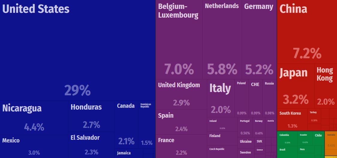
  1. Economic (advanced data): Observation of Economic Complexity

Understanding global trade and economic data can feel overwhelming, but fortunately there are online tools that help us to visualize complex economic data. The “VISUALIZATIONS” are my favorite things to see on this site.  The Observation of Economic Complexity is MIT’s companion website to the Atlas of Economic Complexity (Harvard’s version of the same data visualization–here is my tutorial on how to use the Atlas of Economic Complexity).

OEC

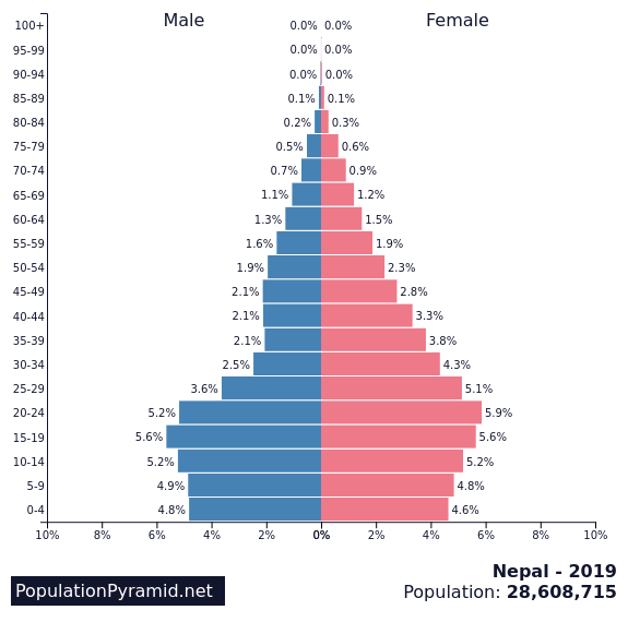
  1. Demographic (introductory data): Population Pyramid

Populationpyramid.net creates interactive, population pyramids that can be downloaded as image with the raw data also available for download.  Simple, powerful, easy.

Nepal PP

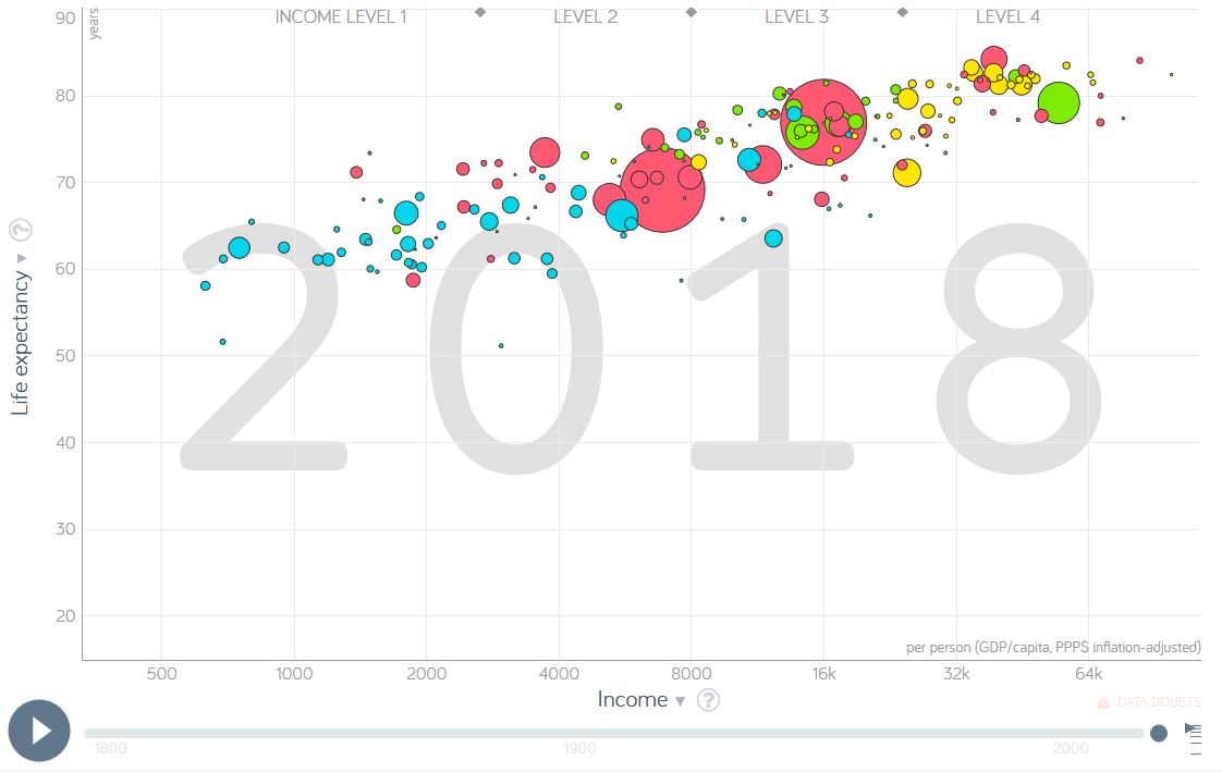
  1. Demographic (advanced data): Gapminder Tools

Gapminder is a tremendous resource that I’ve shared in the past and total fertility rates is an ideal metric to see in this data visualization tool.  This is one of the best ways to visualize global statistics.  The world is changing–see how.

GapminderTools

5. Our World in Data

Like Gapminder, Our World in Data is a fantastic source of global data, maps, and charts on an incredibly wide range on topics. Type any country name in the search bar, and you’ll find a wide range of metrics.

6. ArcGIS StoryMaps

This is my principle cartographic tool that I use in GEOG 201 (Mapping our Changing World). Classic Story Maps is the feature that ArcGIS has to make user-friendly platform to share maps along with a rich, multimedia environment with a variety of pre-made templates. The video below is and introduction to the newer Story Builder which combines a variety of the elements of the templates into one that is more optimized for mobile devices.

7. Google Earth (now completely online)

Google Tours used to be a way to present a series of places on a map, with text, pictures, and videos, but that has been de-commissioned and the online version of Google Earth is now the best alternative. Yes, it works best in Google Chrome, and you’ll need a Google account to save it to your Google Drive. The video below is a brief introduction to the tools that are available to you:

Mapping the Wind

EarthNull

It is incredibly cold in New England right now.  How can maps help us to understand the weather patterns we are facing?  How is what we are facing in our community connected to global patterns?  Maps help us to contextualize information and understand processes.  So to investigate this our freezing wind conditions we will look at a series of online resources.

  1. Dynamic Wind Map of USA (Visualization).
  2. Interactive wind map (Ventusky).
  3. Interactive wind map (WindyTy).
  4. Digital Globe with Wind patterns (Null School)

GeoEd TAGS: physical,  weather and climate, mapping, visualization.

Persuasive Maps

Awakening
The Awakening” was created by Henry Mayer in 1915. It is considered one of the most striking of the ‘suffrage maps,’ which played a major role in the successful fight for women’s suffrage in the U.S. 

This is a collection of ‘persuasive’ cartography: ​more than 800 ​ maps intended primarily to influence opinions or beliefs – to send a message – rather than to communicate geographic information. The collection reflects a variety of persuasive tools ​, including​ allegorical, satirical and pictorial mapping; selective inclusion; unusual use of projections, color, graphics and text; and intentional deception. Maps in the collection address a wide range of messages: religious, political, military, commercial, moral and social.” SOURCE: Cornell University Library

This is a fantastic collection of historical maps.  I especially enjoy the rhetorical and overtly persuasive quality of the maps in this collection.  Too often, we assume that maps convey data and information from a strictly neutral position.  Just like every news article, how the information in a map is arranged, selected, and framed is helpful in evaluating the usefulness, important, and accuracy of the information that is being presented.

GeoEd Tags: cartography, visualization, mapping, art.

The Man Behind Most of the Ski Maps in America

“The ski trail map at your local mountain was probably painted by James Niehues. Now you can see his life’s work in one beautiful book.”

Source: www.outsideonline.com

This new book looks to be a wonderful cartographic coffee table piece.  Good cartography lies at the intersection of rigorous scientific data display and an aesthetic touch of beauty. 

GeoEd Tags: cartography, visualization, mapping, art.

Scoop.it Tags: cartography, visualization, mapping, art.

Crop Intensity Visualized

This visualization shows Crop Intensity data (regions that produce the most crops), followed by the MODIS croplands product, the 26 countries that produce 82% of the world’s food, the population density in 2002 and finally the projected population in 2050.

Source: svs.gsfc.nasa.gov

Follow the link to a video/animation that displays several important global agricultural trends.  NASA’s Scientific Visualization Studio has produced many other agricultural visualizations that would be useful for teaching about the patterns of global agriculture. 

Tags: food production, agribusinessvisualization, agriculture.

WordPress TAGS: food production, agribusiness, visualization, agriculture.

Job openings in U.S. down

On the last business day of May 2018, the number of job openings edged down to 6.6 million from a revised April level of 6.8 million, a series high. Combined, over one-third of those job openings were in professional and business services (1,190,000) and health care and social assistance (1,119,000).

Source: www.bls.gov

I’m not sharing this article because of the monthly fluctuations in labor.  The interactive chart in this article is an excellent visualization of the shifts in labor in the various economic sectors. 

Tags: laborvisualization, economicindustry

WordPress TAGS: labor, visualization, economic, industry.

Ventusky – Wind, Rain and Temperature Maps

Animated wind, rain and temperature maps, detailed forecast for your place, data from the best weather forecast models such as GFS, ICON, GEM

Source: www.ventusky.com

With people on the East Coast concerned about the possible trajectories for Hurricane Florence, I think it is the right time to share these two interactive maps: Ventusky and Windy.  In the past, I also shared NullSchool’s  mesmerizing digital globe with wind data and many other options.  Collectively, these my three favorite online visualization of meteorological data.  Any other favorites?  To friends and family in the Carolinas, stay safe.   


Scoop.it Tagsphysical, weather and climate, mapping, visualization.

WordPress TAGS: physical,  weather and climate, mapping, visualization.

The art of making globes

“In the era of Google Maps, who makes a living out of creating globes – by hand? Peter Bellerby, of Bellerby & Co. Globemakers, for one. Headquartered in London, he talks with Martha Teichner about how a desire to purchase a globe led to him becoming one of the masters of the craft.”

Source: www.youtube.com

Yes, these globes are precise archives filled with geospatial data and locational information–however, that pales in comparison to the artistic brilliance of the globes. These hand-crafted globes are truly works of art.  Marvel at the merger of mathematical precision and artistic design that makes a globe such as these a cartographic gem. 

FUTURE WATCHING: Here is the longer video of the Bellerby Globes being produced.     


Tags: cartography, visualization, mapping, artgeo-inspiration.

The Two Koreas

“While the Korean War of the early 1950s never formally ended, its aftermath has created starkly divergent worlds for those living on either side of the north-south divide. What follows is a look at life in the two Koreas; how such a night-and-day difference came to be; and where the crisis could go from here. Both governments claimed to be the legitimate rulers of the peninsula. Tensions between north and south gradually mounted, until finally, in June 1950, hundreds of thousands of North Korean troops stormed across the 38th parallel. The unsuspecting South Korean defenders were outgunned and outnumbered, and beat a hasty retreat southward.”

Source: storymaps.esri.com

This excellent interactive was created by Esri’s Story Maps team using the Story Map Cascade app–making it an great resources of the geography of the Korean Peninsula as well as a stellar example of how maps, infographics, videos, images and text can be combined using ArcGIS online.


Tags: mappingESRIStoryMapinfographic, visualizationNorth KoreaSouth Korea, East Asiaborders, political, geopolitics, historical.

Blog at WordPress.com.

Up ↑