Search

GEOGRAPHY EDUCATION

Supporting geography educators everywhere with current digital resources.

Tag

cartography

EEZs in the Gulf of Mexico

If you look at maps of the Americas ranging from the 16th to the 20th centuries many of them have an island within the Gulf of Mexico called Bermeja…but on modern maps, it’s not there.” SOURCE: Geography Geek

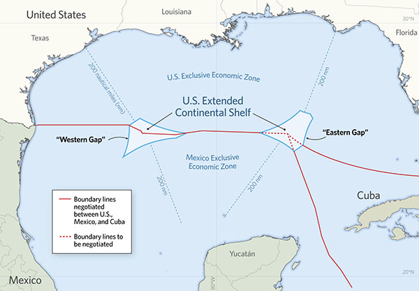
Don’t be fooled by the click-bait nature of the embedded video title (of course the CIA didn’t make the island disappear), because this obscure topic is a nice entry into several geographic topics.  In the Gulf of Mexico, the tiny island of Bermeja (Vermeia) was listed on maps from 1539 to 1922 as Mexican territory but simply on the strength of these old maps and 16th century maritime record.  As oil exploration in the Gulf intensified, and with the passage of UNCLOS, Mexico wanted to claim as large an Exclusive Economic Zone as possible and even searched for this apocryphal island, but to no avail.  This has led to two donut-hole gaps in the Gulf of Mexico between the US and Mexican EEZs, one that has be negotiated, and one that still remains to be determined.   The island, or lack there of is insignificant, but there are 3 good geographic topics this highlights:

  • Cartographic errors that get repeated over centuries.
  • UNCLOS and the Law of the Seas.
  • Off-shore natural resource management.
Mapping the smallest circle around the largest population

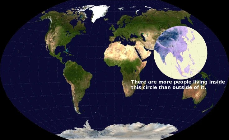
My students have seen this image ever since I found this on social media. I’ve used it as a way to help students assess the validity of online resources (wait, you mean that not everything on the internet is true?!?) We often find what looks like a great maps or resource online that don’t have any reference to the data, author, date, or any other type of metadata.
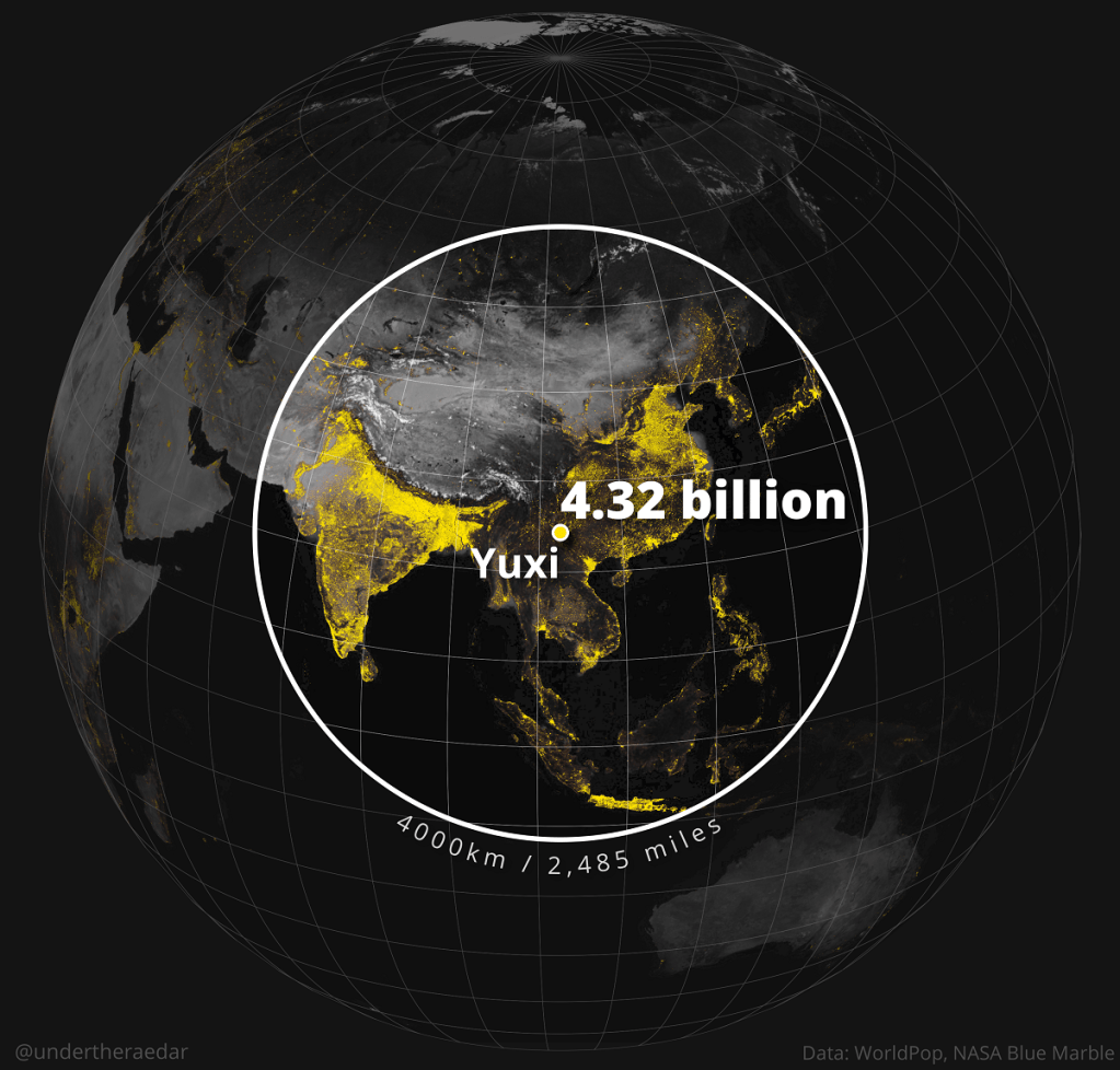
This map called the Valeriepieris Circle became famous about 9 years ago after garnering a ton of attention on Reddit. A cartographer did a deep dive into mapping the smallest circle around the largest percentage of the the global population. The result was dozens of maps, include the Yuxi Circle depicted below. This is such a powerful way to convey how uneven the distribution of global population actually is and opens the door to explore the consequences of population density.

SOURCES: Visual Capitalists, Stats Maps n Pix (deeper dive).

TAGS: cartography, mapping, density, population.

Maps that show who we are (not just where we are)

What does the world look like when you map it using data? Social geographer Danny Dorling invites us to see the world anew, with his captivating and insightful maps that show Earth as it truly is — a connected, ever-changing and fascinating place in which we all belong. You’ll never look at a map the same way again.”

This was a great TED talk that is firmly in my wheelhouse and hits many of the key big ideas that I want my undergraduates to learn (importance of human geography, using statistics to update people’s world views, fun and intelligent cartography…the list goes on).  I wish I had seen this a few years ago when I was preparing my TEDx talk in 2019, which was just one of many talks that day about geography education.

The Almost Map of the USA

SOURCE: XKCD

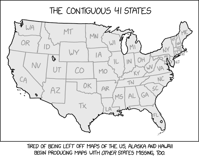
There are many great cartographically-themed XKCD comic strips (here are a bunch of my favorites). This particular one ALMOST looks right and finding the inaccuracies is a little harder than you might think (yes, I am proud of myself for finding them all, and yes, that is the ridiculous bit of profession pride).

Questions to Ponder: When you see a map, do you assume that it is 100% accurate? If so, how come? Where you able to find the “missing states” in this psuedo-map?

GeoEd Tags: xkcd, cartography, mapping, fun.

These students make maps for the Philippines and Belize. They never leave campus to do it.

mapathon-1

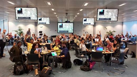
With Queen’s ‘Bohemian Rhapsody’ humming in the background, about two dozen students at George Washington University traced skinny lines and square-shaped landmarks on a satellite image of a rural chunk of Mindanao, the second-largest island in the Philippines. They are in the early stages of piecing together a map of the region where half of the country’s food is grown but where most people live in poverty.

The students carefully scanned the photos to scope out buildings and roads tucked between thick trees. The task is painstaking but necessary to create an up-to-date map. This corner of the Philippines — like large swaths of the planet — does not have any recent digital maps.” SOURCE: Washington Post

Crowd-sourced mapping is increasingly an important resource during an emergency and one of the best ways to put geographic knowledge and geospatial skills in action.  Many high school and college students around the country are learning mapping skills by creating maps for places that aren’t well-mapped and in great need.  Poorer places are often not as well mapped out by the commercial cartographic organizations and these are oftentimes the places that are most vulnerable to natural disasters.  Relief agencies depend on mapping platforms to handle the logistics of administering aid and assessing the extent of the damage and rely on these crowd-sourced data sets.  My students and I are working on this over the weekend; can you join in and help?  The projects that are marked urgent by the Red Cross are all in Haiti right now.  Here are is a video playlist that explains the project and how you can help if you are new to OpenStreetMap (OSM).  The embedded TEDx talk below discusses the advantages of using OSM in geography teaching.

GeoEd Tags: cartography, disasters, mapping, STEM.

Mapping the Wind

EarthNull

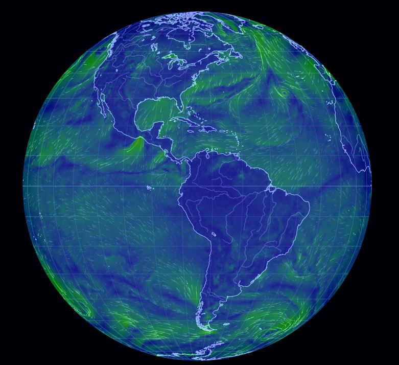
It is incredibly cold in New England right now.  How can maps help us to understand the weather patterns we are facing?  How is what we are facing in our community connected to global patterns?  Maps help us to contextualize information and understand processes.  So to investigate this our freezing wind conditions we will look at a series of online resources.

  1. Dynamic Wind Map of USA (Visualization).
  2. Interactive wind map (Ventusky).
  3. Interactive wind map (WindyTy).
  4. Digital Globe with Wind patterns (Null School)

GeoEd TAGS: physical,  weather and climate, mapping, visualization.

Persuasive Maps

Awakening
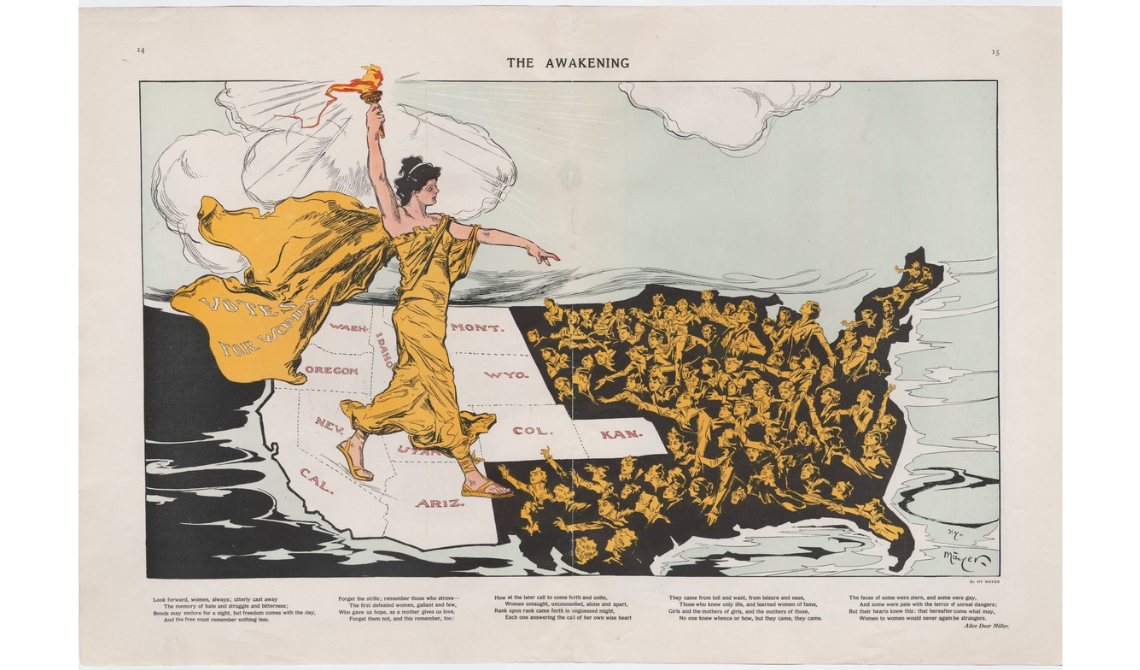
The Awakening” was created by Henry Mayer in 1915. It is considered one of the most striking of the ‘suffrage maps,’ which played a major role in the successful fight for women’s suffrage in the U.S. 

This is a collection of ‘persuasive’ cartography: ​more than 800 ​ maps intended primarily to influence opinions or beliefs – to send a message – rather than to communicate geographic information. The collection reflects a variety of persuasive tools ​, including​ allegorical, satirical and pictorial mapping; selective inclusion; unusual use of projections, color, graphics and text; and intentional deception. Maps in the collection address a wide range of messages: religious, political, military, commercial, moral and social.” SOURCE: Cornell University Library

This is a fantastic collection of historical maps.  I especially enjoy the rhetorical and overtly persuasive quality of the maps in this collection.  Too often, we assume that maps convey data and information from a strictly neutral position.  Just like every news article, how the information in a map is arranged, selected, and framed is helpful in evaluating the usefulness, important, and accuracy of the information that is being presented.

GeoEd Tags: cartography, visualization, mapping, art.

United States of Alaska Map

If the title of this post is confusing, it’s because the map is completely unconventional (and I love it).  True, it is not the title of the map, but it could have been.  So often we see a map of the United States with the 48 contiguous states prominently displayed and Alaska and Hawaii scaled down, and stuck in a corner somewhere.  Well, this map ingeniously inverts that paradigm.

Alaska

If the inset (and the insult) are too subtle for you, here is the meme that brought this to my attention.

70008718_10157514681264805_6612298801564614656_n

Questions to Ponder:

  • Describe the quality of the main map compared to the quality of the inset maps.
  • Why would the cartographer take the time to make this map?
  • Why would someone purchase this map?

How to Read a Topo Map

topographic_map_grande

“A topographic map is designed to show the physical features and terrain of an area. They’re different from other maps because they show the three-dimensional landscape: its contours, elevations, topographic features, bodies of water, and vegetation.” SOURCE: Backpacker.com

This article gives a nice introduction to topographic maps, explains how to read them, and why they are useful.  While I love digital maps and the features that are offered through GIS, old school paper maps still play a vital role in helping us navigate this world of ours.  This additional article from CityLab, shows how you can lie with maps (and it’s not just with a sharpie).

Tags: mapping, physical, cartography, unit 1 geoprinciples.

Blog at WordPress.com.

Up ↑