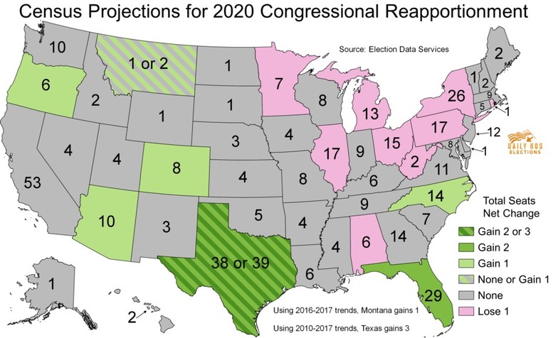
Search

GEOGRAPHY EDUCATION

Supporting geography educators everywhere with current digital resources.

Tag

electoral

2020 Census Means Congressional Shake-up

Texas, Florida and North Carolina are among the states that will gain congressional seats based on new population data from the U.S. census, a shift that could boost Republican chances of recapturing the U.S. House of Representatives from Democrats in next year’s midterm elections. The overall U.S. population stood at 331,449,281, the Census Bureau said on Monday, a 7.4% increase over 2010 representing the second-slowest growth of any decade in history. The release of the data, delayed for months due to the coronavirus pandemic, sets the stage for a battle over redistricting that could reshape political power in Washington during the next decade. States use the numbers and other census data to redraw electoral maps based on where people have moved.” SOURCE: Reuters

It is constitutionally mandated that the U.S. government conduct a census every ten years.  There are many benefits for all that data, but the original purpose was to allot congressional seats in the House of Representatives.  Today the number is locked in at 435, so as states’ populations grow or (relative to others) shrink, a given state many gain or lose seats in the House.  This ends up being very consequential, especially in a two-party country that is pretty evenly divided.  

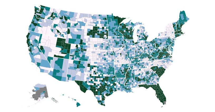
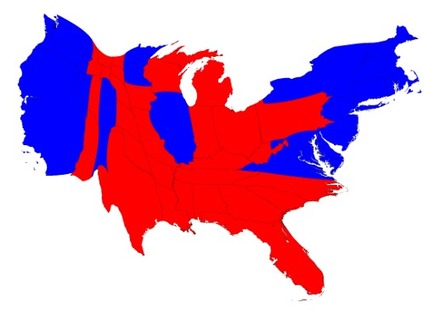
New York and California (two of the largest states with the most seats) are the most upset since they are seeing their relative political power in the House of Representatives wane for the first time in decades while Texas is smiling big with 2 added seats.  Little Rhode Island is letting out a huge sigh of relief, since it was projected that Rhode Island would be losing 1 of their 2 congressional seats along with federal funding that is attached to that seat.  However, Rhode Island managed to retain their two seats. The census only says how many seats a given state will have, but it is up to the state government to reapportion the districts.  Redistricting can be very contentious and when it gets overtly and unfairly partisan, that’s when regular old redistricting can become gerrymandering.

Things to Consider: What demographic shifts have led to these new political patterns on the map?  Will these shifts lead to gerrymandering?  How will this impact the states gaining (or losing) seats? 

Tags: electoral, gerrymandering, USA, mapping.

U.S. Counties Vary by Their Degree of Partisan Prejudice

A guide to the most—and least—politically open-minded counties in America

Source: www.theatlantic.com

I would like to start off by saying that I’ve lived in Red America and Blue America, and I love the people and places of both.  This is a fascinating set of maps because it isn’t just about where are the Republicans and Democrats–we’ve all seen those maps.  More important to to me is attempting to discern where people can still see their neighbors as neighbors, even if they strongly disagree politically.  "In general, the most politically intolerant Americans, according to the analysis, tend to be whiter, more highly educated, older, more urban, and more partisan themselves."


GeoEd TAGS: electoral,  political, mapping.

Scoop.it Tags: electoral, political, mapping.

New census data projects which states could gain or lose congressional seats in 2020 reapportionment

the Census Bureau released its population estimates for 2017 for every state, detailing how many residents each state has gained or lost since the 2010 census. The firm Election Data Services has used these estimates to project how many congressional seats each state might gain or lose in the 2020 round of reapportionment, which assigns each state its share of the House’s 435 districts based on its population.

Source: www.dailykos.com

Reapportionment is a forgotten step.  Before a state can redistrict the congressional districts within the state, every 10 years, the Federal government is constitutionally required to conduct a census with the main goal of being able to reapportion the congressional seats based on the decennial census.  The upcoming 2020 Census is big deal, showing regional population shifts with political ramifications.   

Tags: electoral, political, mapping.

WordPress TAGS: electoral,  political, mapping.

How to Win Florida

"It’s the southernmost section of the Deep South, the sixth borough of New York City, and the northernmost nation of Latin America. But even in the ultimate swing state, some voters are more equal than others."

Source: www.politico.com

Sure this article might be used for partisan purposes, but it’s analysis of how a diverse group of interlocking demographic communities vote in the United States is very insightful.  This article doesn’t focus on identity politics, but it does show how identity shapes political views and how the demographics of a particular constituency might shape the platforms of candidates. 


Questions to Ponder: What makes a swing state a swing state? How is Florida emblematic of the nation as a whole? 


Scoop.it Tags: electoral, political, ethnicity.

WordPress TAGS: electoral, political, ethnicity.

Political Bubbles and Hidden Diversity: Highlights From a Very Detailed Map of the 2016 Election

The Times’s interactive map of precinct results shows that even within partisan strongholds, there are contrary-voting enclaves.

Source: www.nytimes.com

This feature that shows the 2016 election results at the precinct level is astounding, revealing, and a testament to the difficulty of putting all this information together.  The built-in features in this interactive map to explore selected “voter islands” and one-sided places are especially helpful, but much like Google Earth, many people are eager to zoom in to their own neighborhoods.  The article that accompanies the interactive had some excellent case-studies at a variety of scales.  Geography always matters and the maps reveal so many telling patterns. 


Tags: electoral, politicaldensity, mapping.

Election Results in the Third Dimension

“By extending each region into the 3rd dimension, it’s possible to show the relative importance of each region while retaining the map’s shape, keeping the areas recognizable. In this case, the height of each county corresponds to its total number of votes, though it could just as easily show population or share of the electoral vote. For a closer look, see the full screen interactive version.”

Source: metrocosm.com

We’ve all probably seen enough maps of the 2016 presidential election and are familiar with the basic patterns (although my favorite is still the interactive that let’s you redraw the states to alter the election).  This 3D map certainly though is an innovative way to portray some of the disparities in the U.S. electorate.


Tags: electoral, politicaldensity, mapping.

Election Cartograms

“The states are colored red or blue to indicate whether a majority of their voters voted for the Republican candidate, Donald Trump, or the Democratic candidate, Hillary Clinton, respectively. There is significantly more red on a traditional election maps than there is blue, but that is in some ways misleading: the election was much closer than you might think from the balance of colors, and in fact Clinton won slightly more votes than Trump overall. The explanation for this apparent paradox, as pointed out by many people, is that the map fails to take account of the population distribution. It fails to allow for the fact that the population of the red states is on average significantly lower than that of the blue ones.

We can correct for this by making use of a cartogram, a map in which the sizes of states are rescaled according to their population. That is, states are drawn with size proportional not to their acreage but to the number of their inhabitants, states with more people appearing larger than states with fewer, regardless of their actual area on the ground. On such a map, for example, the state of Rhode Island, with its 1.1 million inhabitants, would appear about twice the size of Wyoming, which has half a million, even though Wyoming has 60 times the acreage of Rhode Island.”


Tags: electoral, scale, politicaldensity, mapping.

Source: www-personal.umich.edu

US election 2016: Trump victory in maps

The map above shows where Mr Trump improved on the share of the vote achieved by Mitt Romney, the Republican presidential candidate who failed to beat President Barack Obama in 2012.


Tags: electoral, political.

Source: www.bbc.com

Maps to change how you think about American voters — especially small-town, heartland white voters

Small towns are as Democratic as big cities. Suburban and rural voters are the Republicans.


I have assembled a Web map from precinct-level 2008 election data that allows users to zoom in and out, focus in on specific towns or neighborhoods and superimpose census data on income and race, allowing readers to examine their own favorite postindustrial towns. One of the most striking lessons from exploring these maps is that the red non-metropolitan counties on election-night maps are internally heterogeneous, but always following the same spatial pattern: Democrats are clustered in town centers, along Main Street, and near the courthouses schools, and municipal buildings where workers are often unionized. They live along the old railroad tracks from the 19th century and in the apartment buildings and small houses in proximity to the mills and factories where workers were unionized in an earlier era.

Source: www.washingtonpost.com

There have been SOOOO many articles about the 2016 election, what happened, why it happened and how particular demographics voted and why.  Most of these articles are highly partisan, or ideologically informed but this just analysis of past spatial voting patterns  (I am waiting for the updated version of these maps to show what happened in 2016–but I’m thinking some of this changed).  Too often we’ve lumped the geography of small towns and rural areas as though they are one and the same.  Too often will only see electoral maps with state-level voting data or possibly county level data; but the sub-county scale reveals what would otherwise be missing in our assessment of electoral, spatial patterns (Scale matters?  Who knew?)


Tags: electoral, scale, political, mapping.

Create a free website or blog at WordPress.com.

Up ↑