Search

GEOGRAPHY EDUCATION

Supporting geography educators everywhere with current digital resources.

Tag

physical

‘Sailing Stones’ in Death Valley

The long version…and no spoilers yet!!

The mystery on the ‘sailing stones’ in Death Valley’s Racetrack playa has been solved and I wrote about a few years ago when it happened, but the video embedded above is so well done, it’s worth revisiting this remote, harsh landscape where large rocks can ‘flow’ uphill. 

SPOILERS (since 2014): On very rare occasions, when it rains in the region, water will accumulate in the playa (discovermagazine.com), and if the temperature dips below freezing a thin layer of ice will cover the playa.  If the wind is powerful and consistent enough, the wind will push the panels of ice against these rocks and over time, the ice floes will push these rocks, leaving behind distinctive trails (latimes.com). This perfect combination of water, wind, ice and heat creates a remarkable signature on the landscape (livescience.com).  The decidedly non-aerodynamic rocks of Death Valley’s Racetrack Playa leave behind a trail in the hot desert.  Numerous attempts using GPS receivers (NatGeo.com) and good ol’ fashioned observations have been made, but observing ice in Death Valley is so rare that it was never observed until 2014 (phys.org). 

Tags: physical, geomorphology, landforms, desertlandscape.

Mapping the Wind

EarthNull

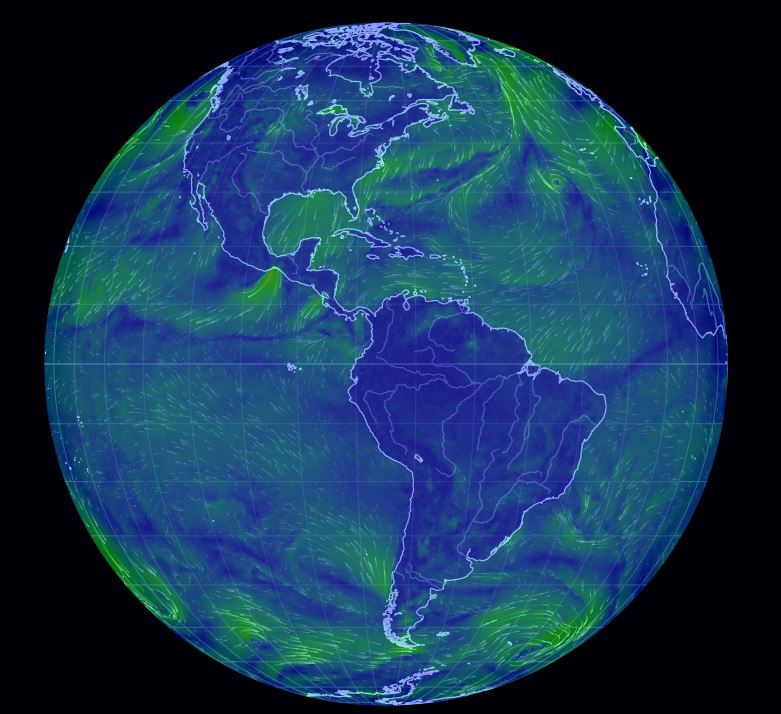
It is incredibly cold in New England right now.  How can maps help us to understand the weather patterns we are facing?  How is what we are facing in our community connected to global patterns?  Maps help us to contextualize information and understand processes.  So to investigate this our freezing wind conditions we will look at a series of online resources.

  1. Dynamic Wind Map of USA (Visualization).
  2. Interactive wind map (Ventusky).
  3. Interactive wind map (WindyTy).
  4. Digital Globe with Wind patterns (Null School)

GeoEd TAGS: physical,  weather and climate, mapping, visualization.

USGS’s Streamer Tool

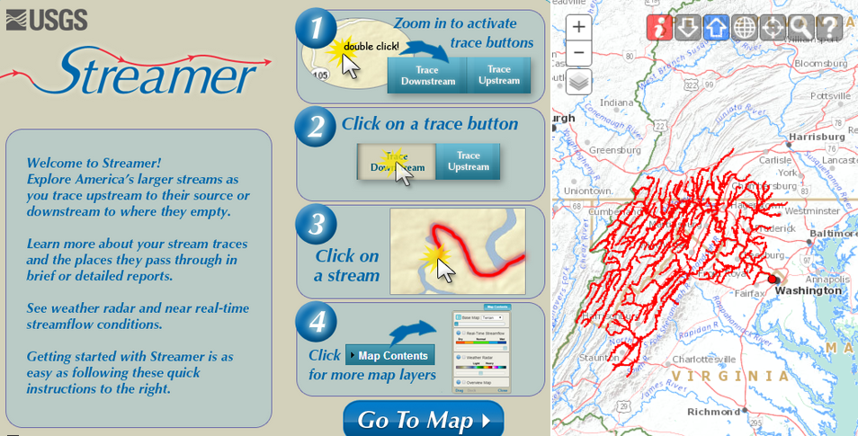
Streamer is a new way to visualize and understand water flow across America. With Streamer you can explore our Nation’s major streams by tracing upstream to their source or downstream to where they empty.

Source: txpub.usgs.gov

Streamer is the online mapping application that lets anyone explore downstream and upstream along America’s rivers and streams (here is a YouTube tutorial). Streamer can be used to follow the paths of rivers up to their headwaters and down to the sea, to view location-related information such as weather radar and near real-time streamflow data, and to discover hydrologic connections between distant places.


Scoop.it Tags: water, mapping, physical, fluvial, regions.

WordPress TAGS: water, mapping, physical, fluvial, regions.

Ventusky – Wind, Rain and Temperature Maps

Animated wind, rain and temperature maps, detailed forecast for your place, data from the best weather forecast models such as GFS, ICON, GEM

Source: www.ventusky.com

With people on the East Coast concerned about the possible trajectories for Hurricane Florence, I think it is the right time to share these two interactive maps: Ventusky and Windy.  In the past, I also shared NullSchool’s  mesmerizing digital globe with wind data and many other options.  Collectively, these my three favorite online visualization of meteorological data.  Any other favorites?  To friends and family in the Carolinas, stay safe.   


Scoop.it Tagsphysical, weather and climate, mapping, visualization.

WordPress TAGS: physical,  weather and climate, mapping, visualization.

Damaged and defiant: Hurricane Harvey

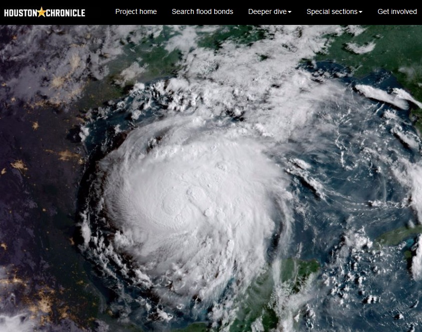
Houston holds strong in the wake of devastation left by Hurricane Harvey.

Source: www.houstonchronicle.com

I am sharing these three interactive webmaps of Houston with my mapping courses to demonstrate what is technologically possible.  Texts, charts, pictures, videos, and maps can be seamlessly integrated to present spatial information in an incredibly engaging and accessible manner.  

Houston’s Hurricane Harvey was incredibly impactful but the factors leading to this were also very complex.  These three Story maps lay out:

  1. Houston’s urban ecological context
  2. The geographic origins of Hurricane Harvey
  3. The human stories from Hurricane Harvey


Scoop.it Tagsphysical, watercoastal, urbanurban ecology, disasters, mappingESRIStoryMap.

WordPress TAGS: physical, water, coastal, urban, urban ecology, disasters, mapping, esri, storymap.

Pacific nation Tuvalu has grown by 73 hectares over 40 years

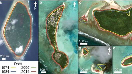
“The tiny Pacific nation of Tuvalu – once thought to be under threat from rising sea levels – has grown the size of California’s Disneyland over the past 40 years. It’s mostly thanks to waves dumping extra sediment, sand and gravel on shore lines, according to research by Auckland University scientists. The study, published in the Nature Communications journal on Friday, was the first in-depth look at how much each of Tuvalu’s 101 islands have changed over the decades.”


Tags: Oceaniawatercoastal, environment, physical, geomorphology, erosiongeology, landforms.

Source: www.stuff.co.nz

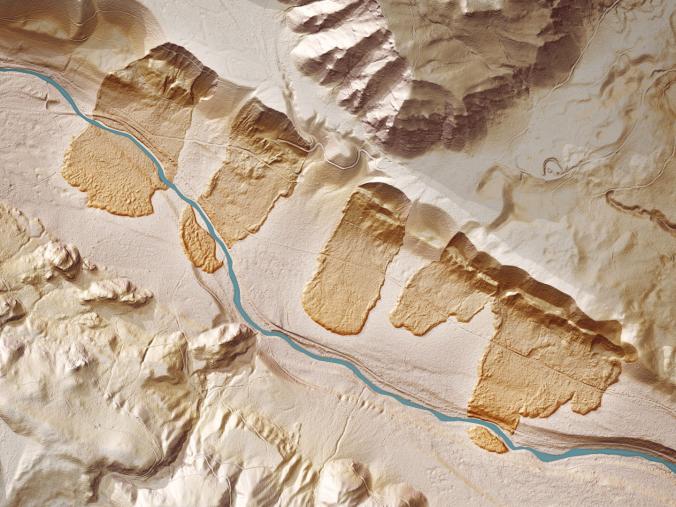
See the Strange, Beautiful Landscapes Revealed by Lasers

“Geospatial technologies unearth a world hidden beneath the lush forests of the Pacific Northwest.”


If you were to strip a forest of all its vegetation, what would you see? To find out, Washington state’s government is using airplanes equipped with LIDAR technology to scan the state’s heavily-forested ground. What’s being revealed beneath the trees is a spectacular and strange landscape of hidden geology. Old landslides, abandoned river channels, ancient lava flows, and the tracks of glaciers are suddenly visible in stark relief. Tracking the altitude and location of a plane with GPS while it scans the ground with LIDAR yields a highly precise digital elevation map of the Earth’s surface created out of the billions of laser pulses. By uncovering the debris from old landslides, LIDAR can show where future slides may occur.


Tags: geomorphologyremote sensing, geology, physical.

Source: news.nationalgeographic.com

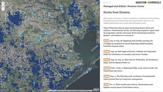
Houston’s stories of Hurricane Harvey

“Blue and her team selected 45 stories, each plotted with ESRI’s ArcGIS software on a map of Greater Houston and tied to the exact location where it was first told. The resulting story map of Hurricane Harvey, ‘Damaged and Defiant: Houston Stories,’ was published in the Houston Chronicle in December. The map shows short narratives gathered by Chronicle staffers from people across the area — from Crosby to Kingwood to Katy — each a unique perspective on the storm; told together, they’re the collective account of a city that experienced one of the worst natural disasters in U.S. history.”

Source: news.rice.edu

These interlinked Houston story maps show some of the key elements of a good story map: 1) strong spatial analytical components, 2) a powerful narrative, 3) rich visuals, 4) solid cartography, and 5) well-sourced information.


Tags: fluvialwatercoastal, urban, disasters, physical, mappingESRIStoryMap.

Alluvial Fans

“When a mountain stream carries a lot of sediment (clay, silt, sand, gravel, cobbles, and boulders) and leaves the confines of the canyon, the sediment is deposited. Over time, this process creates a fan-shaped deposit. The sediment is deposited not because the gradient of the stream decreased, but because the power of the stream dissipates beyond the canyon mouth as the water is spread thin and infiitrates. Many cities are built on alluvium fans, often leading to hazards from flash floods and mudflows.”

Source: www.instagram.com

In mountainous, interior deserts, the largest settlements are usually not deep in the deserts or on top of the mountains but in that in between space.  Many settlements in Central Asia are built on these alluvial fans


Tags: environment, physical, geomorphology, erosiongeology, California, landforms.

Create a free website or blog at WordPress.com.

Up ↑