Search

GEOGRAPHY EDUCATION

Supporting geography educators everywhere with current digital resources.

Tag

GIS

Geography and the Coronavirus

APRIL 6
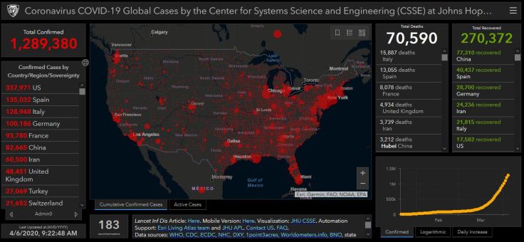
GIS Dashboard screengrab from April 6th

There are far too many geographic issues that stem out of the Coronavirus pandemic to create anything close to comprehensive, but I wanted to share some of the articles that caught my eye recently because they touch on particularly geographic themes.  So, this will not give a global overview, predictions, or breaking news, but some of the underlying issues and questions that we are now grappling with as so many are now in some form of self-isolation.

MAPPING: The best, introductory-level walk-through of how to map the Coronavirus uses ArcGIS online, and has interactive layers that are updated daily, so you don’t have to recreate the wheel for every time new data gets released.  If students are familiar with ArcGIS and already have an account, this is worth having them explore it to learn cartographic techniques.

ENVIRONMENT: There are a host of unintended consequences in natural systems, and when one part of the system, gets altered, there are some down-stream impacts.  This article in the Atlantic discusses some of the environmental impacts of the mass shutdown of normal human activities (1-less pollution, 2-less seismic activity, 3-quiter urban environments).

DEVELOPMENT: The impacts of COVID-19 are clearly uneven; countries and cities that are the most globally connected might benefit usually economically from these connections, but are facing one of the times that this connectivity is a threat to the community.  India, by and large through March 2020, managed to avoid making global headlines, but as the world’s second largest population with some incredibly dense megacities, many are asking how the Coronavirus will impact India in the coming weeks.

URBANIZATION: In the United States, the densest counties have been the most impacted by COVID-19 while rural areas have need been as heavily impacted (by and large—rural counties with ski resorts are one prominent exception to this generalization).  Some are discussing urban density in the time of a pandemic, and there are calls to rethink densely populated cities.  This article from CityLab also discusses the density as a key issue in the transmission of disease, but it is quick to point out other factors that lead some hyper-dense cities to effectively control the spread as well.

CULTURE: To wear a mask, or to not wear a mask?  Why is this a question that seems so controversial?  As more time goes by, we see that wearing a mask to prevent the spread of a disease is not just a medical issue, but also a cultural issue.  Some cultures are uncomfortable with the idea of covering part of face in public and some react against the concept because of the cultural connotations that go along with mask-wearing.  Other societies see if as a prudent way to do your civic duty.  Many are reconsidering their cultural norms that they associate with masks as COVID-19 continues to expand into more communities.

DIFFUSION: This video centers on the beginnings of the spread of the Coronavirus and the origins in Wuhan.  I’m very sensitive to the fact that many discussions about its origin in China can quickly go down some racist paths.  This Vox video explains the wet markets of China as a likely source of infectious disease without veering into racist assumptions.  This interactive from the NY Times explains how the disease spread beyond China.

Stay healthy, stay safe.  I miss other humans, and being social.  I think everyone wishes things were different, but geography and spatial analysis is one of the key lenses that we need to come out on the other end of this.  I hope that we can come out of this more united as members of the human race with a greater resolve to work together to solve global issues.

GeoEd Tags: medical, mapping, GIS, statistics, mortality.
Mapping the Coronavirus

CoronaVirus

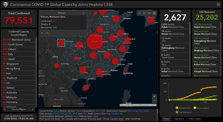
“We are tracking the COVID-19 spread in real-time on our interactive dashboard with data available for download. We are also modeling the spread of the virus.” SOURCE: GIS and DATA at Johns Hopkins University

UPDATE: ESRI has also created a GIS dashboard for the COVID-19 virus that complies an amazing amount of spatial data in a user-friendly format that is definitely worth your time.  Also, this article titled “Why Geography is a Key Part of Fighting the COVID-19 Coronavirus Outbreak” is another example of that shows the importance of spatial thinking in interdisciplinary contexts.

After several inaccurate maps spread misinformation (dare I say, in a viral fashion?),  I felt it would be important to not only share some good maps, but the most data-rich maps as well.  Some U.S. west coast cities, such as San Francisco, are declaring emergencies in anticipation of an outbreak. The Tokyo Marathon has been cancelled (except for the elite runners), and some are worrying out loud about whether the 2020 Tokyo Olympics games might face a similar fate.  This article nicely explains just how contagious the COVID-19 virus actually is…(short answer, it’s pretty contagious).

The video below covers 3 major economic impacts that the virus will have on the global economy.  In short, 1-Tourism and Travel, 2-Supply Chains, and 3-Flight to Quality Goods.

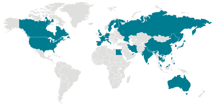
My favorite source is a GIS dashboard from John Hopkins that is incredibly detailed.  This is a great way to show how big data, mapping, and geography become very relevant.  Here is a link to the Center of Disease Control’s (CDC) page about the Coronavirus and a copy of their map (accurate as of Feb 24) in the image below.

outbreak-coronavirus-world
Locations with Confirmed COVID-19 Cases

GeoEd Tags: medical, mapping, GIS, statistics, mortality.
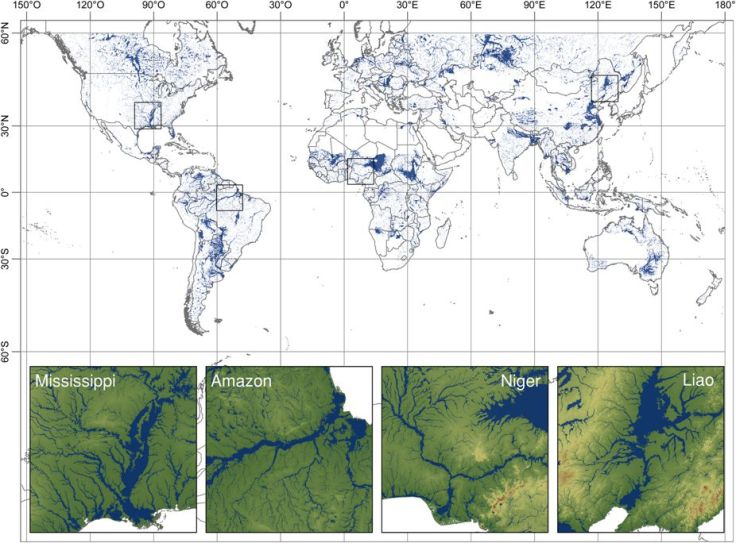
GFPLAIN250m, a global high-resolution dataset of Earth’s floodplains

Identifying floodplain boundaries is of paramount importance for earth, environmental and socioeconomic studies addressing riverine risk and resource management. However, to date, a global floodplain delineation using a homogeneous procedure has not been constructed. In this paper, we present the first, comprehensive, high-resolution, gridded dataset of Earth’s floodplains at 250-m resolution (GFPLAIN250m).

Source: www.nature.com

Satellites see the world as a bunch of pixels.  In this recent article in the journal Nature, the authors used a global set of satellite images to create the first global layer of floodplains.  This data is now publicly accessible as a free download (one you can put into ArcGIS after the files are extracted and zipped).     


GeoEd Tags: mapping, ESRI, GIS, remote sensing.

Scoop.it Tags: mapping, ESRI, GIS, remote sensing.

Leading the Location Intelligence Revolution

"As GPS devises, sensors, and drones proliferate, the power of location intelligence increases exponentially. This means LI can bring clarity to the most pressing business challenges – even those that at first glance don’t seem location related. Esri has location down to a science – The Science of Where. Examples from the Bavarian Police Department, Switzerland’s largest retailer, Migros, the Port of Rotterdam, and the European Environment Agency, provide just a taste of the broad scope of challenges that can be tackled through the lens of where."

Source: www.youtube.com

This video is a good demonstration of the value of GIS, geospatial technologies, and locational intelligence. 

GeoEd Tags: GIS, esri, video, mapping, cartography, geospatial, technology.

Scoop.it Tags: GIS, ESRIvideo, mapping, cartography, geospatial, technology.

This computer programmer solved gerrymandering in his spare time

We could take human error out of the redistricting process entirely. Why don’t we?

Source: www.washingtonpost.com

This computer programmer (code word in the newspapers for geographers using GIS) has created a way to take the human element out of the redistricting process.  Dividing places into separate, formal regions is an important task, one that often times requires an intimate knowledge of the place, it’s cultural, economic and physical characteristics.  That’s how I would want things to been done in a perfect world, but partisan chicanery has led to so many gerrymandered districts that the human touch is what many of us fear more than a cold, impersonal division that does not take place, history, and community into account.    


Questions to Ponder: Do you trust the politicians that are in charge of your state to create better districts than computer-generated districts that are optimized for compactness?  What are some of the potential limitations of compact districts?  Would an independent committee/bipartisan group do a better job? How does the Voting Rights Act complicate the redistricting process?    


Tags: gerrymandering, politicalmapping, cartography, GIS, unit 4 political.

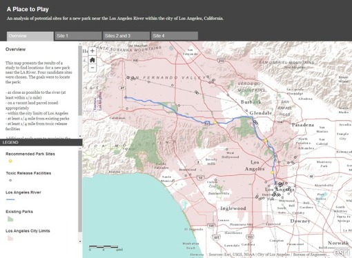
Creating RI’s Off-Shore Wind Farm

Today, to the southeast of Block Island, there are five new structures rising from the ocean. These are the towers of the Block Island Wind Farm (BIWF), the first offshore wind energy installation in the United States. The turbines will generate 30 megawatts of energy; providing electricity to 17,000 households on Block Island and coastal Rhode Island (McCann, 2016), and replacing the diesel generators that previously powered New Shoreham. The turbines are on schedule to begin turning in November 2016 once commissioning is complete.

Source: uri.maps.arcgis.com

One of the overriding, major take-home points of this ESRI StoryMap, is that a project of this scale, scope, and magnitude requires geographic data across many disciplines (to see the largest off-shore wind farm in the world, click here).


Tags: mapping, Rhode IslandESRIStoryMap, GISresources, water, coastalenergy, environment depend.

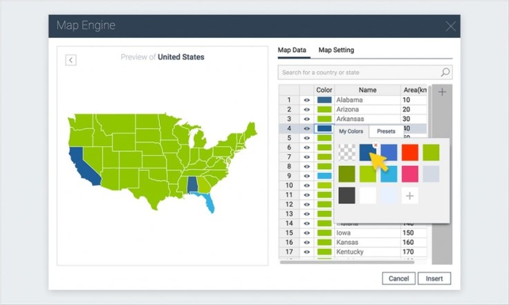
How to Create an Interactive Map with Visme

A step-by-step tutorial on how to create an interactive map with Visme, a free online infographic and presentation tool.

Source: blog.visme.co

If you have students use Piktochart to create infographics, then this is a new tool that you should consider.  In addition to creating infographics, this allows users to create and embed interactive maps in those infographics.  This is a both a baby-step into the world of GIS as well as a way to create student projects that are richly informative.


TagsAPHG, infographic, visualization, mapping, GIS, edtech.

Speaking the “Language” of Spatial Analysis

“Spatial analysis has always been a hallmark of GIS, the ‘numerical recipes’ which set GIS apart from other forms of computerized visualization and information management. With GIS we pose questions and derive results using a wide array of analytical tools to help us understand and compare places, determine how places are related, find the best locations and paths, detect and quantify patterns, and even to make spatial predictions.”

Source: blogs.esri.com

GIS is a key tool in spatial analysis, but it can also be a driving force in using math, science, technology and (yes) geography as interdisciplinary ways of teaching the curriculum.  StoryMaps can be rich with images and videos, but also filled with data at a variety of scales.  ESRI has share a “Maps we love” page with excellent examples of Story Maps and carefully explains WHY these maps work and HOW they were made.  Are you new to using the Analysis tool in ArcGIS Online?  Try this exercise on analyzing flood risk to guide you through some of the steps to learn what is possible for a project of your own.  What stories can you tell in this rich, visual format?  What visual template shown might lend itself best for that sort of project? 


Tagsmapping, GISESRIgeography education, geospatial, edtech.

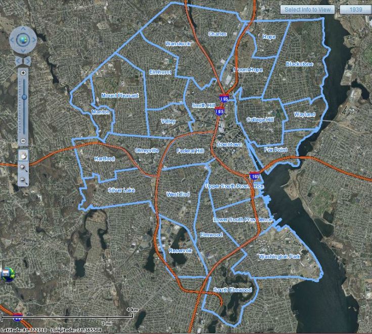
Historic Aerial Mapper

“This application was developed by The Providence Plan utilizing photos from the Rhode Island Geographic Information System.”

Source: mapper.provplan.org

This map is a great archive of historic satellite imagery of the Ocean State, with a special nod to Providence.  This is a great tool that can be used to show how and particular place in Rhode Island has changed over the years at the neighborhood scale.  At the metropolitan scale, it is easy to see the population grown, development expansion, and urban sprawl.  The years of data coverage are 1939, 1952, 1962, 1972, 1981, 1985, 2003, 2008, 2011, and 2014.    


Tags: mapping, Rhode IslandESRIStoryMap, GIS, remote sensing.

Create a free website or blog at WordPress.com.

Up ↑