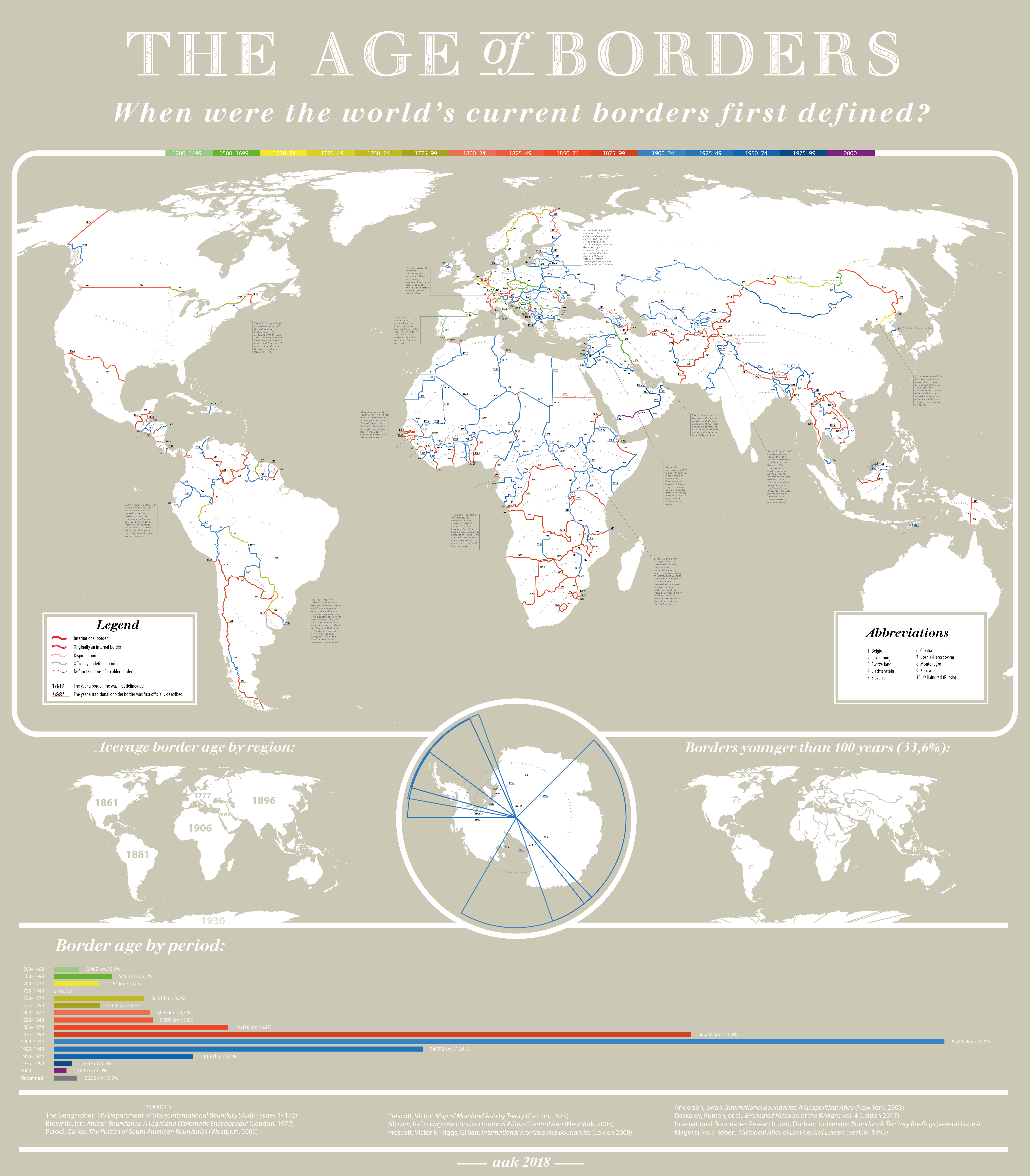
“The creation date of (almost) every international border. Full-size image here.”
Tags: infographic, worldwide, borders, political, historical.
Source: c1.staticflickr.com
“The creation date of (almost) every international border. Full-size image here.”
Tags: infographic, worldwide, borders, political, historical.
Source: c1.staticflickr.com

“While the Korean War of the early 1950s never formally ended, its aftermath has created starkly divergent worlds for those living on either side of the north-south divide. What follows is a look at life in the two Koreas; how such a night-and-day difference came to be; and where the crisis could go from here. Both governments claimed to be the legitimate rulers of the peninsula. Tensions between north and south gradually mounted, until finally, in June 1950, hundreds of thousands of North Korean troops stormed across the 38th parallel. The unsuspecting South Korean defenders were outgunned and outnumbered, and beat a hasty retreat southward.”
Source: storymaps.esri.com
This excellent interactive was created by Esri’s Story Maps team using the Story Map Cascade app–making it an great resources of the geography of the Korean Peninsula as well as a stellar example of how maps, infographics, videos, images and text can be combined using ArcGIS online.
Tags: mapping, ESRI, StoryMap, infographic, visualization, North Korea, South Korea, East Asia, borders, political, geopolitics, historical.

Walmart employs 1.5 million people across the country – and the retail behemoth is now the largest private employer in 22 states.
In an era where Amazon steals most of the headlines, it’s easy to forget about brick-and-mortar retailers like Walmart.
But, even though the market values the Bezos e-commerce juggernaut at about twice the sum of Walmart, the blue big-box store is very formidable in other ways. For example, revenue and earnings are two areas where Walmart still reigns supreme, and the stock just hit all-time highs yesterday on an earnings beat.
Tag: rural, retail, labor, economic, industry.
Source: www.visualcapitalist.com

Source: xkcd.com
This ‘map’ is a pithy and quite pointed critique of the many maps that get shared on social media claiming to be based on big data, but they might be more fluff than true substance.
Tags: XKCD, infographic, mapping, social media, cartography.
Source: imgur.com
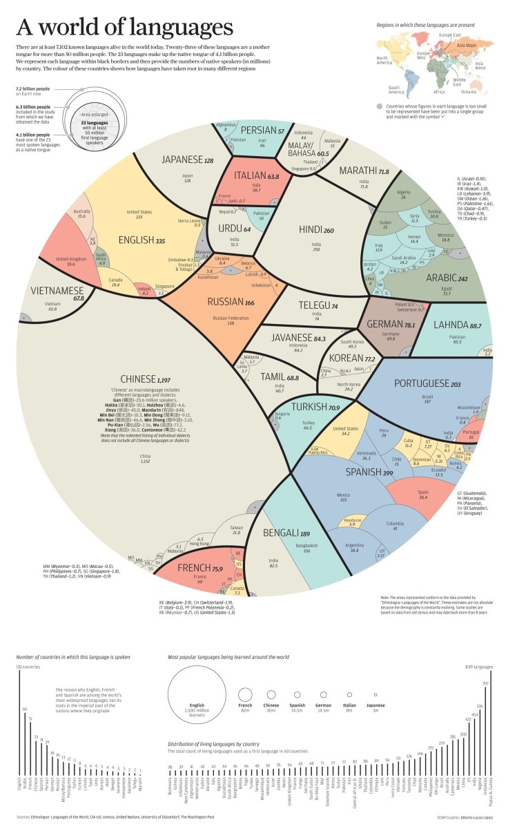
This infographic has been making the rounds again this year and it is worth shaing again. It is a great way to visualize the dominant languages on Earth. Since this only counts one language per person, mother tongues are listed. Consequently, lingua franca’s such as English and France are smaller than you might have presumed them to be.
Tags: language, culture, infographic.

North Korea – a country hard to illustrate by numbers and those available are based on estimates. Accordingly, this graphic intends to give an overview on relevant aspects of a country hardly known by outsiders. Overall, we know little about the isolated northern part of the Korean peninsula and what we know is mostly disturbing: The DPRK’s government headed by Kim Jong-un has recently launched another missile test, adding up to 14 tests only in 2017.
Besides that, the country is estimated to be among the most militarised on the globe with more than a million active soldiers and an air force counting 944 aircrafts in total. Thus, North Korea is ranked 23rd (out of 133 countries) for military spending which approximately amounts to $7.5 billion per year. According to the CIA, young adults are obliged to spend several years in the military service, women around seven and men even ten years.
But above all, North Korea is a country that is desperately poor. Out of an estimated 25,115,311 inhabitants, only 36 percent of the population has access to electricity and the GDP per capita amounts to $1,700 – similar to that of South Sudan.
Tags: North Korea, infographic.
Source: www.statista.com

Source: www.illustratedtextbook.com
If you haven’t seen any resources from the Human Imprint, this is a great source of teacher-produced AP Human Geography as well as other social studies. This new project, the Illustrated Textbook, was created to be a “one-stop-shop for human geography fundamentals” using a fun, graphic style interlaced with content-heavy text. I’m very excited to see this online textbook continue to unfold. This is definitely on the shortlist of best materials on this site.
Tags: geography education, APHG, infographic, textbook.
A step-by-step tutorial on how to create an interactive map with Visme, a free online infographic and presentation tool.
Source: blog.visme.co
If you have students use Piktochart to create infographics, then this is a new tool that you should consider. In addition to creating infographics, this allows users to create and embed interactive maps in those infographics. This is a both a baby-step into the world of GIS as well as a way to create student projects that are richly informative.
Tags: APHG, infographic, visualization, mapping, GIS, edtech.
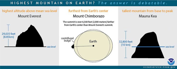
“Mount Everest is usually said to be the highest mountain on Earth. Reaching 29,035 feet at its summit, Everest is indeed the highest point above global mean sea level—the average level for the ocean surface from which elevations are measured. But the summit of Mt. Everest is not the farthest point from Earth’s center.
Earth is not a perfect sphere, but is a bit thicker at the Equator due to the centrifugal force created by the planet’s constant rotation. Because of this, the highest point above Earth’s center is the peak of Ecuador’s Mount Chimborazo, located just one degree south of the Equator where Earth’s bulge is greatest. The summit of Chimborazo is 20,564 feet above sea level. However, due to the Earth’s bulge, the summit of Chimborazo is over 6,560 feet farther from the center of the Earth than Everest’s peak. That makes Chimborazo the closest point on Earth to the stars.
You may be surprised to learn that Everest is not the tallest mountain on Earth, either. That honor belongs to Mauna Kea, a volcano on the Big Island of Hawaii. Mauna Kea originates deep beneath the Pacific Ocean, and rises more than 32,800 feet from base to peak.”
Source: oceanservice.noaa.gov
I’ve tried to answer this question without any visual aids and there is always at least one confused look in the class. This infographic is the most straightforward way to give the ‘long’ answer to a seemingly simple question, “what is the tallest mountain on Earth?” It all depends on how you measure it and what your reference point is.


