In Pakistan’s tribal areas, alcohol bootleggers, lured by enormous profits, have created clandestine delivery services to evade recent crackdowns by the Taliban and the police.
Seth Dixon‘s insight:
This 2010 New York Times video shows in a poignant way how the past and the present, the global and the local comibine to create underground cultural practices among the wealthy in Pakistan.
Michael Slackman, The Times’s Berlin Bureau Chief, looks into the city’s obsession with a popular street dish that combines sausage, ketchup and curry powder.
This short video on the street foods of German cities is a rich, tangible example to show cultural patterns and processes. Culture is not static and this New York Times video can be used to teach the various concepts of culture; per the updated APHG outline, the initial concepts of culture are:
Culture traits
Diffusion patterns
Acculturation, assimilation and multiculturalism
Culture region, vernacular region, cultural hearth
Globalization and the effects of technology on culture.
Question to Ponder: How are these 5 major elements of culture seen in this video?
Learning about North, South Carolina isn’t easy; and don’t get me started on Due West…throw in a different accent and you’ve got a failure to communicate (and for the record, she is dead on with her geographic descriptions).
“With Europe sputtering and China costly, the ‘stars are aligning’ for Mexico as broad changes in the global economy create new dynamics of migration.”
Seth Dixon‘s insight:
I’ve posted earlier about the end of cheap China; the rising cost of doing business in China coupled with the higher transportation costs to get goods to North American and European markets have made manufacturing in Mexican much more competitive on the global market. Many investors are turning to Mexico as an emerging land of opportunity and Mexico is now a destination for migrants. This is still a new pattern: only 1 percent of the country is foreign-born compared to the 13 percent that you would see in the United States. Mexican migration to the United States has stabilized; about as many Mexicans have moved to the U.S. (2005-2010) as those that have moved south of the border.
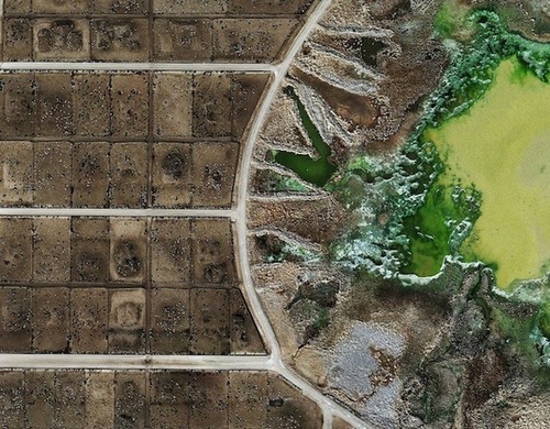
“Feedlots, a new series of images crafted by British artist Mishka Henner, uses publicly available satellite imagery to show the origins of mass-produced meat products.”
As a kid, I grew up watching the Rocky movies, shadow boxing with my brothers and doing push-ups during the workout montages. One on my favorite montages was in Rocky II when Rocky runs through the whole city of Philadelphia, thronged by adoring fans as he runs to the top of the stairs to the Philadelphia Museum of Art (and yes, of course I re-enacted that scene when I was there).
I was thrilled to reading an article in the Philly Post by Dan McQuade entitled “How Far did Rocky Go is His Training run in Rocky II?” This article identifies the locations that were used in the movie to evoke such a strong sense of place. Earlier versions of this article did not have a map and I wanted to see the images and the map together. That was enough of a reason for me to make both an online map on arcgis.com and an interactive web mapping application with an ESRI storymap template.
The online map opening in arcgis.com as has sequential pop-ups that show images from the run. Nice, but not quite what I had envisioned.
This ESRI storymap allows the user to more freely move between the pictures, map and text. More and more, we are seeing that maps can help us tell stories. If you would like to learn how to create your own storymap, read this earlier article I posted for my mapping students.
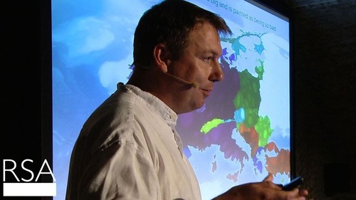
Overpopulation is a term that is often used and many assume that global population growth is a ‘population bomb’ to will be one of the major problems in the next 50 years. Some researchers argue that the problem is overstated; in this 20 minute lecture geographer Danny Dorling says that overconsumption is the real issue, not population growth per se. In this New York Times article, geographer Earle Ellis discusses how the world’s carrying capacity expands with technological advances and that demographic statistics show that growth won’t continue forever. Others fear that humanity will outstrip the world’s carrying capacity, including the letters to the editor responding to the original NY Times article.
Questions to Ponder: Do you see population growth as a looming problem that will negatively impact humanity? If so how much should we be concerned?
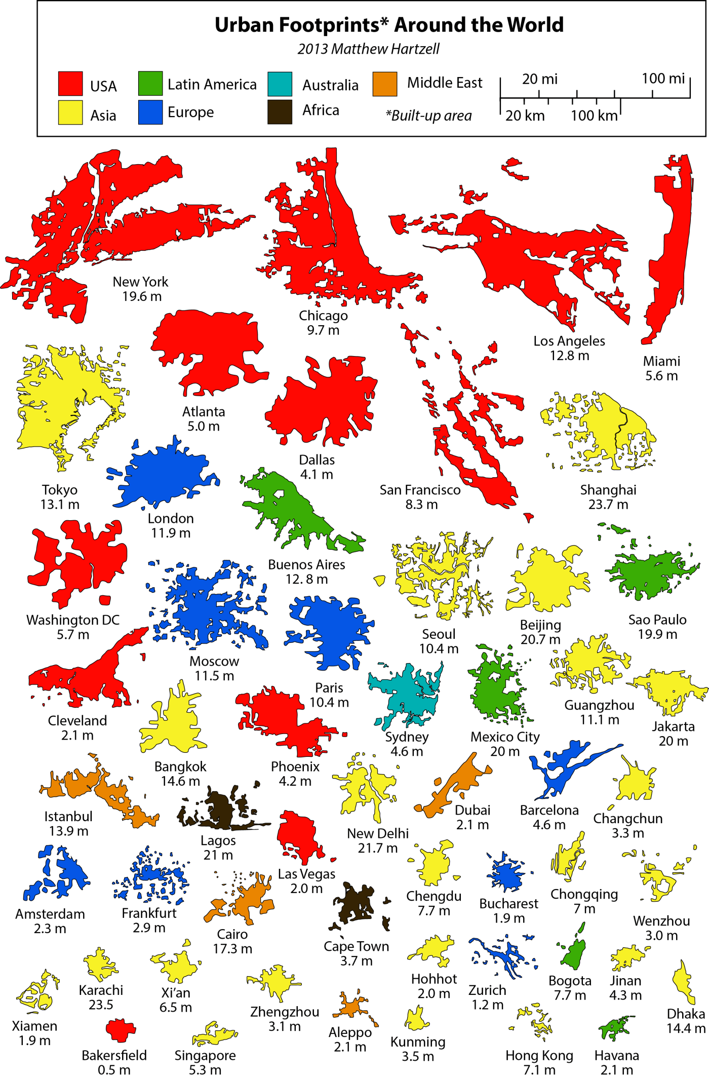
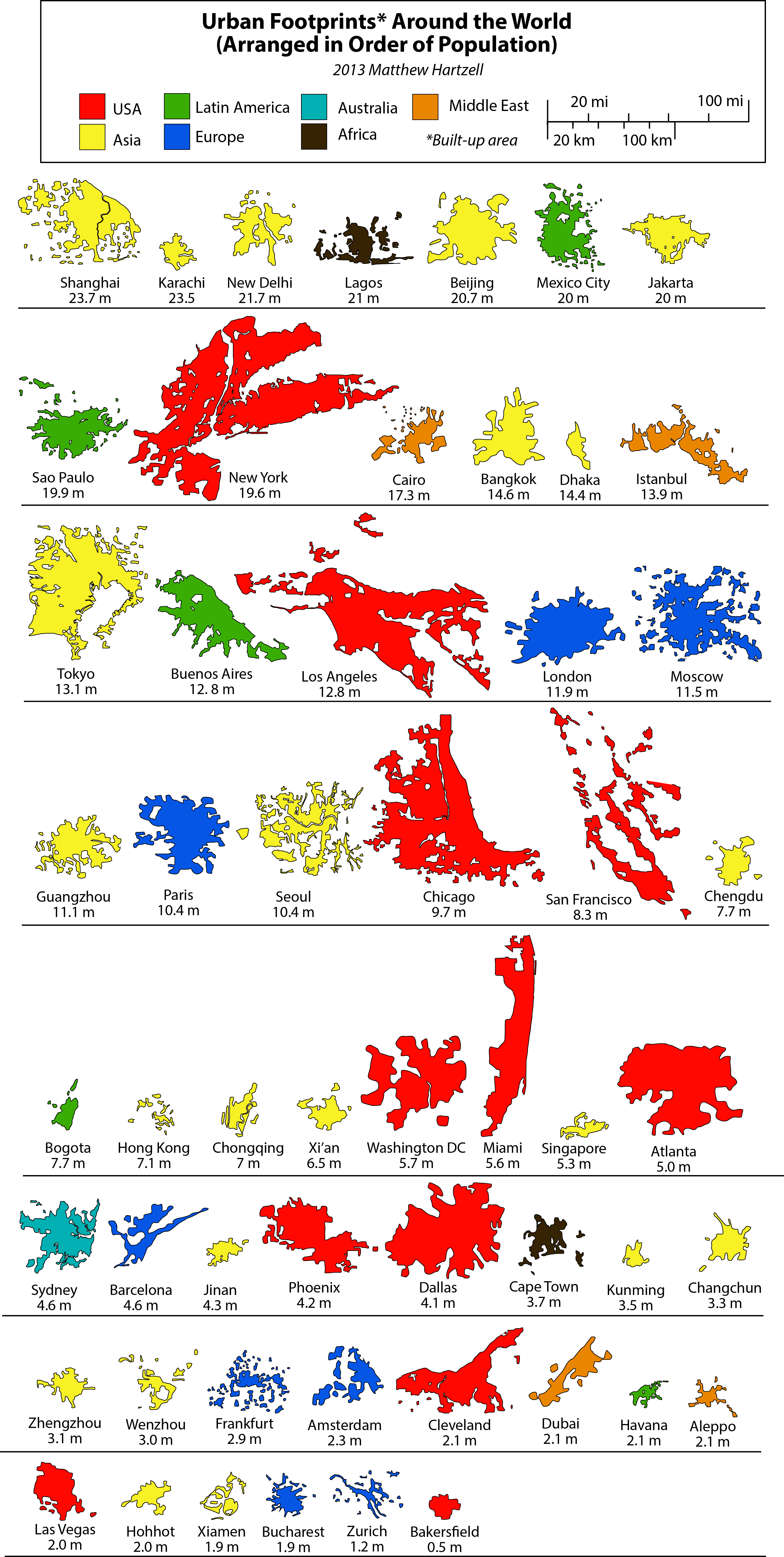
This is a series of infographics (or geo-infographics) created by Matthew Hartzell, a friend of mine that I met when we were both geography graduate students at Penn State in few years back. I will allow him to explain the rest.
“I created comparing the physical footprints of 54 cities around the world. They are presented side-by-side at the same scale, allowing the viewer to compare these cities in a new light.
Among these 54 are some of the world’s major cities, at least a few from each world region. Chinese and US cities over-represented since those are my countries. Some smaller or lesser cities I threw in at random.
In the first graphic the cities are arranged by size (or thereabouts…since the footprints are geometrically complex I had to eye-ball the approximate size). They are color-coded by world region. You’ll notice that all the top contenders are from the United States (surprise surprise). You’ll notice that when arranged in this fashion, there is no correlation to population.
What can we see in these simplified urban footprints? Apart from size, shape is the most obvious factor. Some cities, like Beijing, London, and Bakersfield, are highly compact; they’re not perfect circles or rectangles, but they’re not far off. Other cities are highly perforated (Seoul), elongated (Miami), or scattered (San Francisco). This is usually due to geographic barriers like water bodies and mountains, although it can also reflect urban development that is catalyzing farmland in a scattershot fashion, as is the case of Shanghai).
In the second graphic, the cities are arranged by population. This provides for some sharp juxtapositions. Karachi has more people than all of the New York Tri-State Region, yet its footprint is just a fraction of its size. Obviously, this is where the clearest inferences about density can be made.
The third graphic takes one of the most extreme cases–Atlanta—and makes an example out of it. Atlanta is the least dense city in the US (and therefore the world). With a population of 5 million, it takes up a footprint equivalent to that of Karachi, Jakarta, Cairo, Dhaka, Chengdu, Chongqing, Xi’an, and Jinan, with a combined population of 100 million.
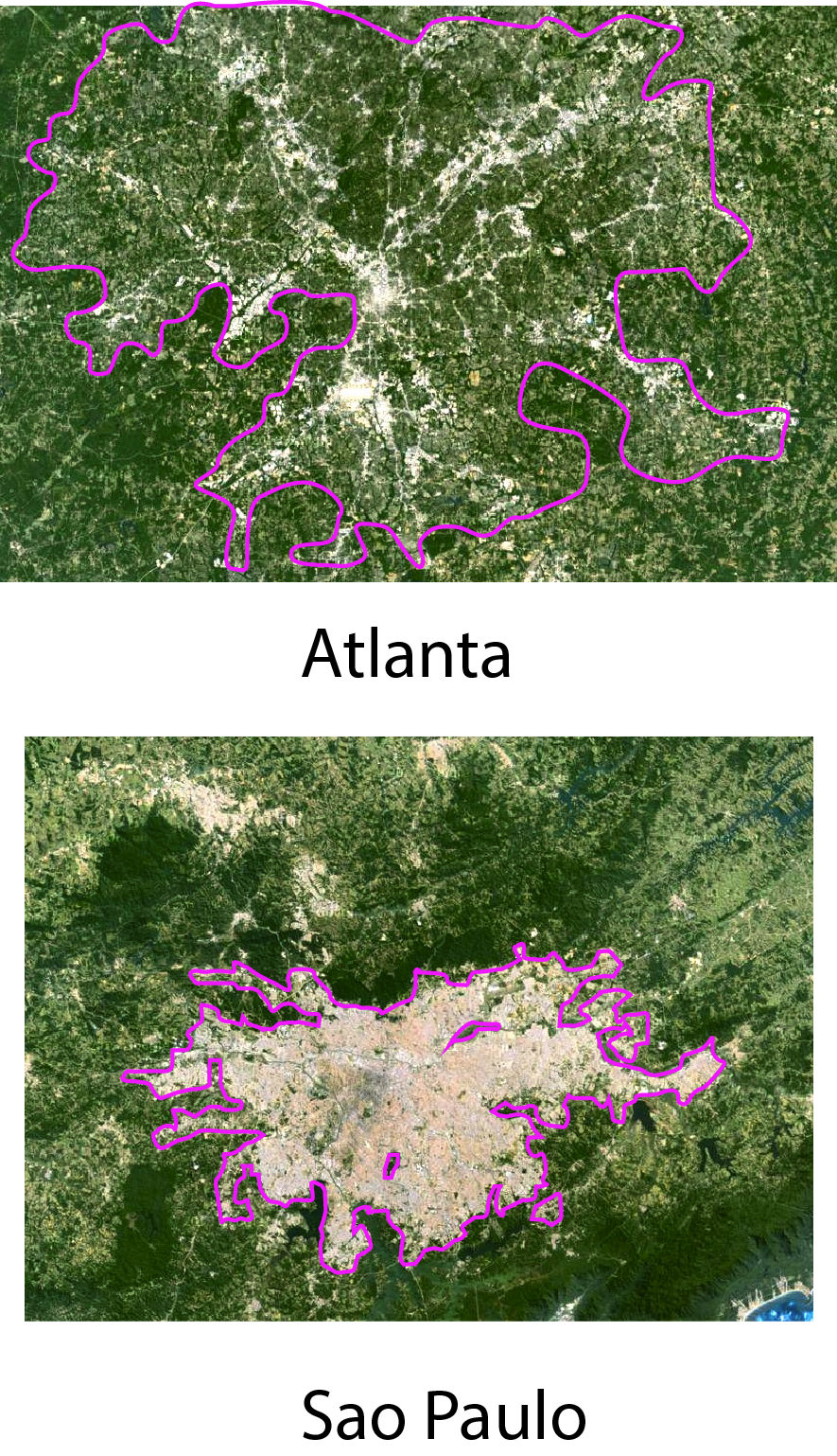
And now a few words on methodology. As with all maps and statistics, these should be taken with several grains of salt. The goal here was to create a simple infographic for broad comparative purposes. To create the footprints themselves, I used satellite imagery to physically trace the boundaries of the built-up area of each city’s greater urban area. These footprints do not correspond to administrative boundaries. They are based purely on the divide between urban and rural land use. Which, at times, can be a very subjective task. I included low density suburban housing tracts within my urban footprints (hence the size of the US cities). I included dense built up areas which weren’t connected to the main contiguous urban area but were within its periphery (examples: Moscow, Frankfurt). I excluded rural areas, farmland, villages, or large urban parks. Obviously, simplification was necessary.
A word also has to be said about the population statistics. Unfortunately, it is impossible to get population data to match precisely the urban footprints which I have drawn. Definitions of cities and metropolitan areas, as well as what land is included within what definition, vary from country to country. Wherever possible the population figures I gathered reflect the “metropolitan region”, because the vast majority of its population is located within the built up area of that region. Where this could go wrong is in parts of the Bay Area, say, where a small percentage of people, counted among the metropolitan population, actually live in rural areas, and thus were not included in my footprints. For New York, I tried to draw the boundary at the census-designated MSA boundary in order to match the population statistic. In reality, the built up area of New York is a component of a nearly unbroken contiguous built up area stretching all the way from Boston to Northern Virginia, which I did not include. For Chinese cities, I used the “urban population” statistics as reported by the government. These most accurately reflect the population inside the built up areas only, rather than the total municipal population (which are often much higher because they include large rural populations. Some of the more difficult cities to estimate were Tokyo and Jakarta. These cities both have official populations based on municipal boundaries, and much larger metropolitan populations which include vast surrounding regions. My footprints for these cities were somewhere in between these two statistics, which I tried to adjust for in the populations I listed.
Two examples of the process I went through to trace the urban footprints based on satellite imagery. Note that in the case of Sao Paulo, the urban boundary is readily apparent. In the case of Atlanta, however, low density suburbs with lots of trees blend into the surrounding environment, and require a more discerning eye (and examining of the satellite imagery at a larger scale).”
In the Winnie the Pooh Movie Pooh’s Grand Adventure, the character Rabbit has absolute confidence in the printed word and especially the map.
Questions to ponder: How much do we trust any given map? How much should we trust a map (or the printed word)? What makes a document reliable or unreliable?