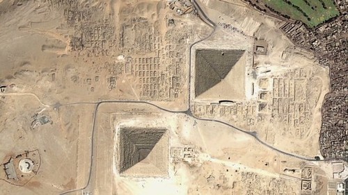
Some city skylines are so iconic they are instantly recognisable.
See on www.theguardian.com
Some city skylines are so iconic they are instantly recognisable.
See on www.theguardian.com
Hijab is an Islamic concept of modesty and privacy, most notably expressed in women’s clothing that covers most of the body.
What is the geography of hijab? Covering one’s head pre-dates Islam in the Middle East but many associate this practice strictly with Islam and only for women–read this article (with teaching tips and supplemental resources) for more context on this cultural and religious practice.
Tags: Islam, perspective, religion, culture, National Geographic.
The Stanford History Education Group has amassed some great resources for social studies teachers. Their chief resources is a program called Reading Like a Historian. The program has 71 stand-alone lessons for U.S. History organized within 11 units. These lessons span colonial to Cold War America and cover a range of political, social, economic, and cultural topics. They are continuing to expand the Reading Like a Historian program to World History. Currently there are 15 lessons from across the world history sequence with more lesson plans under development that will be released in the next few months.
Tags: historical, teacher training.
See on sheg.stanford.edu
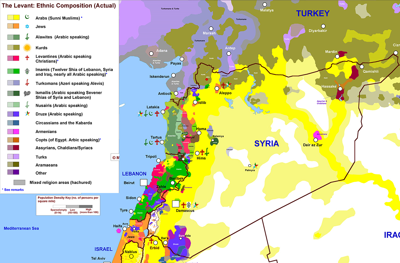
A color-coded map of the country’s religious and ethnic groups helps explain why the fighting is so bad.
This map of the various ethnic and religious groups in being shown on major media outlets and some Western countries including the United States are considering military action in Syria. This map powerfully conveys while many may conceptualize Syrians as a single monolithic group, that idea is a fiction that was created in the absence of geographic content to fill the void.
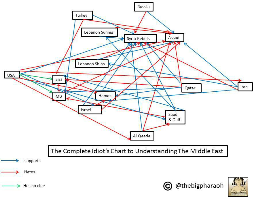
Additionally this diagram has also been circulating lately for the same reasons; this flow chart lays out the Middle East’s political rivalries and alliances. “The enemy of my enemy is my friend” is a well-quoted proverb to simplify Middle Eastern political alliances and rivalries. Seeing this web, you can only imagine that living by that dictum can certainly lead to complicated geopolitical conflicts among countries and culture groups.
Tags: Syria, MiddleEast, conflict, political, ethnicity, religion.
See on www.washingtonpost.com
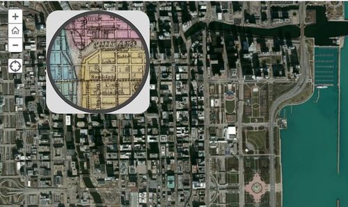
This 1868 pocket map of Chicago shows the city in full-blown expansion, a mere 3 years before the infamous blaze
This interactive map with a ‘spyglass’ feature Chicago is displaced during a economic boom period as the U.S. was expanding westward. Where where the railroads located then? Why have some of them vanished today? Notice anything curious about the coastline along Lake Michigan? Follow this link to see similar interactives of other major U.S. cities.
Tags: Chicago, historical.
See on www.smithsonianmag.com
“170 Years of the World’s Hurricane Tracks on One Dark and Stormy Map.”
What physical forces create hurricanes? What spatial patterns are evident? How does this map impact settlement patterns or hazard mitigation efforts?
Tags: physical, disasters, environment,
See on www.wired.com
Pittsburgh, called “hell with the lid taken off” in the 19th century because of its industrial filth, is now an academic leader in the green movement.
This is a great article on regional sustainability initiatives and education in the Pittsburgh area. Given Pittsburgh’s history, that makes these clean industrial projects all the more impressive.
See on www.pittsburghmagazine.com
“Drawing on data from the 2010 U.S. Census, the map shows one dot per person, color-coded by race. That’s 308,745,538 dots in all.”
This is an incredibly gorgeous interactive map of population density in the United States. It is very reminiscent of this North American Map with two major differences. On the down side, Mexican and Canadian data are not displayed but on the bright side, the added color component is used to show ethnic categories as defined by the 2010 U.S. census. Please explore this map at a variety of scales and in distinct locales.
Questions to Ponder: Is this a map of ethnic diversity patterns or is it a map of racial segregation? How come? Is there additional information that you would need to decide? This review of the map on Wired described this map as a map depicting segregation: why would they say that?
Tags: cartography, mapping, visualization, population, density, ethnicity. race.
“If you’re concerned about Common Core and how geography fits in then don’t miss this informative event. We’ll dive into resources that were designed to expand the definition of text, show the alignment between the ELA common core standards and Geography for Life along with suggesting teaching ideas. This presentation will focus on the ELA and Geography Interconnections document that was created to support educators. The session will also highlight the National Geographic Common Core website and the resources available. Join us for a look into Common Core Standards and Geography Education!”
NCGE and National Geographic Education have partnered to bring you the first free partnership webinar of the 2013-2014 NCGE Webinar Series! This webinar is tomorrow evening (Wednesday August 28th, 9:00pm EDT) so register ASAP! I’ve posted some resources in the past about how geography and the Common Core can be aligned; this webinar will pull together years of work to ensure that geography does not get squeezed out of the curriculum.
Tags: common core, English, NCGE, National Geographic, geography education, teacher training.
See on attendee.gotowebinar.com