Search

GEOGRAPHY EDUCATION

Supporting geography educators everywhere with current digital resources.

Category

Uncategorized

Bike Share Map

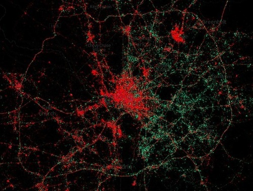
Visualisation for bike shares across the world.

Seth Dixon‘s insight:

Many cities (including Denver) have active bike share programs to ease congestion and foster a less automobile-centric urban design.  London, Paris and Mexico City are a handful of the international cities listed here but it isn’t only the largest cities (Hello Lillestrøm, Norway!).  In the U.S., it is the same with typical cities (NYC and Washington DC) as well as as some smaller cities (Chattanooga and Omaha).  Is your city on the list

Tags: transportation, urban, planning.

See on bikes.oobrien.com

Map

Seth Dixon‘s insight:

The best technologies aren’t only the newest and the most expensive.  We are often attracted to the latest and greatest and devalue the tried and true practices out there. 

See on www.youtube.com

Choices Program Presentation

What Does Good GeographyTeaching Look Like? Answering the Big Questions in Geography.

Seth Dixon‘s insight:

I’m presenting today at a summer institute entitled, Thinking Geographically About International Issues for The Choices Program (housed at Brown University).  This is a preview for what will be discussed there.    

See on www.slideshare.net

Placing Literature maps book scenes in the real world

Placing Literature maps book scenes in the real world.”

Seth Dixon‘s insight:

This article reviews a great new site, Placing Literature.  Much like Google Lit Trips, this site’s goal is to make geography come alive in literature.  Given that this site is still in its infancy, there are few novels and places in the system, but I don’t see that as a drawback.  I see this as a fantastic platform for a student project where they could make a significant online contribution.

See on news.cnet.com

Visualizing 3 Billion Tweets

This is a look at 3 billion tweets – every geotagged tweet since September 2011, mapped, showing facets of Twitter’s ecosystem and userbase in incredible new detail, revealing demographic, cultural, and social patterns down to city level detail, across the entire world.

Seth Dixon‘s insight:

In this this great social media dataset, patterns of population density are immediately evident, with areas with great population densities not surprisingly representing the greatest concentration of social media usage.  On closer inspection though, the major transportation arteries (or in this particular map map of NYC, tourism districts) become much more visible than a population density map would suggest.  


Tags: visualizationsocial media, transportation, globalization, mapping, NYC, tourism.

See on www.mapbox.com

California’s biggest dam removal project in history begins in Carmel Valley

In a project that will be watched by engineers and biologists across the nation, construction crews today will begin a three-year, $84 million project to tear down the hulking San Clemente Dam in Californias largest dam-removal project ever.

See on www.mercurynews.com

Map The iPhone Users In Any City, And You Know Where The Rich Live – Business Insider

“Our stuff often says a lot about us, whether we own a hybrid car or a station wagon, a MacBook Pro or an ancient desktop.  Among other things, cell phone brands say something about socio-economics – it takes a lot of money to buy a new iPhone 5 (and even more money to keep up with the latest models that come out faster than plan upgrades do). Consider, then, this map of Washington, D.C., which uses geolocated tweets, and the cell phone metadata attached to them, to illustrate who in town is using iPhones (red dots) and who’s using Androids (green dots).”

See on www.businessinsider.com

Esri Thematic Atlas

The Esri Thematic Atlas is a configurable web application that uses a collection of intelligent web maps with text, graphics, and images to talk about our world.

Seth Dixon‘s insight:

ESRI is moving towards creating a dynamic, authorative, living digital atlas; and empowering users to create their own.  StoryMaps are also democratizing the mapping process.  Explore these excellent examples of storymaps (Endangered Languages and top 10 physical landforms). 

Tags: GIS, ESRI, mapping, cartography, geospatial, edtech.

See on atlas.esri.com

Gapminder

” Unveiling the beauty of statistics for a fact based world view.”

Seth Dixon‘s insight:

I know that many of you have seen Gapminder, but for those that haven’t, this is one of the best ways to visualize global statistics.  The world is changing–see how. 

Tags: visualization, statistics.

See on www.gapminder.org

Create a free website or blog at WordPress.com.

Up ↑