Search

GEOGRAPHY EDUCATION

Supporting geography educators everywhere with current digital resources.

Category

Uncategorized

African dams linked to over one million malaria cases annually

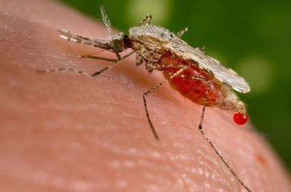
“Over one million people in sub-Saharan Africa will contract malaria this year because they live near a large dam, according to a new study which, for the first time, has correlated the location of large dams with the incidence of malaria and quantified impacts across the region. The study finds that construction of an expected 78 major new dams in sub-Saharan Africa over the next few years will lead to an additional 56,000 malaria cases annually.”

Source: medicalxpress.com

Medical geography explores the patterns and impacts of diseases; physical geography (temperature and precipitation) and human geography (development, standard of living, etc) both shape these patterns.  This article is a good example of how both play key roles since the distribution of mosquitoes is a critical component in the geography of development. 


Tagsmedical, diffusion, Africa, development, infrastructure.

How El niño affects commodity prices

“Cocoa, coffee and minerals are especially vulnerable to the weather pattern first named by Peruvian fishermen.”

Source: www.youtube.com

Geography is all about the finding the connections between seemingly unrelated issues. The geography of coffee is connected to weather, cultural, economic and many other geographies.  

Tags: environment, resources, economic, weather and climate, agriculture.

The World’s Congested Human Migration Routes in 5 Maps

The desperate men, women, and children flooding into Europe from the Middle East and Africa are not the only people moving along ever-shifting and dangerous migration routes.

Last year saw the highest levels of global forced displacement on record—59.5 million individuals left their homes in 2014 due to “persecution, conflict, generalized violence, or human rights violations” according to the United Nations. That’s 8.3 million more people than the year before.

Source: news.nationalgeographic.com

Wall for nothing: the misjudged but growing taste for border fences

“Globalisation was supposed to tear down barriers, but security fears and a widespread refusal to help migrants and refugees have fuelled a new spate of wall-building across the world, even if experts doubt their long-term effectiveness. When the Berlin Wall was torn down a quarter-century ago, there were 16 border fences around the world. Today, there are 65 either completed or under construction, according to Quebec University expert Elisabeth Vallet.”

Source: news.yahoo.com

This is an intriguing opinion piece that would be good fodder for a class discussion on political geography or the current events/refugee crisis. 

Tags: borders, political.

Migrant crisis: Neighbours squabble after Croatia U-turn

Croatia reverses its policy on allowing in migrants and instead transports hundreds northwards, angering Hungary and Slovenia.

Source: www.bbc.com

How Not to Be Ignorant About the World

How much do you know about the world? Hans Rosling, with his famous charts of global population, health and income data (and an extra-extra-long pointer), demonstrates that you have a high statistical chance of being quite wrong about what you think you know. Play along with his audience quiz — then, from Hans’ son Ola, learn 4 ways to quickly get less ignorant.

Source: www.youtube.com

Our preconceived notions of places, as well as some of the dominant narratives about regions, can cloud our understanding about the world today.  This video is a good introduction to the Ignorance Project which shows how personal bias, outdated world views and news bias that makes combating global ignorance difficult.   However, the end of the video shows some good rules of thumb to have a more fact-based world view.  


Tagsstatistics, placeregions, media, models, gapminderdevelopment, perspective.

Fuzzy Borders

TagsCanadalanguage, social media, images, placeculture, landscape, tourism

Source: instagram.com

Changes in Mortality: 1900 to 2010

“The New England Journal of Medicine looks at death reports in 200 years of back issues. The first thing to notice here is how much our mortality rate has dropped over the course of a century, largely due to big reductions in infectious diseases like tuberculosis and influenza.”

Source: www.washingtonpost.com

This infographic shows the main causes of death in 1900 in the United States and compares that with the 2010 figures.  The United States, during that time underwent what many call the epidemiological transition (in essence, in developed societies we now die for different reason and generally live longer).  


Questions to Ponder: What geographic factors shape mortality rates and shifts in the mortality rates?  What is better about society today then before?  Has anything worsened?  How come?


Tagsmortality, medical, development, historical, USA, population, statistics, unit 2 population, infographic, models.

Human activities are reshaping Earth’s surface

“By moving the slider, the user can compare 1990 false-color Landsat views (left) with recent true-color imagery (right). Humans are increasingly transforming Earth’s surface—through direct activities such as farming, mining, and building, and indirectly by altering its climate.”

Source: storymaps.esri.com

This ESRI interactive web app uses the “swipe” function to compare 12 places over time.  These locations have experienced significant environmental change since 1990.  This is an user-friendly way to compare remote sensing images over time.  Pictured above is the Aral Sea, which is and under-the-radar environmental catastrophe in Central Asia that has its roots in the Soviet era’s (mis)management policies.  


Tags: remote sensing, land use, environment, geospatial, environment modify, esri, unit 1 Geoprinciples.

Create a free website or blog at WordPress.com.

Up ↑