See on Scoop.it – Social Media Classroom

Simple, effective tutorial to explain some of the mechanics to informed twitter useage.
See on kulowiectech.blogspot.fr
See on Scoop.it – Social Media Classroom
Simple, effective tutorial to explain some of the mechanics to informed twitter useage.
See on kulowiectech.blogspot.fr
See on Scoop.it – Geography Education
Report by an Israeli non-governmental organisation says 2011 was a record year for Palestinian displacement.
This infographic comes from the group http://visualizingpalestine.org This corresponds with the UN’s recent statement that Gaza ‘will not be liveable by 2020’ given Israeli policies as reported by the BBC: http://www.bbc.co.uk/news/world-middle-east-19391809
See on www.aljazeera.com
Via Scoop.it – Geography Education

Explore and vote on the best Google Maps satellite imagery around the world.

For the first time in U.S. history, a Mormon is on a major-party presidential ticket. The Wall Street Journal examines the changing role of religion in America…
Aren’t religion and politics supposed to be the two things we are counseled not to discuss to avoid controversy? This video hits on something that plays a role for both candidates in the 2012 presidential campaign in the United States: their faith and how voters perceive their faith. This video discusses Mitt Romney, Barack Obama and some past presidents’ religious beliefs. I feel this video handles very controversial topics in a thoughtful and fair manner given that it treats various religious traditions and political ideologies in a non-partisan manner. The geography of religion might play an significant role in the outcome of the 2012 election.
See on Scoop.it – Geography Education
See on www.youtube.com
See on Scoop.it – Geography Education
The natural landscapes shown as captured by satellite imagery is as beautiful as anything artists have ever created. Some of the colors shown in the video may seem otherworldy. Most of those color anomalies are due to the fact that remotely sensed images have more information in them than just what we see in the visible portion of the electromagnetic spectrum. Some of these images are processed to show different bands so we can visually interpret data such as what is in the near infra-red band, skewing the color palette.
See on www.youtube.com
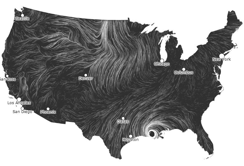
See on Scoop.it – Geography Education See on hint.fm
This is a repeat, but you simply MUST check out Louisiana right now on this map as Hurricane Isaac has made landfall.
“This interactive map is a ‘nearly live’ dynamic display of United States winds patterns (speed, direction and broad spatial context). Click on the image to see the animated, large version.”


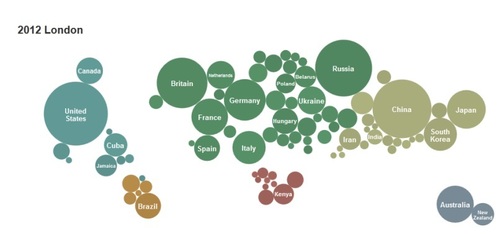
See on Scoop.it – Regional Geography
You can see the effects of political climates over the history of the “modern” Olympics
See on london2012.nytimes.com
See on Scoop.it – Geography Education
This is a primer on how to use online resources for geography students so they can learn more about the world by participating in global conversations (not just hearing about them).
See on storify.com
See on Scoop.it – Geography Education
This a visually stunning video with clips compiled from the Discovery Channel’s series “Planet Earth.”