Search

GEOGRAPHY EDUCATION

Supporting geography educators everywhere with current digital resources.

“Political Landscapes”

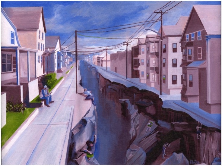
While touring Kevin Babola’s art studio yesterday, I found this thought-provoking piece entitled ‘Political Landscapes.’ I greatly enjoyed my conversation with the artist about the political, economic and urban visions that went into this painting.  The conceptual idea behind this painting started when the artist was exploring the neighborhoods of New Bedford, MA and noticed how a sense of place can change very quickly. I dare say most cities have areas similar to the one portrayed here where the socioeconomic character changes very abruptly. While physically it might be very easy to cross from the side of the street with tenements to the neighborhood with single family homes, making that transition permanent is incredibly difficult.

Questions to ponder: what leads to cities having abrupt changes in the urban fabric? What might this chasm represent to people on either side of the divide? How does this impact the neighborhood institutions (schools, local government, etc.)?  Please visit the artist’s webpage.

See on Scoop.itGeography Education  See on www.kbolaillustration.com

Real-time Earthquake Map

USGS Earthquake Hazards Program, responsible for monitoring, reporting, and researching earthquakes and earthquake hazards…

This map represents the 1079 earthquakes with magnitudes higher than 2.5 that have occured in the last 30 days.  You can customize the map to display different data at any scale.  There is detailed information about each earthquake in this great dataset.

See on Scoop.itGeography Education    See on earthquake.usgs.gov

Strange Things in Google Maps

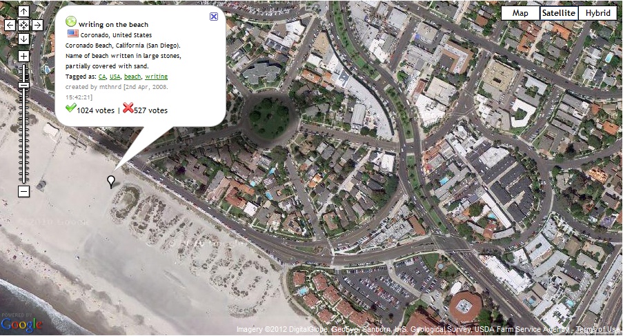
This site “Map of Strange” is dedicated to showing strange things that can be seen in Google Maps. Displayed here is a beach that I loved to go to growing up in San Diego.  Coronado is written in large stones on this part of the beach right next to the red roof of the famous Hotel Del Corondo.

See on Scoop.itGeography Education  See on www.mapofstrange.com

Using satellite images, 5th and 6th grade students learn about human impact on environment

See on Scoop.itGeography Education

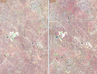
“With the help of satellite images fifth and sixth grade students at Mr. Tim Blum’s geography class at the University of Wyoming Lab School got a birds-eye view of how humans have impacted or modified their environments. Images acquired by satellites decades apart showed cleared forests, irrigated crop fields in the middle of the deserts, altered landscapes (new roads and water bodies), and urban growth.”


SD: Geospatial technologies can sound daunting for teachers that don’t feel that they are specialists. Yet there are simple ways to make sophisticated technologies very relevant to just about any grade level as this article demonstrates. 

See on blog.americaview.org

The Human and Natural World


While I do enjoy this video, it is especially interesting in in how it conceptualizes the world in the two frames.  Urban, human, civilized society on one side, with natural, unsettled wilderness on the other.  The video attempts to bridge the divide, hoping that more people will see more interconnections between the human/urban world and the natural/wildlife world.  While geographers recognize that all elements of the planet are interconnected, most people still think of the world through dichotomies such as these: civilization vs. wilderness, cultural vs. natural and human vs. animal.  How do these terms shape our thinking about the world?

See on www.youtube.com  See on Scoop.itGeography Education

Mount St. Helens: Volcanic Eruption and Recovery

The 1980 Mount St. Helens eruption was one of the most significant natural disasters in the U.S. in the past half-century. Landsat captured the extent of, and recovery from, the destruction.

The accompanying satellite images (also compiled in a video to show the temporal changes) demonstrate one way that remote sensing images can help us better understand the spatial patterns in the biosphere.

See on Scoop.itGeography Education   See on www.nasa.gov

Mapping American Stereotypes

See on Scoop.itGeography Education

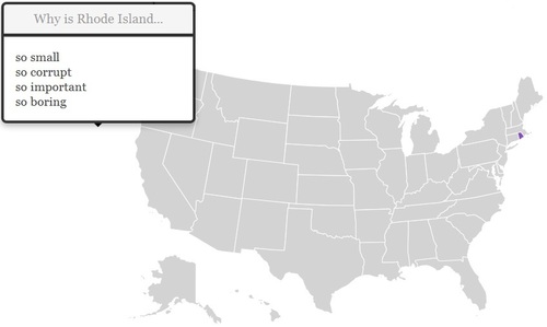
There are plenty of regional biases about other places.  This map was generated by Google autocomplete.  If you Google, “Why is Rhode Island so….” if will automatically suggest some responses.  This was done for all the states and these autoresponses are quite revealing (and often humorous). 

See on blog.noupsi.de

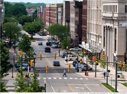
Cities where homebuying is most (and least) affordable

See on Scoop.itGeography Education

Looking for an affordable home? Here are 5 cities that are good bets, and 5 cities where owning is tough.

This is an intriguing set of lists.  What geographic factors explain why some cities are on either of these lists?  In related news on housing in the United States, many of the so-called “McMansions” of the 1990s and 2000s were virtually unsellable during the height of the recession.  They are now being sold, but for around half of what they were selling for at their peak.

See on money.cnn.com

Stories Displayed on Maps

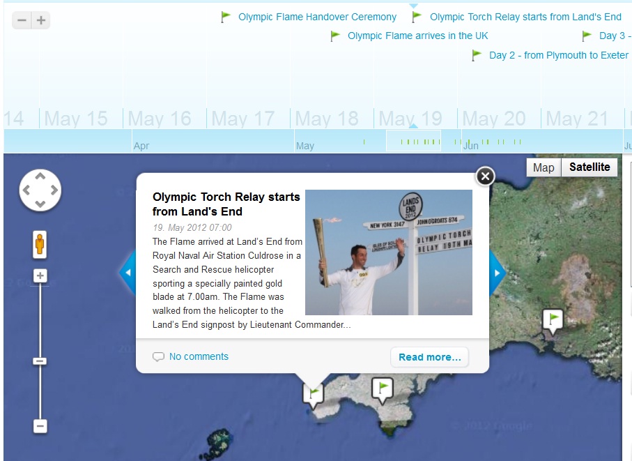
On myHistro you can create advanced geolocated timelines that you can play as presentations. Pin your events, videos and photos to the map and share them with friends and family.

This new resource, myHistro, combines interactive maps with timelines to organize stories, journeys or historical events as the move over time and place.  By embedding photos, videos and links this creates an incredibly dynamic platform for telling historical and geographic stories.  By combining these features, this is a powerful tool to create customized resources for you students.  Pictured above is a sample timeline that shows the spatial and temporal journey of the Olympic torch for the 2012 Games.

See on Scoop.itGeography Education

See on www.myhistro.com

Blog at WordPress.com.

Up ↑