This is a series of infographics (or geo-infographics) created by Matthew Hartzell, a friend of mine that I met when we were both geography graduate students at Penn State in few years back.  I will allow him to explain the rest (UPDATE: In 2013, Matt provided this update).
“I created comparing the physical footprints of 54 cities around the world. They are presented side-by-side at the same scale, allowing the viewer to compare these cities in a new light.
Among these 54 are some of the world’s major cities, at least a few from each world region. Chinese and US cities over-represented since those are my countries. Some smaller or lesser cities I threw in at random.
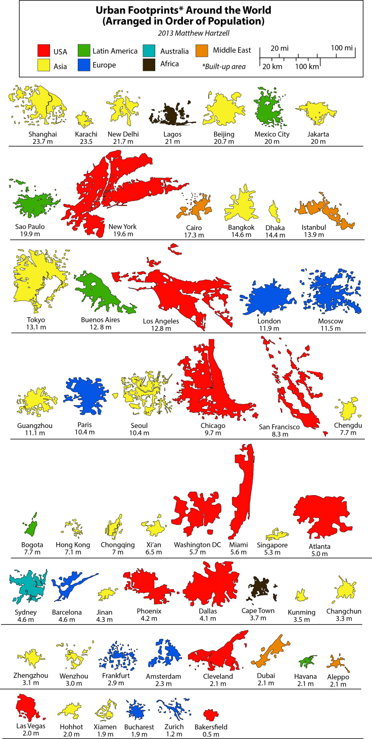
In the first graphic the cities are arranged by size (or thereabouts…since the footprints are geometrically complex I had to eye-ball the approximate size). They are color-coded by world region. You’ll notice that all the top contenders are from the United States (surprise surprise). You’ll notice that when arranged in this fashion, there is no correlation to population.
Urban Footprints
What can we see in these simplified urban footprints? Apart from size, shape is the most obvious factor. Some cities, like Beijing, London, and Bakersfield, are highly compact; they’re not perfect circles or rectangles, but they’re not far off. Other cities are highly perforated (Seoul), elongated (Miami), or scattered (San Francisco). This is usually due to geographic barriers like water bodies and mountains, although it can also reflect urban development that is catalyzing farmland in a scattershot fashion, as is the case of Shanghai).
In the second graphic, the cities are arranged by population. This provides for some sharp juxtapositions. Karachi has more people than all of the New York Tri-State Region, yet its footprint is just a fraction of its size. Obviously, this is where the clearest inferences about density can be made.
Urban Footprints by Population
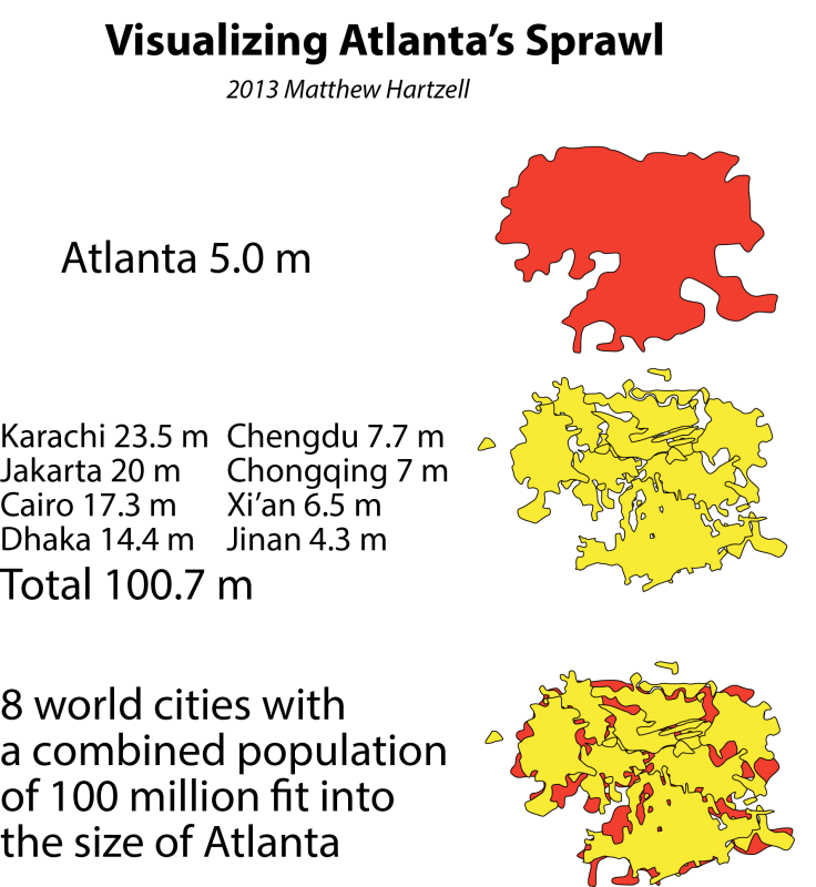
The third graphic takes one of the most extreme cases–Atlanta—and makes an example out of it. Atlanta is the least dense city in the US (and therefore the world). With a population of 5 million, it takes up a footprint equivalent to that of Karachi, Jakarta, Cairo, Dhaka, Chengdu, Chongqing, Xi’an, and Jinan, with a combined population of 100 million.
Visualizing Atlanta's Sprawl
And now a few words on methodology. As with all maps and statistics, these should be taken with several grains of salt. The goal here was to create a simple infographic for broad comparative purposes. To create the footprints themselves, I used satellite imagery to physically trace the boundaries of the built-up area of each city’s greater urban area. These footprints do not correspond to administrative boundaries. They are based purely on the divide between urban and rural land use. Which, at times, can be a very subjective task. I included low density suburban housing tracts within my urban footprints (hence the size of the US cities). I included dense built up areas which weren’t connected to the main contiguous urban area but were within its periphery (examples: Moscow, Frankfurt). I excluded rural areas, farmland, villages, or large urban parks. Obviously, simplification was necessary.
A word also has to be said about the population statistics. Unfortunately, it is impossible to get population data to match precisely the urban footprints which I have drawn. Definitions of cities and metropolitan areas, as well as what land is included within what definition, vary from country to country. Wherever possible the population figures I gathered reflect the “metropolitan region”, because the vast majority of its population is located within the built up area of that region. Where this could go wrong is in parts of the Bay Area, say, where a small percentage of people, counted among the metropolitan population, actually live in rural areas, and thus were not included in my footprints. For New York, I tried to draw the boundary at the census-designated MSA boundary in order to match the population statistic. In reality, the built up area of New York is a component of a nearly unbroken contiguous built up area stretching all the way from Boston to Northern Virginia, which I did not include. For Chinese cities, I used the “urban population” statistics as reported by the government. These most accurately reflect the population inside the built up areas only, rather than the total municipal population (which are often much higher because they include large rural populations. Some of the more difficult cities to estimate were Tokyo and Jakarta. These cities both have official populations based on municipal boundaries, and much larger metropolitan populations which include vast surrounding regions. My footprints for these cities were somewhere in between these two statistics, which I tried to adjust for in the populations I listed.

Satellite interpretation example

Two examples of the process I went through to trace the urban footprints based on satellite imagery. Note that in the case of Sao Paulo, the urban boundary is readily apparent. In the case of Atlanta, however, low density suburbs with lots of trees blend into the surrounding environment, and require a more discerning eye (and examining of the satellite imagery at a larger scale).”