Via Scoop.it – Geography Education
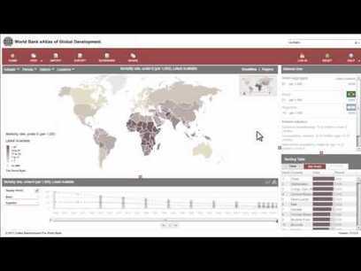
“The World Bank eAtlas of Global Development maps and graphs more than 175 thematically organized indicators for over 200 countries, letting you visualize and compare progress on the most important development challenges facing our world. Most indicators cover several decades, so you can see, for example, how ‘life expectancy at birth’ has improved from 1960 up through the latest year.” This tool should greatly enhance student projects as they will add more data, and see bigger patterns.
Via www.youtube.com
- Articles
- APHG Faculty Lectures
- Assessing the Validity of Online Sources
- Brexit: Reaction and the Aftermath
- Comparing Urban Footprints
- Geographic Imagination in the English Anthem ‘Jerusalem’
- Geography on Twitter
- Israeli-Palestinian Conflict updates, 2016
- Learning From Home
- Political and Economic Geography Presentations
- Start-of-the-Year Videos
- Strava Heat Map and National Security
- Teaching about Syrian Refugees
- Thanksgiving Resources
- The Atlas of Economic Complexity: the Case of Costa Rica
- The Geography of E-Waste
- Videos: How Does it Grow?
- California’s Drought
- Cultural Meaning in Moving Monuments
- Gerrymandering
- Navigating and Occupying Gendered Space
- Place and Flash Mobs
- Imaginary Geographies
- Older Articles
- Regional
- Thematic
- Geospatial
- Courses
- Presentations
- About


Leave a comment