See on Scoop.it – Geography Education
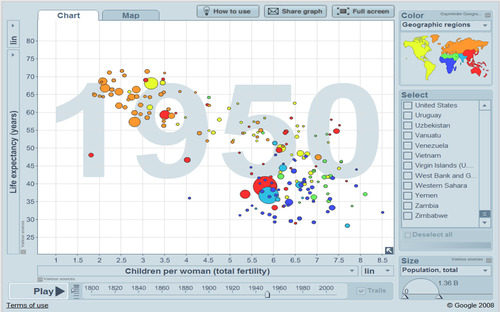
This particular graph shows Total Fertility (x axis) and Life Expectancy (y axis) which collectively can explain some of what can be called human development. This is an interactive graphic that shows both temporal and regional patterns in changes in development.
See on www.gapminder.org


Leave a comment