This is a great gallery of clever artwork that puts the “art” in cartography (The Earth without art is just “eh).
See on www.brainpickings.org
This is a great gallery of clever artwork that puts the “art” in cartography (The Earth without art is just “eh).
See on www.brainpickings.org
Listed here are the top choices for election maps for keeping an eye on election results and twitter maps.
Just a friendly reminder to vote tomorrow for those of you in the United States.
See on gislounge.com
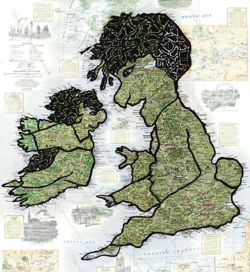
Britain has invaded all but 22 countries in the world in its long and colourful history, new research has found.
This is a great map to show the historical impact of colonialism on the world map. The map is based on the work in the new book All the Countries We’ve Ever Invaded: And the Few We Never Got Round To.
Tags: book reviews, colonialism, war, historical, UK.
See on www.telegraph.co.uk
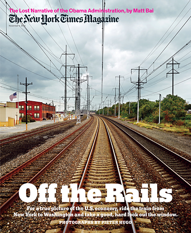
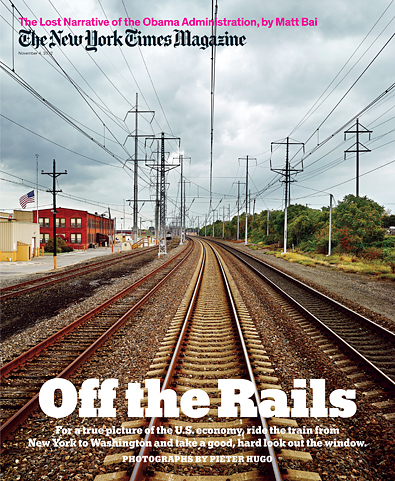
The death and life of the industrial corridor linking New York and Washington.
This article is a great example of analyzing the landscape to observe changes in any given place. This corridor is home to 8 of the 10 wealthiest counties; at the same time this transportation corridor is also home a half a dozen of the country’s most broken cities. Exploring this area is way to analyze the changing economic geographies of the United States. For a visual representation of these same themes, see this 5 minute video that corresponds to this NY Times magazine article.
Tags: industry, economy, unit 6 industy, transportation, neighborhood, landscape.
See on www.nytimes.com
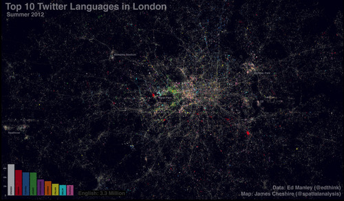
This map is a fantastic geovisualization that maps the spatial patterns of languages used on the social media platform Twitter. This was inspired by a Twitter map of Europe. While most cities would be expected to be linguistically homogenous, but London’s cosmopolitan nature and large pockets of immigrants impact the distributions greatly.
Tags: social media, language, neighborhood, visualization, cartography.
See on spatialanalysis.co.uk
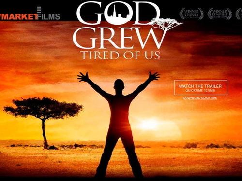
The story of the “Lost Boys” of Sudan is a heartbreaking and inspiring tale of youth caught in cultural and geopolitical conflicts and fored to leave their homes. The film God Grew Tired of Us ” tells a moving story of young people overcoming incredible challenges and struggling to improve their own lives and those of family and friends left behind.” Linked here is a lsson plan from National Geographic “to teach students about concepts of migration, cultural mosaics, sense of place, and forces of cooperation and conflict among communities” using this 90 minute documentary. The film can be viewed online on HULU as well as other media outlets.
Tags: culture, Africa, political, conflict, war, migration, development, APHG.
NP: Four years ago, Channel One News, the weekday news program for middle and high school kids featured a dynamic area cartogram as a way of making the point that some states have much more electoral weight than others. In that broadcast, the map of the United States, featuring the familiar red and blue states indicating presidential election results, became animated. States with smaller populations squeezed into tiny shapes, while states with large populations expanded. At the time, we didn’t know this kind of map was called an area cartogram; we called it a “squishy map.” It does a nice job of making this case: some states matter more than others when it comes to US presidential elections.
Seeing the map on Channel One also launched me into work that continues with my dissertation. What kind of sense do kids make from complex representations like an area cartogram? In the Channel One broadcast in 2008, the map was presented as part of a sensible lesson about “electoral weight.” With Vanderbilt professors Rogers Hall and Kevin Leander, we wondered if the map made sense to kids and if the argument was strengthened by the map.
Four years later, I’m still working on those questions and others like them. In the mean time, here’s another awesome area cartogram. In this case, NPR’s “It’s All Politics” blogger Adam Cole makes an argument about the advertisement spending of superPACs and other outside groups. Which states matter to these groups? And how much do they spend per voter on these ads? The squishy maps tell the story. Cole has a great video here as well–it’s whimsical and informative. Finally, another move by Cole in these maps is the scaling of elections at the level of the state by popular vote. This means that states that are more contested turn purple (half blue and half red) rather than the color of the winning candidate from the last election.
See on www.npr.org

A graphic novel to entertain, excite, and educate…and with an experimental interactive comic app as well! Plaid power to the people!
Looking to teach geography and world affairs with a flair? The Plaid Avenger has a new interactive comic book to teach about the geography of Mexico and the geopolitical impacts of the the drug wars in that country. If you’ve received some value from his work in the past, please consider supporting this endeavor which is pushing the boundaries of educational technologies and platforms.
Tags: Mexico, geography education, edtech, narcotics.
See on www.kickstarter.com
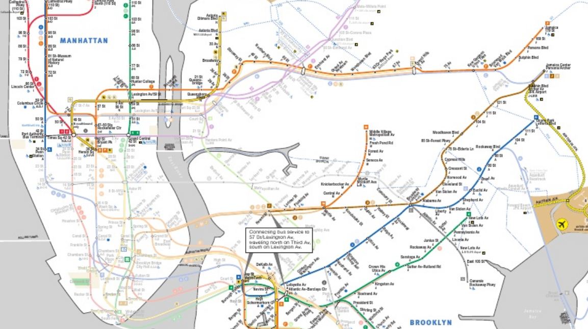
This map “grays out” the inoperable subway lines in New York City that have been flooded or otherwise damaged during Hurricane Sandy.
See on www.scribd.com