You’ve seen the this image as a static map, as a video and as an adjusted cartogram here before. This link is especially intriguing because this same data has been added to Google Maps so a user can interactively explore this layer and compare it to daytime satellite imagery or a standard map (it can also be seen on an interactive globe on http://www.geteach.com/).
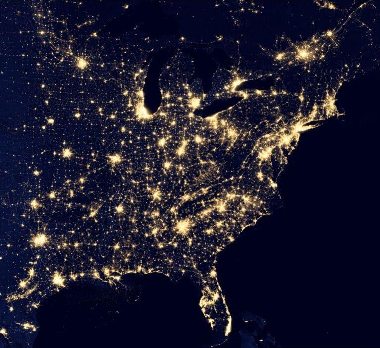
The first impulse of most students is to note when analyzing this image is to note that the map will show us where people live, where the cities are or some other comment that speaks to the magnitude of the population in the white areas. Let them analyze this for more time, and they’ll notice that population isn’t the whole story of this image. A place like India shines, but less brightly than the eastern part of the United States. I like to point out that South Korea appears to be an island (because North Korea is literally blacked out). Politics, development, affluence and population information are all embedded in this image. As with all maps, the more information you have about the place in question (in this case, Earth), the more meaningful information you can extract out of the map.
Tags: remote sensing, images, mapping, cartography, geospatial, edtech, geography education, unit 1 GeoPrinciples.
See on earthbuilder.google.com


Leave a comment