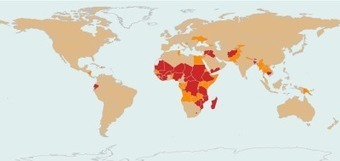
“The map [above] sorts the countries of the world into three groups based on their relative coup risk for 2013: highest (red), moderate (orange), and lowest (beige).”
Seth Dixon, Ph.D.‘s insight:
While this is not predicting a coup in any of these places, this map is a visualization of data that was used to assess the factors that would make a coup likely (to see an alternate map, here is the Washington Post’s review of the same data that mapped the 30 countries most likely to have a coup).
Questions to Ponder: What factors do you think would be important in compilling data of this nature? What makes a country susceptible to this type of governmental overthrow? What creates governmental stability?
Tags: political, conflict, unit 4 political, governance, Africa.


Leave a comment