
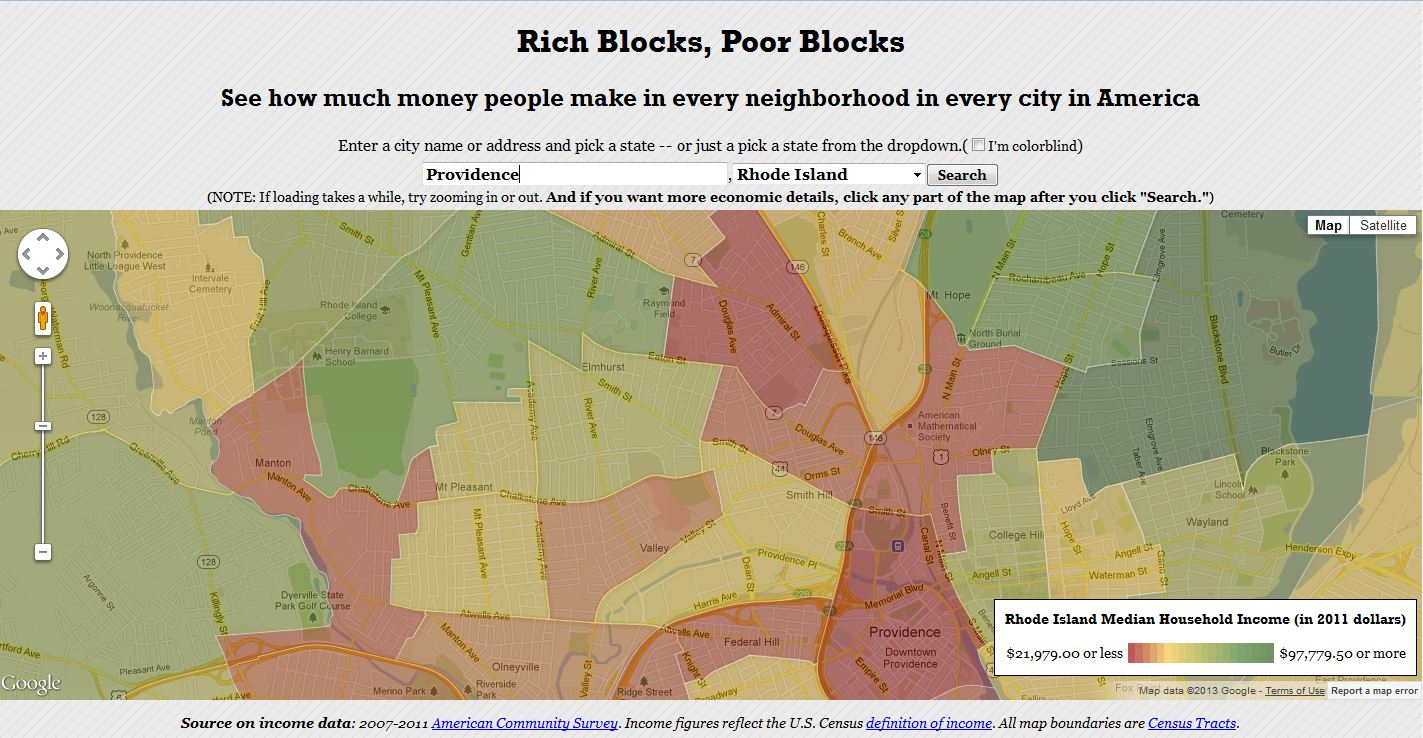
Income maps of every neighborhood in the U.S. See wealth and poverty in places like New York, Los Angeles, Chicago, Philadelphia, San Francisco, Miami, and more.
Seth Dixon, Ph.D.‘s insight:
This is the most user-friendly website I’ve seen to map economic census data. This maps the average household income data on top of a Google Maps basemap that can be centered on any place in the United States. This is a great resource to share with students of just about any age.
Tags: statistics, census, GIS, mapping, cartography.
See on www.richblockspoorblocks.com


Leave a comment