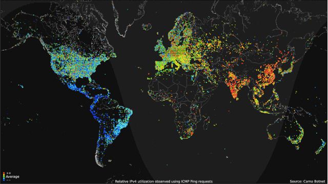
You are looking at, more or less, a portrait of the internet over an average 24 hours in 2012—higher usage in yellows and reds; lower in greens and blues—created by an anonymous researcher for the “Internet Census 2012” project.
Seth Dixon, Ph.D.‘s insight:
This is a stunning animated graphic the represents internet usage. The temporal dynamics of map make it especially mesmerizing.
See on gawker.com


Leave a comment