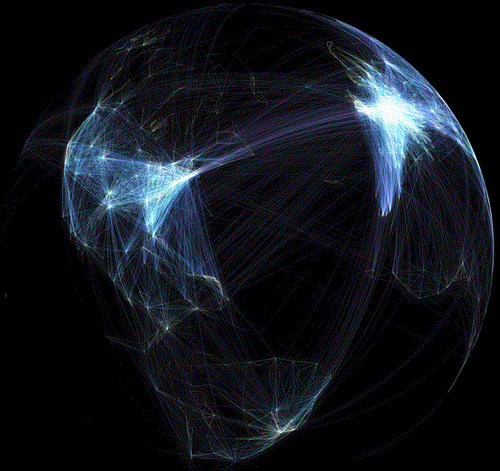
Transportation planner plots pattern of airline travel across the globe.
Seth Dixon‘s insight:
This set of 9 images displays 58,000 flight paths from various perspectives. What patterns do you see emerging from as you are able to visualize this data? What does this tell you about the world today?
Tags: visualization, transportation, statistics, globalization, mapping.
See on www.bbc.co.uk


Leave a comment