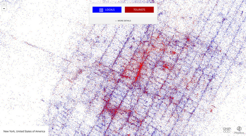
This is a look at 3 billion tweets – every geotagged tweet since September 2011, mapped, showing facets of Twitter’s ecosystem and userbase in incredible new detail, revealing demographic, cultural, and social patterns down to city level detail, across the entire world.
In this this great social media dataset, patterns of population density are immediately evident, with areas with great population densities not surprisingly representing the greatest concentration of social media usage. On closer inspection though, the major transportation arteries (or in this particular map map of NYC, tourism districts) become much more visible than a population density map would suggest.
Tags: visualization, social media, transportation, globalization, mapping, NYC, tourism.
See on www.mapbox.com


Leave a comment