Just not always for the better: “I’ve deliberately designed maps that are deliberately horrible to look at, and succeeded.”
Seth Dixon‘s insight:
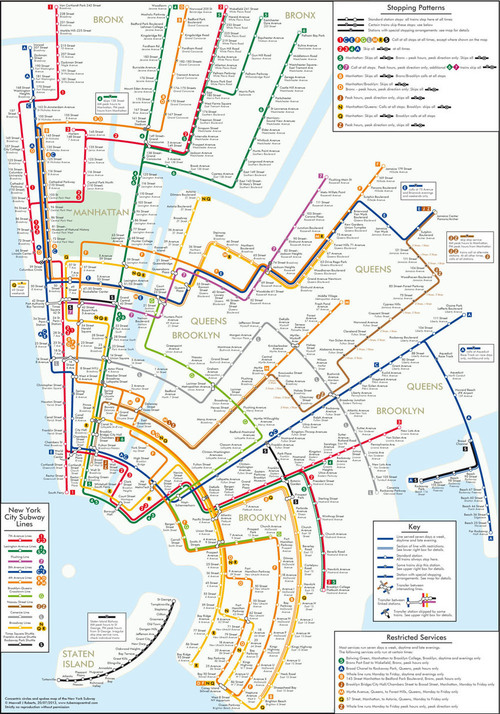
All maps are compromises; the Mercator projection preserves shape but distorts size, and so on. What about sacrificing locational accuracy to preserve the aesthetic design or readability? Just some things to think about as you peruse these redesigned subway maps.
Tags: visualization, transportation, mapping, NYC.
See on www.theatlanticcities.com


Leave a comment