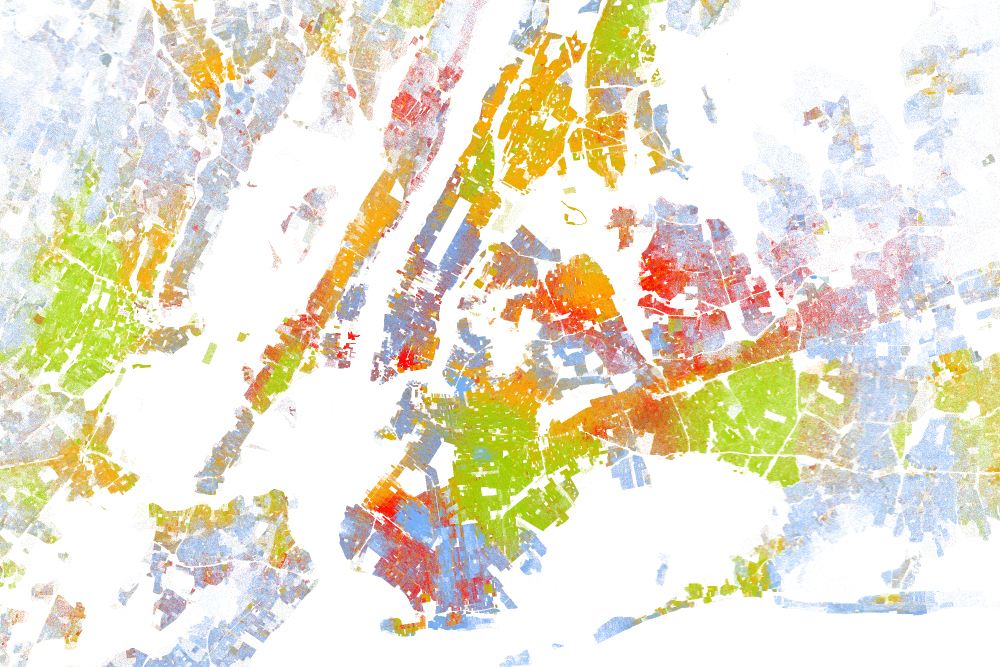
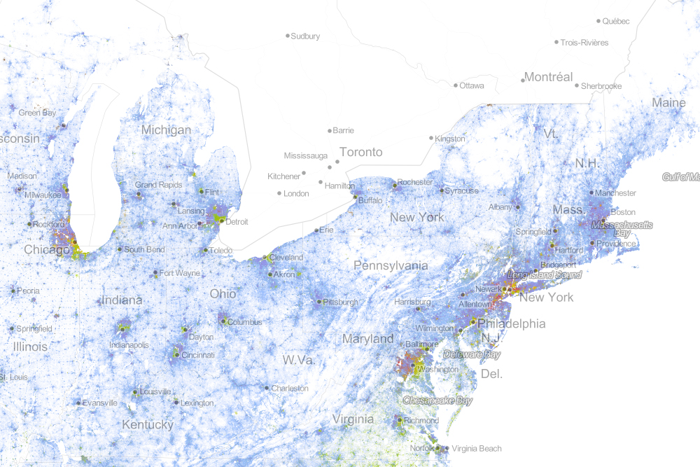
“Drawing on data from the 2010 U.S. Census, the map shows one dot per person, color-coded by race. That’s 308,745,538 dots in all.”
This is an incredibly gorgeous interactive map of population density in the United States. It is very reminiscent of this North American Map with two major differences. On the down side, Mexican and Canadian data are not displayed but on the bright side, the added color component is used to show ethnic categories as defined by the 2010 U.S. census. Please explore this map at a variety of scales and in distinct locales.
Questions to Ponder: Is this a map of ethnic diversity patterns or is it a map of racial segregation? How come? Is there additional information that you would need to decide? This review of the map on Wired described this map as a map depicting segregation: why would they say that?
Tags: cartography, mapping, visualization, population, density, ethnicity. race.


Leave a comment