Think everyone should just pull themselves up by their bootstraps? Try this one on for size.
This video shows the place matters; a Washington D.C. educator shows how food deserts and other spatial problems of poverty impact his students on a daily basis.
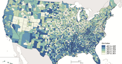
We usually look at life expectancy data at the national scale and that obscures some of the real issues of poverty in developed countries. Above is a map that shows the Gini index which measures the degree of economic inequality (the Gini coefficient was recently added to the APHG course content for the Industrialization and Economic Development unit). Here are some maps and data from the World Bank that utilizes the Gini Index as well as an interactive Gapminder graph.
Tags: industry, location, place, migration, APHG, poverty, socioeconomic.
See on www.upworthy.com


Leave a comment