See on Scoop.it – Geography Education
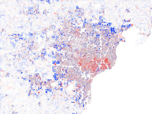
“Maps Of U.S. Population Change, 2000-2010. Blue is population increase, red represents population decline.”
This series of maps shows important patterns impacting American cities today. Pictured above is Detroit, emblematic of urban decline, but some of the patterns that we see in Detroit are happening elsewhere in the United States (but not was pronounced). Three patterns are especially noteworthy: 1) Decline of the urban core, 2) Growth in the suburban ring but most especially 3) a revitalization of the downtown (specks of blue in the sea red).
Questions to Ponder: So what processes are creating these patterns? Have does this information mesh with, or change our understanding of the urban models?
Tags: urban, planning, unit 7 cities, urban models, economic.
See on www.datapointed.net


Leave a comment