INTERNATIONAL borders are often tricky to chart on maps. Tangible topographic features can be pinned down by satellite imagery but the boundaries between many states…
Source: www.economist.com
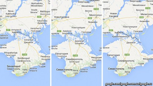
I’ve shared some links in the past that some mapping dilemmas with current events in Ukraine. Google Maps shows international borders differently and National Geographic maps show Crimea as a part of Russia. In this podcast we learn that this isn’t the only international border dispute that is displayed differently in Google Maps. Google uses over 30 distinct versions of international borders because there is an underlying geopolitical dimension to cartography. However, this article from the Economist is more explicitly geographic in its analysis of the situation and how the discipline(s) of geography/cartography shape the political situation; maps are NOT just a reflection of reality on the ground. To paraphrase the cartographer Andy Shears, there is a lot of teaching applications and discussion material in these articles.
Questions to Ponder: Why have different cartography for different audiences? Why does this small cartographic decision matter? How can maps be used to lie/stretch the truth? How to governments derive political legitimacy from maps? Why is Google the cartographic gatekeeper?


Leave a comment