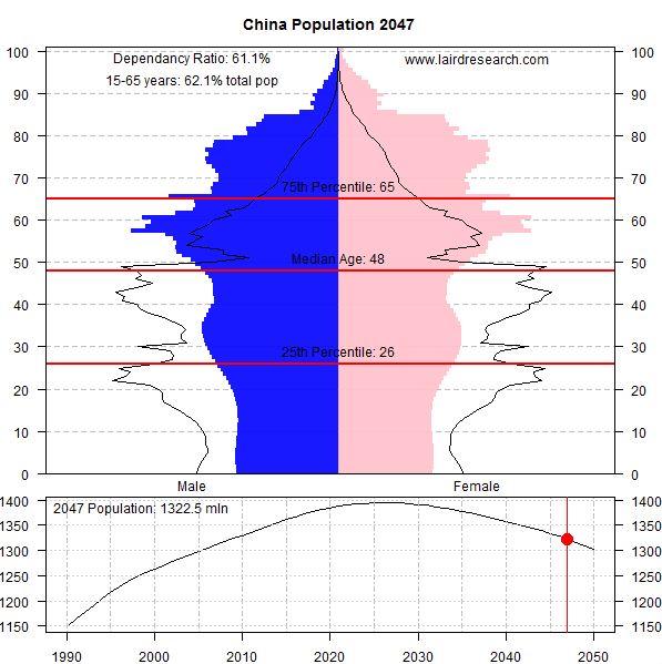
“The International Database at the US Census Bureau [provides] population estimates broken down by country, age and year for essentially every country. [With this data we can track] shifts in population makeup over time. I’ve created a few interesting graphs to show the expected shifts over the next 35 years, including the dependency ratio.”
Source: lairdresearch.com
This article has some excellent animated graphs and population pyramids to show some of the demographic changes that countries will be experiencing from now until 2050. These animated GIFs are perfect teaching images.


Leave a comment