
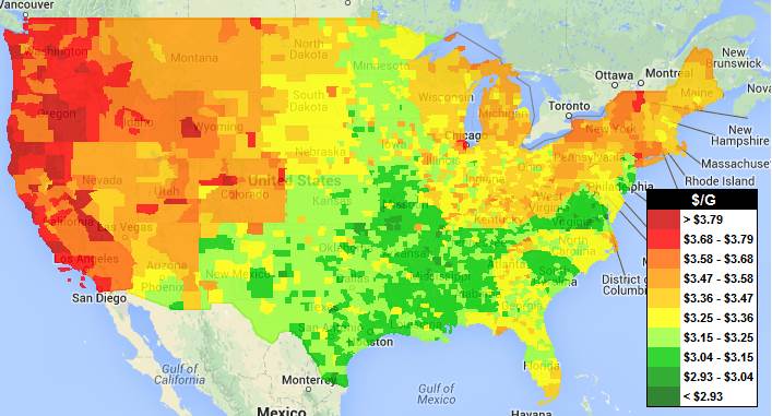
“Now you can see what gas prices are around the U.S. at a glance. Areas are color coded according to their price for the average price for regular unleaded gasoline. Click here for the Canada National Gas Price Heat Map.”
Source: www.gasbuddy.com
In 2012, this visualization of gas prices by county in the United States was because high gas prices were hitting Americans hard in the pocketbooks and became a major political hot-button topic. Today, this map still shows the regional variations in prices (so sorry to my California friends), but the recent drop in prices makes most consumers give a sigh of relief.. Supply and demand works beautifully on a two-axis graph, but supply and demand happen somewhere, giving a simple chart added complexity since it’s spatially contingent and we must make the assumption and caveat explicit.
Questions to Ponder: Why are the prices for a certain commodity higher in one region than another? What factors lead to the spatial differences in the relative economic value in one region over another?
Tags: energy, resources, unit 6 industry.
Just for fun, this was the map in 2012.


Leave a comment