“A new study maps the population gaps between men and women around the world.”
Source: www.washingtonpost.com
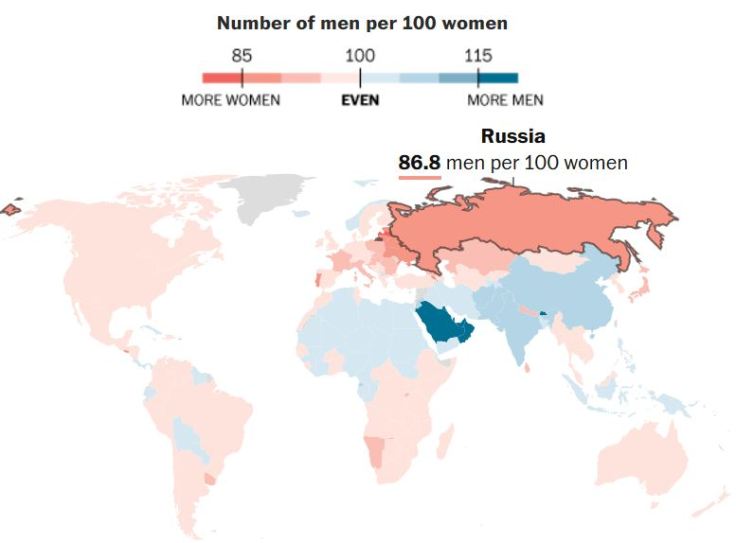
This interactive map is a great way to show how the 3 questions of geography make statistical analysis become more meaningful (where, why there and why care?). There are plenty of reason to care about these spatial patterns and their far-reaching implications.
Tags: gender, population, mapping, regions.


Leave a comment