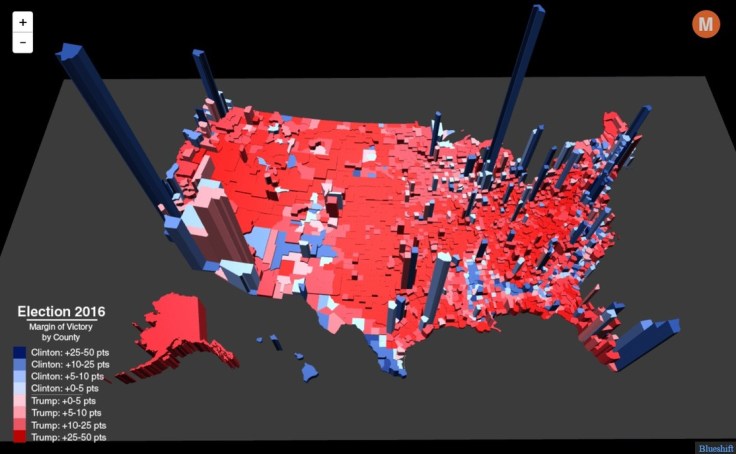
“By extending each region into the 3rd dimension, it’s possible to show the relative importance of each region while retaining the map’s shape, keeping the areas recognizable. In this case, the height of each county corresponds to its total number of votes, though it could just as easily show population or share of the electoral vote. For a closer look, see the full screen interactive version.”
Source: metrocosm.com
We’ve all probably seen enough maps of the 2016 presidential election and are familiar with the basic patterns (although my favorite is still the interactive that let’s you redraw the states to alter the election). This 3D map certainly though is an innovative way to portray some of the disparities in the U.S. electorate.


Leave a comment