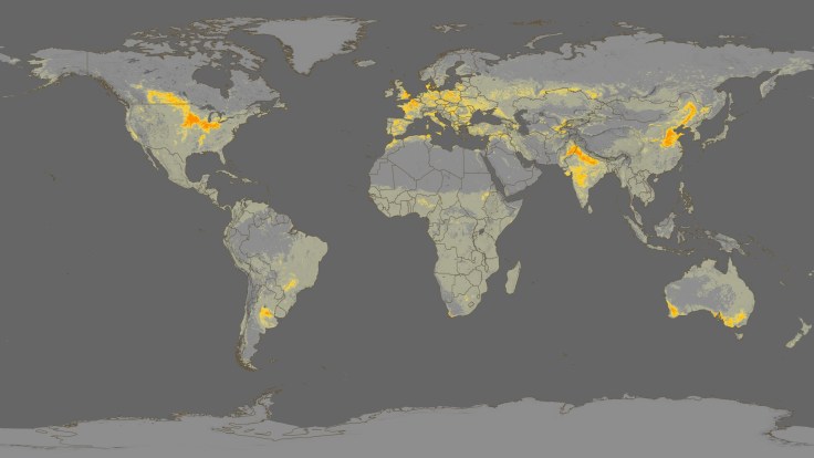
This visualization shows Crop Intensity data (regions that produce the most crops), followed by the MODIS croplands product, the 26 countries that produce 82% of the world’s food, the population density in 2002 and finally the projected population in 2050.
Source: svs.gsfc.nasa.gov
Follow the link to a video/animation that displays several important global agricultural trends. NASA’s Scientific Visualization Studio has produced many other agricultural visualizations that would be useful for teaching about the patterns of global agriculture.
Tags: food production, agribusiness, visualization, agriculture.
WordPress TAGS: food production, agribusiness, visualization, agriculture.


Leave a comment