There are far too many geographic issues that stem out of the Coronavirus pandemic to create anything close to comprehensive, but I wanted to share some of the articles that caught my eye recently because they touch on particularly geographic themes. So, this will not give a global overview, predictions, or breaking news, but some of the underlying issues and questions that we are now grappling with as so many are now in some form of self-isolation.
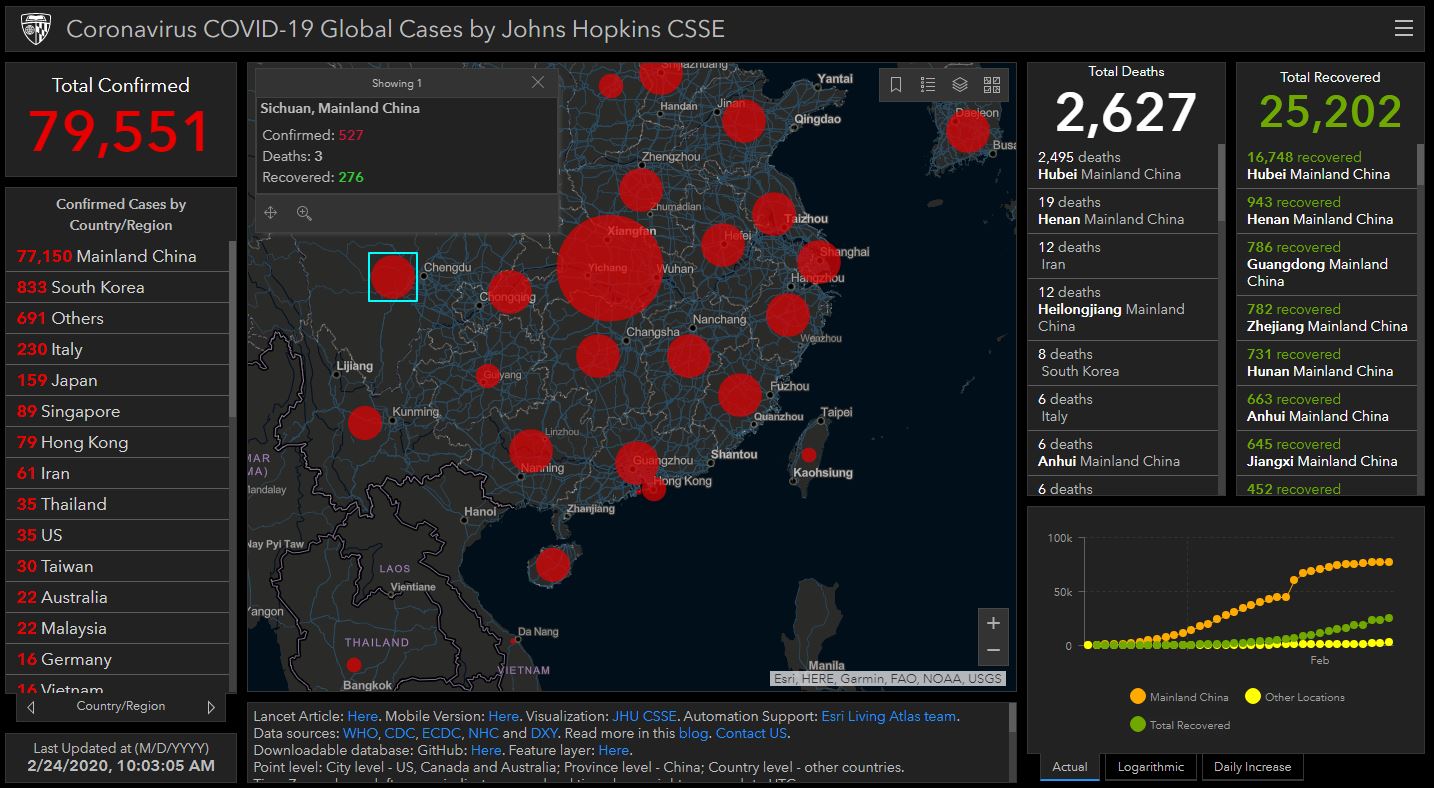
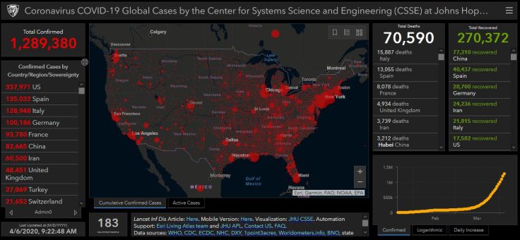
MAPPING: The best, introductory-level walk-through of how to map the Coronavirus uses ArcGIS online, and has interactive layers that are updated daily, so you don’t have to recreate the wheel for every time new data gets released. If students are familiar with ArcGIS and already have an account, this is worth having them explore it to learn cartographic techniques.
ENVIRONMENT: There are a host of unintended consequences in natural systems, and when one part of the system, gets altered, there are some down-stream impacts. This article in the Atlantic discusses some of the environmental impacts of the mass shutdown of normal human activities (1-less pollution, 2-less seismic activity, 3-quiter urban environments).
DEVELOPMENT: The impacts of COVID-19 are clearly uneven; countries and cities that are the most globally connected might benefit usually economically from these connections, but are facing one of the times that this connectivity is a threat to the community. India, by and large through March 2020, managed to avoid making global headlines, but as the world’s second largest population with some incredibly dense megacities, many are asking how the Coronavirus will impact India in the coming weeks.
URBANIZATION: In the United States, the densest counties have been the most impacted by COVID-19 while rural areas have need been as heavily impacted (by and large—rural counties with ski resorts are one prominent exception to this generalization). Some are discussing urban density in the time of a pandemic, and there are calls to rethink densely populated cities. This article from CityLab also discusses the density as a key issue in the transmission of disease, but it is quick to point out other factors that lead some hyper-dense cities to effectively control the spread as well.
CULTURE: To wear a mask, or to not wear a mask? Why is this a question that seems so controversial? As more time goes by, we see that wearing a mask to prevent the spread of a disease is not just a medical issue, but also a cultural issue. Some cultures are uncomfortable with the idea of covering part of face in public and some react against the concept because of the cultural connotations that go along with mask-wearing. Other societies see if as a prudent way to do your civic duty. Many are reconsidering their cultural norms that they associate with masks as COVID-19 continues to expand into more communities.
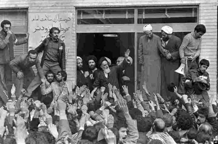
DIFFUSION: This video centers on the beginnings of the spread of the Coronavirus and the origins in Wuhan. I’m very sensitive to the fact that many discussions about its origin in China can quickly go down some racist paths. This Vox video explains the wet markets of China as a likely source of infectious disease without veering into racist assumptions. This interactive from the NY Times explains how the disease spread beyond China.
Stay healthy, stay safe. I miss other humans, and being social. I think everyone wishes things were different, but geography and spatial analysis is one of the key lenses that we need to come out on the other end of this. I hope that we can come out of this more united as members of the human race with a greater resolve to work together to solve global issues.
GeoEd Tags: medical, mapping, GIS, statistics, mortality.