Via Scoop.it – Geography Education
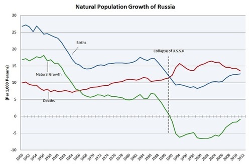
The economic and social turmoil after the fall of the Soviet Union was profound enough to be seen in the demographic statistics. Birth rates dropped as the death rates went up. Typically when birth rates drop it is presented as an indicator of social development, but it clearly is not in this instance. What explains these statistics?
Via en.wikipedia.org

Via Scoop.it – Geography Education
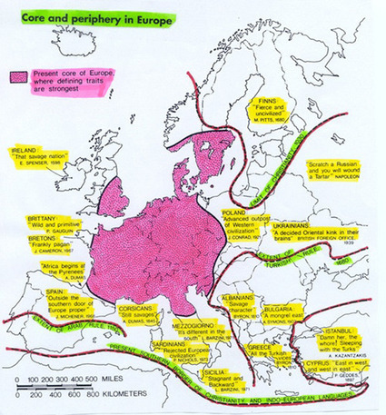
This site houses several good maps, especially this one of the ‘core’ and ‘periphery’ of Europe. This map corresponds strongly with maps that show the first places to be industrialized. The Map on the formal culture regions is also especially useful for understanding cultural barriers to diffusion. What is the connection between the branches of Christianity and Indo-European language families?
Via www.nonformality.org
Via Scoop.it – Geography Education
This video is not very educational, filled with bad stereotypes and some truly inaccurate (and potentially offensive) statements. Still, I show it every semester as the rationale for why we need to study more about Europe (but mainly because my students LOVE watching it).
Via www.youtube.com

Via Scoop.it – Geography Education
“The American Geographical Society (AGS) needs your help in a matter of vital importance. We are conducting a nationwide survey of public attitudes toward geography and knowledge about geography. This is our part in a major study funded by the National Science Foundation. The only eligibility requirement is that you must be age 18 or older. The results will help guide Federal and state policies regarding geographic education.” Please take the quiz but MORE IMPORTANTLY, get non-geographers (FB friends, twitter followers, etc.) to take the quiz.
Via www.amergeog.org

Via Scoop.it – Geography Education
This NASA-produced timelapse video of Landsat data shows the spatial spread of the Las Vegas metropolitan area from 1975-2010. These are not true color images, but false color that shows the near infrared portions of the electromagnetic spectrum as red in the image. Geospatial technologies are once again, shown as invaluable in our analysis of the urban environment.
Via www.flickr.com

Via Scoop.it – Geography Education
This is an excellent interactive map that allows the user to explore the various neighborhoods of New York City and analyze the housing market for a particular income bracket. I’ve discovered that trying to purchase a home or rent an apartment can be one of the best hands-on lessons in urban social geography. I envision a dynamic project that could be designed around this resource where several members of a group are given different demographic characteristics (for example: single income, 2 married adults, 3 children under 10 years of age) and income levels and a fixed workplace. Where would you live? What determines your choices? What would your personal geographies look like?
Via envisioningdevelopment.net

Via Scoop.it – Geography Education
Today, we want to show you another wonderful 3D illusion which is installed in front of the steps of Paris’s city hall. Geographically inspired public art that is also a massive optical illusion makes me happy on so many levels.
Via www.boredpanda.com

Via Scoop.it – Geography Education
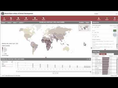
“The World Bank eAtlas of Global Development maps and graphs more than 175 thematically organized indicators for over 200 countries, letting you visualize and compare progress on the most important development challenges facing our world. Most indicators cover several decades, so you can see, for example, how ‘life expectancy at birth’ has improved from 1960 up through the latest year.” This tool should greatly enhance student projects as they will add more data, and see bigger patterns.
Via www.youtube.com


