Search

GEOGRAPHY EDUCATION

Supporting geography educators everywhere with current digital resources.

Category

Scoop.it

A More Accurate World Map Wins Prestigious Japanese Design Award

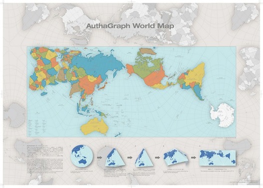
“To design a map of the world is no easy task. Because maps represent the spherical Earth in 2D form, they cannot help but be distorted, which is why Greenland and Antarctica usually look far more gigantic than they really are, while Africa appears vastly smaller than its true size. The AuthaGraph World Map tries to correct these issues, showing the world closer to how it actually is in all its spherical glory.”

Source: mentalfloss.com

This just shows how subjective the concept of “accurate” can be. First off, this is a fabulous map that nicely minimizes distortions (distance, direction, area, and shape) of the land on our planet. Any criticism of the map just shows the impossibility of making an accurate 2D map of a 3D Earth, but I still think that there is plenty of room to discuss the flaws/distortions that were chosen instead of others. It is interesting to note that a Japanese contest awarded this map with it’s top honor (I doubt a Brazilian organization would feel the same way about this map). This map does make with some traditional cartographic conventions in its representation of Earth.  


Questions to Ponder: What are some elements of this map that are different from more traditional maps? This map claims to be more accurate; does that make it more useful?    


Tags: visualization, mapping, cartography, geospatial, technology.

Election Cartograms

“The states are colored red or blue to indicate whether a majority of their voters voted for the Republican candidate, Donald Trump, or the Democratic candidate, Hillary Clinton, respectively. There is significantly more red on a traditional election maps than there is blue, but that is in some ways misleading: the election was much closer than you might think from the balance of colors, and in fact Clinton won slightly more votes than Trump overall. The explanation for this apparent paradox, as pointed out by many people, is that the map fails to take account of the population distribution. It fails to allow for the fact that the population of the red states is on average significantly lower than that of the blue ones.

We can correct for this by making use of a cartogram, a map in which the sizes of states are rescaled according to their population. That is, states are drawn with size proportional not to their acreage but to the number of their inhabitants, states with more people appearing larger than states with fewer, regardless of their actual area on the ground. On such a map, for example, the state of Rhode Island, with its 1.1 million inhabitants, would appear about twice the size of Wyoming, which has half a million, even though Wyoming has 60 times the acreage of Rhode Island.”


Tags: electoral, scale, politicaldensity, mapping.

Source: www-personal.umich.edu

In The Mountains Of Georgia, Foxfire Students Keep Appalachian Culture Alive

For 50 years, high school students in Rabun County have chronicled their region’s disappearing traditions and mountain people, from blacksmiths to moonshiners, in publications and a living museum.

Source: www.npr.org

This is an excellent, rich example of preserving old elements of rural, folk cultures that are rapidly disappearing.  The project ties local students to the region to appreciate past more and creates a remarkable archive for the future. 


Tagsculture, historicalrural, folk culturesthe Southpodcast, unit 3 culture.

US election 2016: Trump victory in maps

The map above shows where Mr Trump improved on the share of the vote achieved by Mitt Romney, the Republican presidential candidate who failed to beat President Barack Obama in 2012.


Tags: electoral, political.

Source: www.bbc.com

Maps to change how you think about American voters — especially small-town, heartland white voters

Small towns are as Democratic as big cities. Suburban and rural voters are the Republicans.


I have assembled a Web map from precinct-level 2008 election data that allows users to zoom in and out, focus in on specific towns or neighborhoods and superimpose census data on income and race, allowing readers to examine their own favorite postindustrial towns. One of the most striking lessons from exploring these maps is that the red non-metropolitan counties on election-night maps are internally heterogeneous, but always following the same spatial pattern: Democrats are clustered in town centers, along Main Street, and near the courthouses schools, and municipal buildings where workers are often unionized. They live along the old railroad tracks from the 19th century and in the apartment buildings and small houses in proximity to the mills and factories where workers were unionized in an earlier era.

Source: www.washingtonpost.com

There have been SOOOO many articles about the 2016 election, what happened, why it happened and how particular demographics voted and why.  Most of these articles are highly partisan, or ideologically informed but this just analysis of past spatial voting patterns  (I am waiting for the updated version of these maps to show what happened in 2016–but I’m thinking some of this changed).  Too often we’ve lumped the geography of small towns and rural areas as though they are one and the same.  Too often will only see electoral maps with state-level voting data or possibly county level data; but the sub-county scale reveals what would otherwise be missing in our assessment of electoral, spatial patterns (Scale matters?  Who knew?)


Tags: electoral, scale, political, mapping.

Iceland’s Glacial Melt and Geothermal Activity

Glacial melting and flooding occurs every year by the Skafta River in Iceland. As the water travels down towards the North Atlantic Ocean, incredible patterns are created on the hillsides. Rising lava, steam vents, or newly opened hot springs can all cause this rapid ice melt, leading to a sizable release of water that picks up sediment as it flows down from the glaciers.


Tags: geomorphology, physical, Europe, fluvial, water, landforms, images.

Source: www.instagram.com

How Eratosthenes calculated the Earth’s circumference

“In the mid-20th century we began launching satellites into space that would help us determine the exact circumference of the Earth: 40,030 km. But over 2000 years earlier, a man in Ancient Greece came up with nearly the exact same figure using just a stick and his brain.”

Source: www.youtube.com

Eratosthenes is often referred to as the “father of geography” for creating meridians and parallels on his maps to organize global information, classifying climatic zones, and as shown in the video, calculating the circumference of the Earth. Plus, he coined the terms so he gets the credit. If you have never pondered the meaning of the word “geometry,” the accomplishments of Eratosthenes will certainly show that the mathematical prowess was at the heart of expanding our collective geographic knowledge (additionally, here is a retro Carl Sagan in a video clip from Cosmos that inspired this clip).    


Tagsmapping, math, locationSTEM, historical.

27 stunning satellite images that will change how you see our world – Geoawesomeness

“The images come from the amazing book called “Overview: A New Perspective of Earth”. that just hit the stores around the world. The book is a stunning and unique collection of satellite images of Earth that offer an unexpected look at humanity, derived from the wildly popular Daily Overview Instagram account followed by almost 0.5 million people.”


Hagadera, seen here on the right, is the largest section of the Dadaab Refugee Camp in Northern Kenya and is home to 100,000 refugees. To cope with the growing number of displaced Somalis arriving at Dadaab, the UN has begun moving people into a new area called the LFO extension, seen here on the left. Dadaab is the largest refugee camp in the world with an estimated total population of 400,000.

Source: geoawesomeness.com

Flawed Justice After a Mob Killed an Afghan Woman

At first, the trial and convictions in the death of Farkhunda Malikzada seemed a victory in the long struggle to give Afghan women their due in court. But a deeper look suggests otherwise.

Source: www.nytimes.com

DISCLAIMER: I strongly recommend that the video not be shown in class (I wouldn’t show the embedded video in my college classes, but I would discuss the article).  The video is as horrific as anything I’ve ever seen and yet I feel compelled to share the story because it is important to understand the cultural and institutional problems of Afghanistan to get a handle on the deeply entrenched issues. This also shows parts of Afghanistan are seeking to make the transition into a more modern society, but there are other elements that are firmly rooted in the past where mob rule was once more easily justified.  


Tags: Afghanistan, culture, developmentgender

Create a free website or blog at WordPress.com.

Up ↑