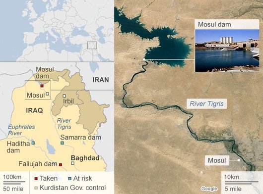
There is a geography to insurgency. This dam controls both the energy and water resources in the region, which gives the insurgents/rebels/terrorists greater local power. On a related noted, this op-ed entitled, “How America Lost the Middle East” has plenty of foreign policy and geopolitical material worth discussing.
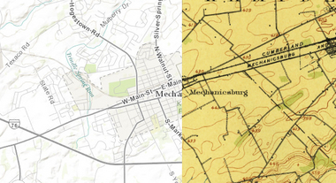
“This cool new historic mapping app from the folks at esri and the U.S. Geological Survey is worth exploring. What it does is take 100 years of USGS maps and lets you overlay them for just about any location in the nation. That allows users to see how a city – say Harrisburg – developed between 1895 and today. The library behind the project includes more than 178,000 maps dating from 1884 to 2006.”
For more ESRI maps that let you explore urban environmental change, the ‘spyglass’ feature gives these gorgeous vintage maps a modern facelift (but not available for as many places). The cities that are in this set of interactive maps are:
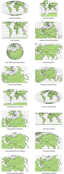
Elizabeth Borneman explores how cartography and cartographic projections help and hinder our perception of the world.
“How do you think the world (starting with our perceptions) could change if the map looked differently? What if Australia was on top and the hemispheres switched? By changing how we look at a map we truly can begin to explore and change our assumptions about the world we live in.”
Geography doesn’t just teach us about the Earth; it provides ways for thinking about the Earth that shapes how we see the world. Maps do the same; they represent a version of reality and that influences how we think about places.
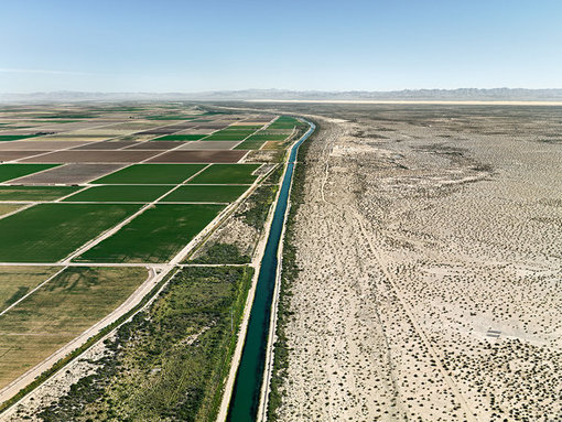
Using aerial photographs that render imperiled landscapes almost abstract, Edward Burtynsky explores the consequences of human activity bearing down on the earth’s resources.
This set of over a dozen images highlight the extent that humanity has modified the physical landscape. These thoughtfully selected images are excellent ‘teaching images’ with a wide range of classroom applications.
“This animation distils hundreds of years of culture into just five minutes. A team of historians and scientists wanted to map cultural mobility, so they tracked the births and deaths of notable individuals like David, King of Israel, and Leonardo da Vinci, from 600 BC to the present day. Using them as a proxy for skills and ideas, their map reveals intellectual hotspots and tracks how empires rise and crumble. The information comes from Freebase, a Google-owned database of well-known people and places, and other catalogues of notable individuals. The team is based at the University of Texas at Dallas.”
This video has garnered a lot of academic and mainstream attention–while I wouldn’t describe in as the Entire History of Human Culture in 5 minutes as the Huffington Post did, it is a stellar visualization that uses big data and was created with some solid academic research. Hierarchical diffusion patterns are powerfully depicted in this video created by Nature that as are other geographic concepts such as urban settlement patterns (e.g.-primate cities and rank-size rule in Europe).
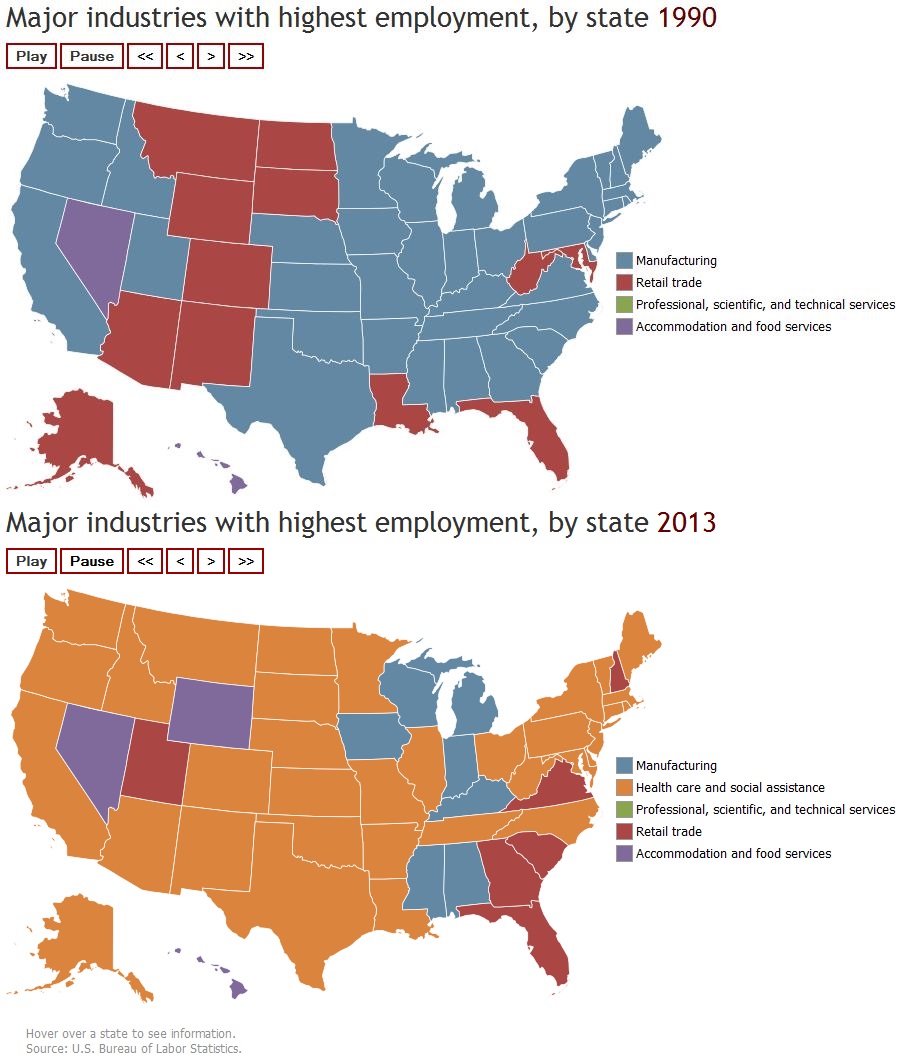
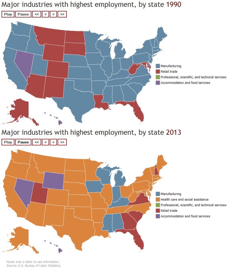
In 1990, the manufacturing industry was the leading employer in most U.S. states, followed by retail trade. In 2003, retail trade was the leading employer in a majority of states. By 2013, health care and social assistance was the dominant industry in 34 states. This animated map shows the top industry in each state and the District of Columbia from 1990 to 2013.
This interactive map is a powerful way to visually display the changes in the economic geography of the United States. It is especially useful when discussing the transition of an economy from the secondary sector to tertiary sector.
Many of Africa’s leaders will be in town next week attending a White House summit. The continent’s land is shared among 49 countries — many of which rarely make U.S. headlines. How familiar are you with Africa’s geography?
This online quiz tests your ability to locate African countries on the map–a basic skill that isn’t ‘doing geography’ (an age-old lament among geography educators). Still, it is hard to have an intelligent discussion about the continent if you can’t name or locate any places other than Egypt and South Africa. For some of my favorite online map quiz resources, click here.
“To be honest I do not know what they make of my beans,” says farmer N’Da Alphonse. “I’ve heard they’re used as flavoring in cooking, but I’ve never seen it. I do not even know if it’s true.” Watch how the Dutch respond to a cocoa bean in return or you can watch our entire episode on chocolate here.
What is the geography of chocolate like? This video was produced in the Netherlands, the global center of the cocoa trade, but the world’s leading producer of cocoa is Côte d’Ivoire. There is a dark side to chocolate production; the dirty secret is that slavery is commonplace on cocoa plantations in West Africa. Although the worst of the situation is glossed over in this video, it still hints at the vast economic inequalities that are part and parcel of the global chocolate trade and the plantation roots of the production. What are some of your reactions to this video?