I’ve searched wide and far for maps that can reveal and surprise and inform in ways that the daily headlines might not.
See on www.washingtonpost.com
I’ve searched wide and far for maps that can reveal and surprise and inform in ways that the daily headlines might not.
See on www.washingtonpost.com
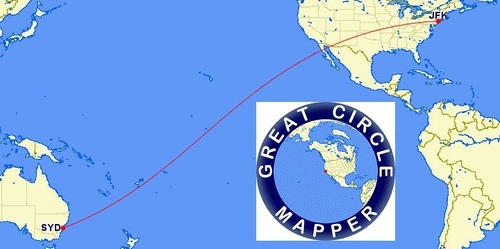
“The Great Circle Mapper displays maps and computes distances along a geodesic path. It includes an extensive, searchable database of airports and other locations.”
The shortest distance between two points is not a straight line…well, that depends on your map projection. A flat map always distorts something when representing our three-dimensional Earth—whether it is distance, direction, shape or area—something gets distorted on our maps. A great circle is the shortest distance between two points on the surface of a sphere, so that’s going to be the quickest travel route between points (which is why so many airline route seem to arc). This website Great Circle Mapper generates great circles that show the shortest distance between two points on many map projects will be an arc. Why does this particular route arc ‘bend’ north for a while and then south? Get out a globe for added perspective.
See on www.gcmap.com
“Muslims around the world celebrate the birth of the Islamic Prophet Muhammed, who was born in Mecca, Saudi Arabia in 570 AD. His birthday is marked in way ways is different Muslim countries.”
This is a great photo gallery, but I wanted to make a special note of this image. The caption for this picture says, “Egyptians watch as Muslims march on the street to mark the birthday of the Prophet Muhammed in Cairo, Jan 13, 2014.” Is this a representative group of Egyptians? What demographic group would we expect to see in the second story balcony? What does the architecture tell us about the cultural norms of the society?
See on www.boston.com
“A 50-year-old export industry that provides millions of jobs has to reinvent itself quickly to stay competitive.”
A maquiladora is a term that often used to describe a factory in Northern Mexico that enjoys special tax breaks for eport-driven production. Northern Mexico is an ideal location for this type of industry because 1) access to American markets is high and 2) labor costs are relatively low. The Mexican Maquiladoras can no longer compete in a ‘race to the bottom’ for the lowest skill jobs, but they can produce higher-end goods and compete with China to supply more innovative consumer goods. Labor costs in China are on the rise, making Mexico able to compete more effectively with them on the open market. The total value of Mexican maquiladoras exports has grown by more than 50% in the last 5 years; more foreign corporations are investing money into Mexico. Some of the more innovative and aggressive maquiladoras are attempting to become more involved in the research and development end of production; essentially they want to start competing with European and American companies on the lucrative high-end of the commodity chain instead of fighting for the scraps at the bottom.
Tags: Mexico, manufacturing, industry, economic, globalization, technology.
See on www.economist.com
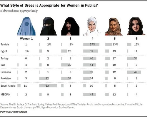
Even as publics in many of the surveyed Muslim-majority countries express a clear preference for women to dress conservatively, many also say women should be able to decide for themselves what to wear.
In my world regional geography class I have 15 weeks to teach about everything in the whole world…no pressure. Clearly, this course is designed to be a mile wide and an inch deep and I can’t teach the nuanced details each country. However, one thing that I try to reinforce every semester is that their is a tremendous about of diversity within regions. No country, region, ethnic or religious group is perfectly homogenous.
Tags: Middle East, regions, gender, culture, Islam, perspective, culture, religion.
See on www.pewresearch.org
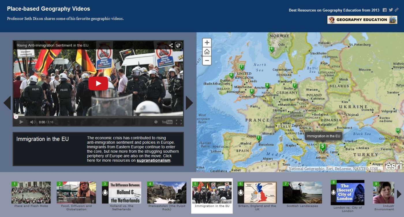
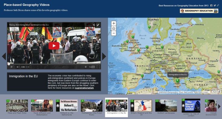
Professor Seth Dixon shares over 50 of his favorite geography videos to share in the classroom http://bit.ly/KDY6C2
Have you ever wanted to watch a video and to have a map handy at the same time? Ever since I first watched Raiders of the Lost Ark, I love the idea of combining video with maps. I produced this bare-bones map on ArcGIS online to spatially index over 50 videos that I enjoy using in my classes; they are all place-specific videos (so they can be ‘located’ on the map). These videos have been shared here earlier, but this map can function as a more user-friendly way to search for engaging video clips. Do you have a great place-based video that teaches principles of geography that you love? Please share the URL in the comments section with a brief paragraph.
Tags: mapping, video, ESRI, geography education.
See on www.arcgis.com
“When you combine a street and a road, you get a STROAD, one of the most dangerous and unproductive human environments. To get more for our transportation dollar, America needs an active policy of converting STROADs to productive streets or high capacity roadways.”
In this video, a road provides high connectivity between places, and a street is a diverse platform of social interactions that create a place. A ‘stroad’ can be likened unto a spork–it tries to do it everything but does nothing especially well. While you may debate the principle being shown, this video (found on Atlantic Cities) is a good way to show the spatial thinking that city planners need to utilize to improve the urban environment.
See on www.youtube.com
“New England’s woody hills and dales hide a secret—they weren’t always forested. Instead, many were once covered with colonial roads and farmsteads.“
I love living in New England and finding stone walls from old farmsteads; an archaeology professor at UConn is using geospatial technologies to map out the remants of that historical landscape. This is a great example of using spatial thinking across the disciplines.
Tags: remote sensing, geospatial, landscape, historical, environment modify.
See on news.nationalgeographic.com
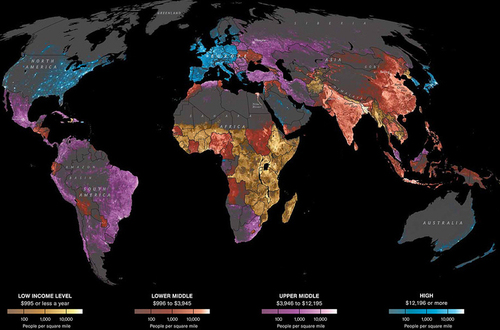
Radical Cartography, brought to you by Bill Rankin
I was recently reminded of the graph and thought is was world sharing again. This is an excellent spatial graph that helps to explain the distribution of the human population. Why do we live where we live? The longitude map is still fascinating, but has less explanatory power. What would be brilliant is a graph that charted population by latitude (as this does) AND charts the amount of land at each given latitude. Click here for Frank Jacobs analysis on the “Strange Maps” blog.
See on www.radicalcartography.net