Search

GEOGRAPHY EDUCATION

Supporting geography educators everywhere with current digital resources.

Category

Uncategorized

Mapping Rocky’s Run

As a kid, I grew up watching the Rocky movies, shadow boxing with my brothers and doing push-ups during the workout montages. One on my favorite montages was in Rocky II when Rocky runs through the whole city of Philadelphia, thronged by adoring fans as he runs to the top of the stairs to the Philadelphia Museum of Art (and yes, of course I re-enacted that scene when I was there).

I was thrilled to reading an article in the Philly Post by Dan McQuade entitled “How Far did Rocky Go is His Training run in Rocky II?” This article identifies the locations that were used in the movie to evoke such a strong sense of place. Earlier versions of this article did not have a map and I wanted to see the images and the map together. That was enough of a reason for me to make both an online map on arcgis.com and an interactive web mapping application with an ESRI storymap template.

10 Rocky Map

The online map opening in arcgis.com as has sequential pop-ups that show images from the run. Nice, but not quite what I had envisioned.

11 Rocky WebApp

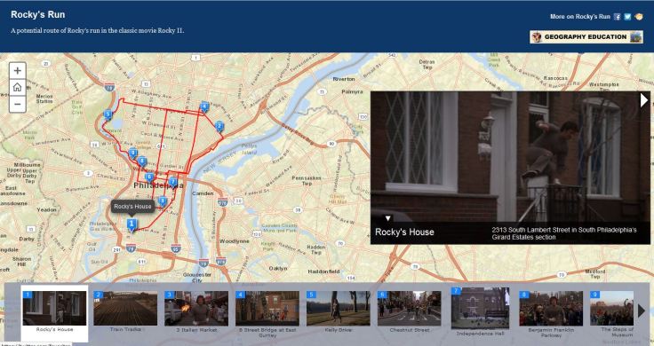
This ESRI storymap allows the user to more freely move between the pictures, map and text. More and more, we are seeing that maps can help us tell stories. If you would like to learn how to create your own storymap, read this earlier article I posted for my mapping students.

See on geographyeducation.org

Should we be worried?

Seth Dixon‘s insight:

Overpopulation is a term that is often used and many assume that global population growth is a ‘population bomb’ to will be one of the major problems in the next 50 years.  Some researchers argue that the problem is overstated; in this 20 minute lecture geographer Danny Dorling says that overconsumption is the real issue, not population growth per se.  In this New York Times article, geographer Earle Ellis discusses how the world’s carrying capacity expands with technological advances and that demographic statistics show that growth won’t continue forever.  Others fear that humanity will outstrip the world’s carrying capacity, including the letters to the editor responding to the original NY Times article.

Questions to Ponder: Do you see population growth as a looming problem that will negatively impact humanity?  If so how much should we be concerned? 

Tags: population, demographics.

See on www.youtube.com

Comparing Urban Footprints

This is a series of infographics (or geo-infographics) created by Matthew Hartzell, a friend of mine that I met when we were both geography graduate students at Penn State in few years back. I will allow him to explain the rest.
“I created comparing the physical footprints of 54 cities around the world. They are presented side-by-side at the same scale, allowing the viewer to compare these cities in a new light.
Among these 54 are some of the world’s major cities, at least a few from each world region. Chinese and US cities over-represented since those are my countries. Some smaller or lesser cities I threw in at random.
In the first graphic the cities are arranged by size (or thereabouts…since the footprints are geometrically complex I had to eye-ball the approximate size). They are color-coded by world region. You’ll notice that all the top contenders are from the United States (surprise surprise). You’ll notice that when arranged in this fashion, there is no correlation to population.
Urban Footprints
What can we see in these simplified urban footprints? Apart from size, shape is the most obvious factor. Some cities, like Beijing, London, and Bakersfield, are highly compact; they’re not perfect circles or rectangles, but they’re not far off. Other cities are highly perforated (Seoul), elongated (Miami), or scattered (San Francisco). This is usually due to geographic barriers like water bodies and mountains, although it can also reflect urban development that is catalyzing farmland in a scattershot fashion, as is the case of Shanghai).
In the second graphic, the cities are arranged by population. This provides for some sharp juxtapositions. Karachi has more people than all of the New York Tri-State Region, yet its footprint is just a fraction of its size. Obviously, this is where the clearest inferences about density can be made.
Urban Footprints by Population
The third graphic takes one of the most extreme cases–Atlanta—and makes an example out of it. Atlanta is the least dense city in the US (and therefore the world). With a population of 5 million, it takes up a footprint equivalent to that of Karachi, Jakarta, Cairo, Dhaka, Chengdu, Chongqing, Xi’an, and Jinan, with a combined population of 100 million.
Visualizing Atlanta's Sprawl
And now a few words on methodology. As with all maps and statistics, these should be taken with several grains of salt. The goal here was to create a simple infographic for broad comparative purposes. To create the footprints themselves, I used satellite imagery to physically trace the boundaries of the built-up area of each city’s greater urban area. These footprints do not correspond to administrative boundaries. They are based purely on the divide between urban and rural land use. Which, at times, can be a very subjective task. I included low density suburban housing tracts within my urban footprints (hence the size of the US cities). I included dense built up areas which weren’t connected to the main contiguous urban area but were within its periphery (examples: Moscow, Frankfurt). I excluded rural areas, farmland, villages, or large urban parks. Obviously, simplification was necessary.
A word also has to be said about the population statistics. Unfortunately, it is impossible to get population data to match precisely the urban footprints which I have drawn. Definitions of cities and metropolitan areas, as well as what land is included within what definition, vary from country to country. Wherever possible the population figures I gathered reflect the “metropolitan region”, because the vast majority of its population is located within the built up area of that region. Where this could go wrong is in parts of the Bay Area, say, where a small percentage of people, counted among the metropolitan population, actually live in rural areas, and thus were not included in my footprints. For New York, I tried to draw the boundary at the census-designated MSA boundary in order to match the population statistic. In reality, the built up area of New York is a component of a nearly unbroken contiguous built up area stretching all the way from Boston to Northern Virginia, which I did not include. For Chinese cities, I used the “urban population” statistics as reported by the government. These most accurately reflect the population inside the built up areas only, rather than the total municipal population (which are often much higher because they include large rural populations. Some of the more difficult cities to estimate were Tokyo and Jakarta. These cities both have official populations based on municipal boundaries, and much larger metropolitan populations which include vast surrounding regions. My footprints for these cities were somewhere in between these two statistics, which I tried to adjust for in the populations I listed.

Satellite interpretation example

Two examples of the process I went through to trace the urban footprints based on satellite imagery. Note that in the case of Sao Paulo, the urban boundary is readily apparent. In the case of Atlanta, however, low density suburbs with lots of trees blend into the surrounding environment, and require a more discerning eye (and examining of the satellite imagery at a larger scale).”

The Authoritative Map

Seth Dixon‘s insight:

In the Winnie the Pooh Movie Pooh’s Grand Adventure, the character Rabbit has absolute confidence in the printed word and especially the map. 

Questions to ponder:  How much do we trust any given map?  How much should we trust a map (or the printed word)?  What makes a document reliable or unreliable? 

Tags: mapping, perspective, K12, video

See on www.youtube.com

Rapid Landscape Change

BOULDER, Colo. — National Guard helicopters were able to survey parts of Highway 34 along the Big Thompson River Saturday. Here are some images of the destruction along the roadway.

Seth Dixon‘s insight:

This photo gallery would be stunningly gorgeous if it weren’t horrifically terrifying.  When the landscape changes this dramatically in a short time span, watch out.

Tags: physical, environment, water,disasters, geomorphology, erosion, images.

See on kdvr.com

big-thompson-road-failure

Inside the Colorado deluge

“Two things that helped make this rainfall historic are breadth and duration. Colorado can get much higher rainfall rates for brief periods and over small areas.”

Seth Dixon‘s insight:

Our thoughts are with our colleagues and friends in Colorado as they are dealing with the impact of this historic weather event.  The geographic factors that contributed to this flooding are explained in this article from the University Corporation for Atmospheric Research (UCAR).  Some are calling this a millennial flood, as it is well past the 100-year stage of flooding. 

Tags: physical, disasters, environment, water, weather and climate.

See on www2.ucar.edu

big-thompson-road-failure

The Map That Lincoln Used to See the Reach of Slavery

“Historian Susan Schulten writes in her book Mapping the Nation: History and Cartography in Nineteenth-Century America that during the 1850s many abolitionists used maps to show slavery’s historical development and to illustrate political divisions within the South. (You can see many of those maps on the book’s companion website.)  Schulten writes that President Lincoln referred to this particular map often, using it to understand how the progress of emancipation might affect Union troops on the ground. The map (hi-res) even appears in the familiar Francis Bicknell Carpenter portrait First Reading of the Emancipation Proclamation of President Lincoln, visible leaning against a wall in the lower right-hand corner of the room.”

Tagsmapping, historical, cartography.

See on www.slate.com

This Pittsburgh restaurant only serves food from America’s “enemies”

Conflict Kitchen is the only restaurant in the world that serves cuisine solely from countries with which the U.S. is in conflict.

Seth Dixon‘s insight:

Questions to Ponder: What do you think the purpose of Conflict Kitchen is for the restaurant owners?  Many people choose restaurants for a cultural experience; what type of cultural experiences are these patrons searching for by eating at Conflict Kitchen?  What political overtones are there to these cultural encounters?  

Tags: foodpolitical, culture.

See on roadtrippers.kinja.com

Vegan food truck makes rounds in ‘food deserts’

Baruch Ben-Yehudah is tackling Prince George’s County’s “food desert” problem. His vegan food truck delivers nourishment to neighborhoods lacking fresh groceries.

Seth Dixon‘s insight:

What are food deserts?  Why do they form?  What does this Washington Post video suggest about the demographic composition of food deserts?


TagsWashington DC, agriculture, food, urban, povertyplace, socioeconomic.

See on www.washingtonpost.com

Create a free website or blog at WordPress.com.

Up ↑