Last year, I was considering ways to get some of the “ancestors” of AP Human Geography to the reading. Alec Murphy was the Professional Development Night speaker at the 2019 APHG reading. I was hoping to have James Marran address the APHG reading community but he has passed away. ETS has asked me to share this letter to remember him as a pioneer for the APHG community and geography education.
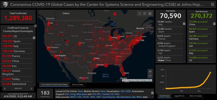
As I mentioned in my last Coronavirus post, there are geographic factors and implications everywhere when dealing with this truly global issue that has profoundly local ramifications. True, I am guilty as charged if I stand accused of seeing geography everywhere, but now even non-geographers are seeing geography, place, distance, regions, interactions, and connections as more important than ever. I would like to share three additional resources that point to the centrality of geographic thought to all that is happening these days:
These three resources show that geographic factors were more than just a part of the origin and diffusion of the Coronavirus; geographic tools and analysis are front and center in local, national, and global responses to the situation. A former student of mine put together the RI Dept. of Health dashboard and I was delighted to see her love of mapping spatial data help my state during this time of crisis. Our ‘personal space’ means much more during social distancing as our spatial settings are at the forefront of our thoughts as we move through our neighborhoods and navigate through space with greater concern. The forces that have made the world more interconnected are the same forces that are requiring that we stay apart. May we also think more geographically as we consider the problems at a bigger scale as we have seen how many things need to be restructured.
There are far too many geographic issues that stem out of the Coronavirus pandemic to create anything close to comprehensive, but I wanted to share some of the articles that caught my eye recently because they touch on particularly geographic themes. So, this will not give a global overview, predictions, or breaking news, but some of the underlying issues and questions that we are now grappling with as so many are now in some form of self-isolation.
MAPPING: The best, introductory-level walk-through of how to map the Coronavirus uses ArcGIS online, and has interactive layers that are updated daily, so you don’t have to recreate the wheel for every time new data gets released. If students are familiar with ArcGIS and already have an account, this is worth having them explore it to learn cartographic techniques.
ENVIRONMENT: There are a host of unintended consequences in natural systems, and when one part of the system, gets altered, there are some down-stream impacts. This article in the Atlantic discusses some of the environmental impacts of the mass shutdown of normal human activities (1-less pollution, 2-less seismic activity, 3-quiter urban environments).
DEVELOPMENT: The impacts of COVID-19 are clearly uneven; countries and cities that are the most globally connected might benefit usually economically from these connections, but are facing one of the times that this connectivity is a threat to the community. India, by and large through March 2020, managed to avoid making global headlines, but as the world’s second largest population with some incredibly dense megacities, many are asking how the Coronavirus will impact India in the coming weeks.
URBANIZATION: In the United States, the densest counties have been the most impacted by COVID-19 while rural areas have need been as heavily impacted (by and large—rural counties with ski resorts are one prominent exception to this generalization). Some are discussing urban density in the time of a pandemic, and there are calls to rethink densely populated cities. This article from CityLab also discusses the density as a key issue in the transmission of disease, but it is quick to point out other factors that lead some hyper-dense cities to effectively control the spread as well.
CULTURE: To wear a mask, or to not wear a mask? Why is this a question that seems so controversial? As more time goes by, we see that wearing a mask to prevent the spread of a disease is not just a medical issue, but also a cultural issue. Some cultures are uncomfortable with the idea of covering part of face in public and some react against the concept because of the cultural connotations that go along with mask-wearing. Other societies see if as a prudent way to do your civic duty. Many are reconsidering their cultural norms that they associate with masks as COVID-19 continues to expand into more communities.
DIFFUSION: This video centers on the beginnings of the spread of the Coronavirus and the origins in Wuhan. I’m very sensitive to the fact that many discussions about its origin in China can quickly go down some racist paths. This Vox video explains the wet markets of China as a likely source of infectious disease without veering into racist assumptions. This interactive from the NY Times explains how the disease spread beyond China.
Stay healthy, stay safe. I miss other humans, and being social. I think everyone wishes things were different, but geography and spatial analysis is one of the key lenses that we need to come out on the other end of this. I hope that we can come out of this more united as members of the human race with a greater resolve to work together to solve global issues.
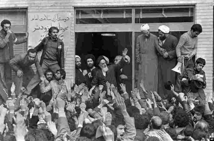
Understanding the events of 1979 is crucial for those trying to figure out a better future for today’s Middle East.
“What happened to us? The question haunts us in the Arab and Muslim world. We repeat it like a mantra. You will hear it from Iran to Syria, from Saudi Arabia to Pakistan, and in my own country, Lebanon. For us, the past is a different country, one not mired in the horrors of sectarian killings. It is a more vibrant place, without the crushing intolerance of religious zealots and seemingly endless, amorphous wars. Though the past had coups and wars too, they were contained in time and space, and the future still held much promise. What happened to us? The question may not occur to those too young to remember a different world, whose parents did not tell them of a youth spent reciting poetry in Peshawar, debating Marxism in the bars of Beirut, or riding bicycles on the banks of the Tigris in Baghdad. The question may surprise those in the West who assume that the extremism and bloodletting of today have always been the norm.” SOURCE: The Atlantic
This opinion piece is a somewhat controversial, but that is part of its value. The core of the author’s thesis is that to understand the modern Middle East, especially if one is searching for a way to create a more democratic Middle East, we must look to the past to see how we got there. 1979 is seen here as the pivotal year that changed the trajectory of the Middle East, in large part because of the Islamic Revolution in Iran, but for many other region-wide changes. A nice pairing would be to also read this discussion from the NY Times about the rise of MBS as the key prince in Saudi Arabia, looking to reform society and reform movements in Saudi Arabia while crushing his opponents. Both are articles are book excerpts.
Questions to Ponder: What were the big shifts that occurred in 1979? What are things that you think that the author gets correct about their historical analysis of the Middle East? What are some positions where you disagree with the author?
“As all of us are hunkering down, universities and high schools are adopting some online teaching strategies. Many people are streaming entertainment content to pass the time with family or roommates as our lifeline to the outside world. While these might not be top on your streaming list of videos, podcasts, or online content, all of these are solid content that teach us plenty about the cultural landscape or about the world around us. This list will continue to be updated as I haven’t watched/listened to everything here as of yet (I’ll be glad to take your suggestions @ProfessorDixon).” SOURCE: Geography Education
I’ll try to organize these by platform accessibility: NETFLIX, AMAZON PRIME, PBS, PODCASTS, SHORT VIDEOS, Teacher-produced videos, explorable websites, and other movies. Check out the full list.
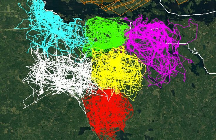
“This image of GPS tracking of multiple wolves in six different packs around Voyageurs National Park was created in the framework of the Voyageurs Wolf Project. It is an excellent illustration of how much wolf packs in general avoid each other’s range.” SOURCE: Earthly Mission
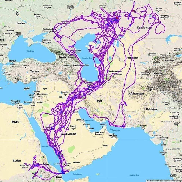
Maps are powerful tools to demonstrate spatial ideas and concepts. Wolves are territorial, and using GPS trackers to understand this really drives home the point. Here is a similarly fantastic map of an eagle’s flight paths shows the patterns amid noise.
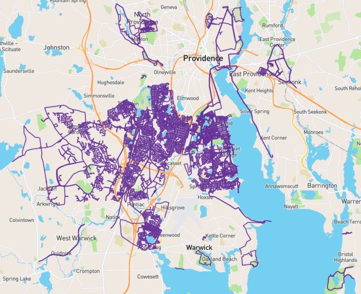
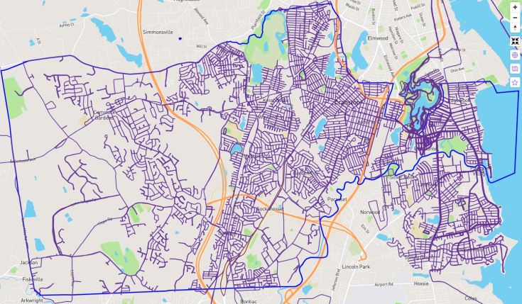
As a runner, I keep track of my all my runs using some apps and Citystrides.com. A screengrab of my “LifeMap” is included below.
With these tools at my disposal I stumbled on the decision to learn about my city by running every single street, exploring the cultural landscape, and make the training miles a part of a bigger goal. With this newfound understanding of my city, I’ve mapped over 100 changes on OpenStreetMap (OSM) to give my newfound knowledge a bit of public utility. The light blue line in the image below is the Cranston (RI) city boundary; As of March 12, I’ve officially run #EverySingleStreet, 100% of Cranston roads. It was a quixotic goal, but an absolutely thrilling way to comibne my love of running, cartography, Cranston, and exploring the cultural landscape.
15 months in the making, a map documenting my runs on #EverySingleStreet of Cranston.
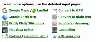
TOOLS: Using GPS data in mapping tools such as ArcGIS.com or Google Earth doesn’t require a lot of expertise, but gathering the data out in the field can usually be done with an app that can create a .GPX file (search your app store for GPX). You can use GPS Visualizer to convert files, create GPX files or convert files to other formats. Look at the screengrab below to see some of the options, especially the ‘sandbox’ tool which lets you create a GPX file.
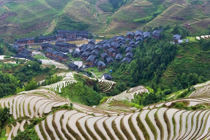
Village houses and water filled rice terraces in Longsheng, Guangxi Province, China.
“For thousands of years, when farmers in mountainous regions have expanded their farms to grow crops on the steep slopes, they have carved massive steps into the terrain, forming terraces of many small platforms. Following the contours of the mountains, the edges of the terraces create sinuous patterns in the landscape, presenting picturesque images. Gathered here are photos from China, Switzerland, Vietnam, Peru, the Philippines, and Japan.” SOURCE: The Atlantic
This gallery of 27 terraced rice fields is absolutely fabulous. I find these to be some of the more beautiful cultural landscapes; I’m drawn to the great extent of agricultural modifications of the environment, coupled with the rugged physical landscape.
In many geography classes, teachers will assign students a country to help them gain some depth about one particular country as a way to explore economic, demographic, cultural, political, and environmental issues. These are some data visualization tools that deals with big data; the listed tools are some of my favorite in part because they can easily to incorporated to an ArcGIS StoryMap (especially in the Map Journal template).
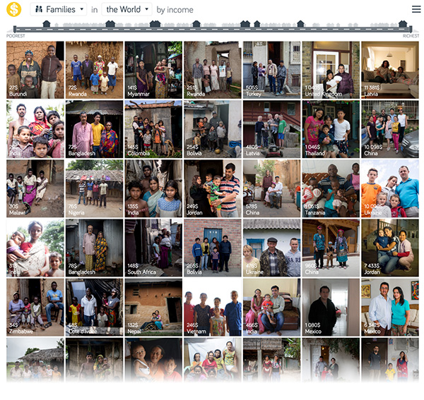
Economic (introductory data):Dollar Street from Gapminder
The best comparison and the most relatable thing for students to see in other countries is real people, leading regular lives. Dollar Street brings the economic realities of other places without some of the of the negative stereotypes or romanticizing far-away places.
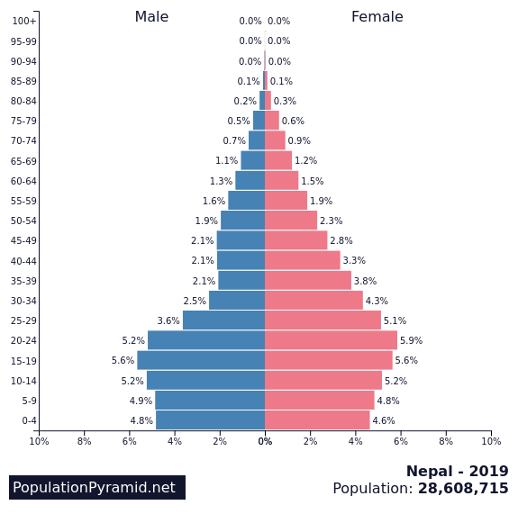
Populationpyramid.net creates interactive, population pyramids that can be downloaded as image with the raw data also available for download. Simple, powerful, easy.
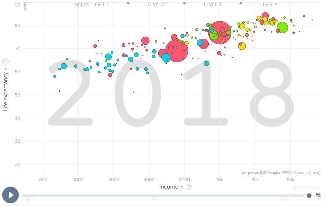
Gapminder is a tremendous resource that I’ve shared in the past and total fertility rates is an ideal metric to see in this data visualization tool. This is one of the best ways to visualize global statistics. The world is changing–see how.
5. Our World in Data
Like Gapminder, Our World in Data is a fantastic source of global data, maps, and charts on an incredibly wide range on topics. Type any country name in the search bar, and you’ll find a wide range of metrics.
6. ArcGIS StoryMaps
This is my principle cartographic tool that I use in GEOG 201 (Mapping our Changing World). Classic Story Maps is the feature that ArcGIS has to make user-friendly platform to share maps along with a rich, multimedia environment with a variety of pre-made templates. The video below is and introduction to the newer Story Builder which combines a variety of the elements of the templates into one that is more optimized for mobile devices.
7. Google Earth (now completely online)
Google Tours used to be a way to present a series of places on a map, with text, pictures, and videos, but that has been de-commissioned and the online version of Google Earth is now the best alternative. Yes, it works best in Google Chrome, and you’ll need a Google account to save it to your Google Drive. The video below is a brief introduction to the tools that are available to you:
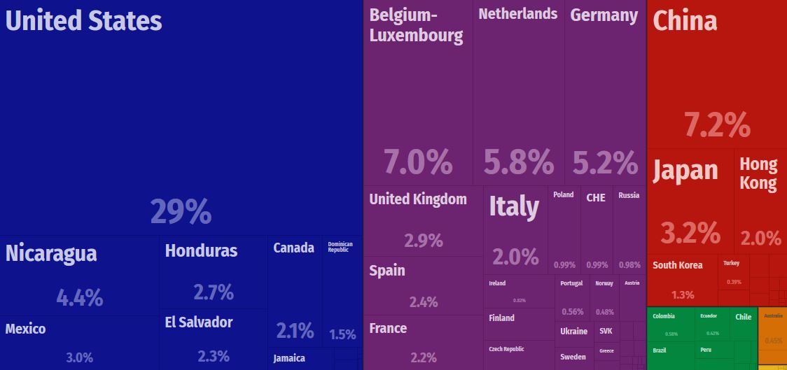
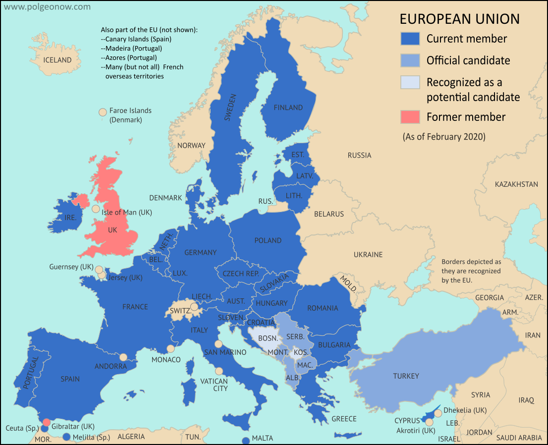
“The UK has finally officially left the European Union (EU), almost four years after its famous ‘Brexit’ vote, and taken the British territory of Gibraltar out with it. Here’s our updated map and list of which countries are in the EU, which ones are trying to join, and which European countries are in neither group.” SOURCE: POLGEONOW
Today I’m teaching the my first class on “the Geography of Europe” since the UK has officially withdrawn from the European Union. As I went looking for any updated map of the EU, I found this excellent article along with the map and thought it was worth sharing. Since Brexit has finally been formalized, these snarky tweets were fun:
My Irish passport is so technologically advanced it allows me to live, work and study in 27 other countries 🤭 https://t.co/1y81wDIx3o
Absolutely disgusting service at Schiphol airport. 55 minutes we have been stood in the immigration queue. This isn’t the Brexit I voted for. pic.twitter.com/QcSne9d4qW
 As I mentioned in my