
Tags: Canada, language, social media, images, place, culture, landscape, tourism.
Source: instagram.com
Tags: Canada, language, social media, images, place, culture, landscape, tourism.
Source: instagram.com
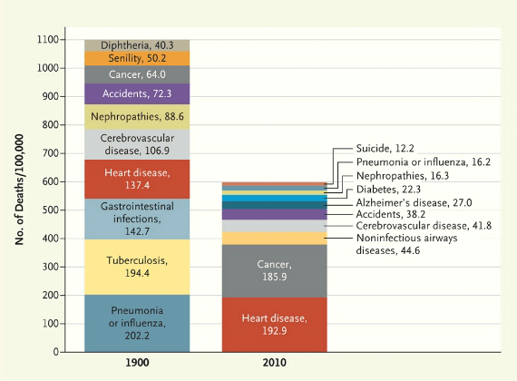
“The New England Journal of Medicine looks at death reports in 200 years of back issues. The first thing to notice here is how much our mortality rate has dropped over the course of a century, largely due to big reductions in infectious diseases like tuberculosis and influenza.”
Source: www.washingtonpost.com
This infographic shows the main causes of death in 1900 in the United States and compares that with the 2010 figures. The United States, during that time underwent what many call the epidemiological transition (in essence, in developed societies we now die for different reason and generally live longer).
Questions to Ponder: What geographic factors shape mortality rates and shifts in the mortality rates? What is better about society today then before? Has anything worsened? How come?
Tags: mortality, medical, development, historical, USA, population, statistics, unit 2 population, infographic, models.
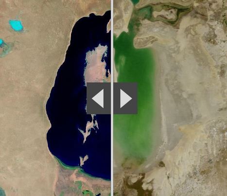
“By moving the slider, the user can compare 1990 false-color Landsat views (left) with recent true-color imagery (right). Humans are increasingly transforming Earth’s surface—through direct activities such as farming, mining, and building, and indirectly by altering its climate.”
Source: storymaps.esri.com
This ESRI interactive web app uses the “swipe” function to compare 12 places over time. These locations have experienced significant environmental change since 1990. This is an user-friendly way to compare remote sensing images over time. Pictured above is the Aral Sea, which is and under-the-radar environmental catastrophe in Central Asia that has its roots in the Soviet era’s (mis)management policies.
Tags: remote sensing, land use, environment, geospatial, environment modify, esri, unit 1 Geoprinciples.
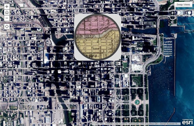
This 1868 pocket map of Chicago shows the city in full-blown expansion, a mere 3 years before the infamous blaze
Source: www.smithsonianmag.com
This is an ESRI interactive web app that uses the ‘spyglass’ feature. Chicago is displaced during a economic boom period as the U.S. was expanding westward. Where where the railroads located then? Why have some of them vanished today? Notice anything curious about the coastline along Lake Michigan? Follow this link to see similar interactives of other major U.S. cities.
Tags: Chicago, historical.

“A new census that shows that Earth is host to a staggering 3.02 trillion trees — more than scientists expected.The most recent estimate only counted 400 billion trees, reports Rachel Ehrenberg. Because prior studies used satellite technology alone instead of including data from on-the-ground tree density studies, writes Ehrenberg, they missed the mark. They also estimate that since human civilization began, 45.8 percent of all trees been lost.”
Source: www.smithsonianmag.com
I love satellite data, but ground-truthing is critical to so many research projects.
Tags: remote sensing, conservation, physical, biogeography, environment, resources.
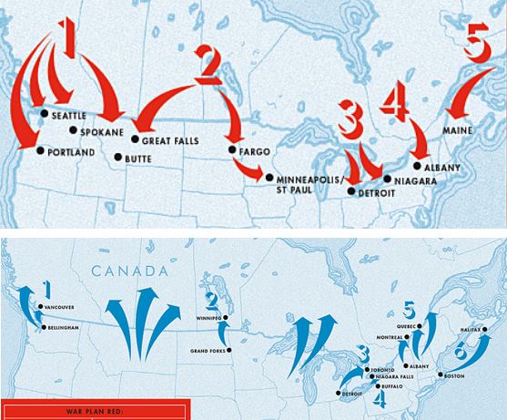
After World War I, Canada drew up classified plans to invade the U.S. Meanwhile, the U.S. had its own secret plot to create the “United States of North America.”
Source: www.mprnews.org
I never knew 1921 to 1930 was such a frosty time in Canadian-U.S. relations that BOTH sides drew up possible invasion plans. Judging by these amazing arrows, these plans were never seriously about to be executed, but it is a good reminder that geopolitical partnerships (and rivalries) are ever-changing. Today, if there are border tensions between these two allies, it might just center around the Arctic as it’s geopolitical importance is rising. Also, I did enjoy the 1920s reference that Americans simply assumed that Canada (once the British Empire was dismantled) would naturally be absorbed by the United States.
Tags: Canada, geopolitics, political, war.
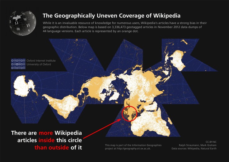
This map points out the highly uneven spatial distribution of (geotagged) Wikipedia articles in 44 language versions of the encyclopaedia. Slightly more than half of the global total of 3,336,473 articles are about places, events and people inside the red circle on the map, occupying only about 2.5% of the world’s land area.
Source: geography.oii.ox.ac.uk
Crowdsourcing is a powerful way to leverage modern digital sharing capabilities, but it inherently going to lead to inequities in the reporting coverage. Why are there so many geo-tagged Wikipedia articles in Europe and not as many elsewhere? What factors account for these discrepancies?
Tags: visualization, social media, mapping, culture, technology, popular culture, Europe.
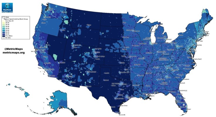
An unconventional look at American roads, mapped by their speed limits.
The above map, from MetricMaps, illustrates that abrupt division using local speed limit data. That map shows the maximum local speed limit for any local roads or highways in each Census block group in the U.S. The nationwide contrasts are striking, but so are the local ones: Zoom in to an individual city like Los Angeles, and the darker arteries effectively outline highways.
Source: www.washingtonpost.com
This map shows some stark contrast between urban and rural land use patterns–it also shows urban networks that are designed to compression time and space.
Tags: transportation, planning, spatial, scale, Time-Space Compression,.
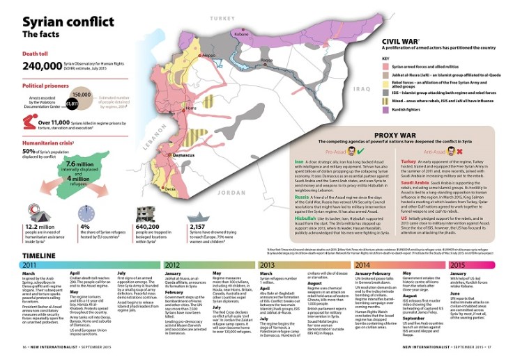
Syria’s civil war has inflicted a humanitarian crisis, expansive exodus of the population and a severe death toll. New Internationalist presents the facts in this zoomable infograph.
Tags: infographic, Syria, migration, political, refugees.
Source: newint.org


