Source: www.youtube.com
Because it’s funny; that’s why.

Based on the Gini coefficient, a measure that captures the level of income distribution in a given area, 24/7 Wall St. reviewed the 20 metropolitan areas with the most uneven income distribution, or the highest Gini coefficients. A Gini coefficient of 1 means all income belongs to a single individual, while a coefficient of 0 reflects a perfectly even distribution. The Bridgeport-Stamford-Norwalk, Connecticut, metro area leads the nation with the worst income distribution.With only a few exceptions, the metro areas with the widest gaps between rich and poor residents tend to have lower median household incomes. The majority of the 20 metro areas with the highest Gini coefficients have median household incomes more than $10,000 below the national median of $52,250.Average incomes, however, tell a different story. Because of the uneven income distribution, the average income is much higher in most of these metro areas.
Source: www.usatoday.com
The Gini index which measures the degree of economic inequality (the Gini coefficient was added to the APHG course content for the Industrialization and Economic Development unit in 2013). This article explains the value of the Gini coefficient without delving much into the statistics.
Tags: statistics, APHG, poverty, socioeconomic, development, economic.

Notes on an Imagined Plaque to be Added to the Statue of General Nathan Bedford Forrest, Upon Hearing that the Memphis City Counci has Voted to Move it and the Exhumed Remains of General Forrest and his Wife, Mary Ann Montgomery Forrest, from their Current Location in a Park Downtown, to the Nearby Elmwood Cemetery
Source: thememorypalace.us
This is a very insightful podcast that explores some of the many ways that the South is remembered. History happened, but heritage is carefully crafted, remolded and contested–geographers are especially interested in seeing how these competing visions of heritage are inscribed in the landscape.
Tags: historical, monuments, the South, landscape, podcast.

“When others get off the train to finally go home, Leonie Müller stays behind. That’s because she already is home: The train is her apartment, and she says she likes it that way. She bought a subscription that allows her to board every train in the country free. Now, Müller washes her hair in the train bathroom and writes her college papers while traveling at a speed of up to 190 mph. She says that she enjoys the liberty she has experienced since she gave up her apartment.”
Tags: mobility, transportation, housing, popular culture, Europe, Germany.
Source: www.washingtonpost.com
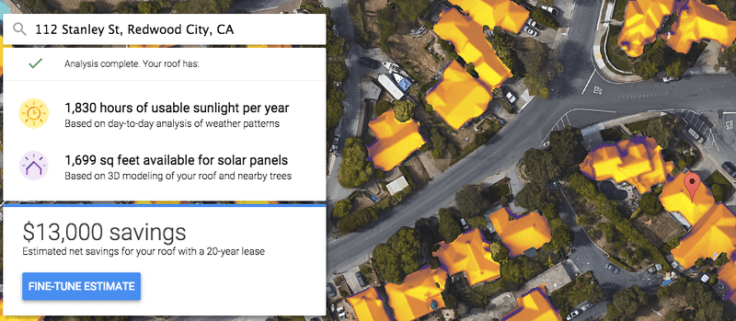
“So it’s welcome news that Google wants to make this all much, much simpler with its brand new Project Sunroof tool. Plug in your address, and Google uses its aerial imagery capabilities to help you figure out whether solar power might be a worthwhile idea. (The project is still in its early stages; here’s Google’s announcement from Monday.)
For now, data is only available for selected parts of the country. But let’s look at a sample address given in Redwood City, California. The tool first calculates both how big the roof is and how much sun it gets per year.”
Source: www.vox.com

We hear the names of these places in the news constantly, but can you actually locate them on a map?
Source: www.washingtonpost.com
I do enjoy a good current events map quiz. Yes, geography is about more than just locating things on the map, but that is still a pretty foundational spatial-thinking skill to build upon. If you want some more quizzes with perhaps more direct applicability in the classroom, click here for online regional quizzes.
Tags: political, geopolitics, fun, trivia.

Source: www.thehumanimprint.com
This outstanding infographic from the Human Imprint is an excellent summary of the AP Human Geography exam and gives some valuable insights to prepare students to pass the exam. This is well worth the read for any APHG teacher.
Tags: APHG, infographic.

This site is used to highlight the distortion issues caused by the Mercator map projection. It can be used to show the true size of countries
How it Works
1. Enter a country or state name
2. Hover over selection for size information
3. Click on selection to drag
4. Right-click on selection to delete
Tags: mapping, visualization, map projections, cartography, perspective.
Source: thetruesize.com
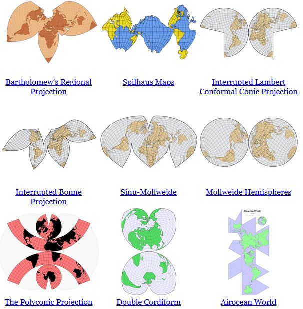
“In some ways, all 2D maps of Earth are interrupted at some point, even if it’s just along the antimeridian at 180°. Interruptions are often in areas of less interest e.g. oceans for a land-focused map.”
Source: www.jasondavies.com
No screenshot could do justice to this animation. It transforms a map of the world from one map projection to another, and in the 5 second interval it ‘spins the globe’ to give you a sense of the the spatial distortions inherent in all projections. This is but one of the many visualizations from Jason Davies mapping project.
Tags: mapping, visualization, map projections, cartography, perspective, unit 1 Geoprinciples.


