Search

GEOGRAPHY EDUCATION

Supporting geography educators everywhere with current digital resources.

Finding and Using Spatial Data Sources

“Data is great, but working with numbers can be intimidating. We have more data than ever before that is available to us, and graphs, charts, and spreadsheets are ways that data can be shared. If that data has a spatial element to it, the best way to visualize a large dataset might just be a map.”

Source: blog.education.nationalgeographic.com

I hope you enjoy this article I wrote about GeoFRED, a way to visualize economic statistics.  All of my future articles for National Geographic Education will be archived here at this link

Tags: National Geographicdevelopment, statistics,  economic, mapping.

How American Agriculture Works

There really are two different Americas: the heartland, and the coasts….

Source: www.huffingtonpost.com

These maps together show that most of the grain from the American breadbasket does not directly on the table but into the feed trough.  I imagined before I saw this data that the percentage of animal feed in the Midwest would be higher than the rest of the United States, but I would not have guessed that it was that high. 


Tagsfoodeconomicfood production, agribusiness, agriculture.

Endangered Wildlife Trust

“If you don’t pick it up they will.”

Source: www.ewt.org.za

I found this ad from the Endangered Wildlife Trust to be very powerful.  It is a good introduction to systems and systems thinking.  


Tags: pollutionsustainability, environment, resources, water, coastal.

The colourful propaganda of Xinjiang

“China is in the midst of a crackdown on what it describes as ‘terrorism driven by religious extremism’. The campaign is focused on the western province of Xinjiang, home to China’s Uighur ethnic minority who are predominantly Muslim.”

Source: www.bbc.com

China does not have a good track record of dealing with ethnic and religious minorities and the murals that can be seen in Xinjiang are a testament to that fact.  This has led to many Muslims in Western China being attracted to more radical ideas.  While I certainly don’t condone radicalism nor China’s heavy-handed tactics, I am fascinated by the cultural messages that are strategically being placed in the landscape to influence the politics and culture of the region.  

Tags: political, conflictgovernance, China, East Asia, religion, culture, Islam, landscape.

Simulation of the Oso Landslide

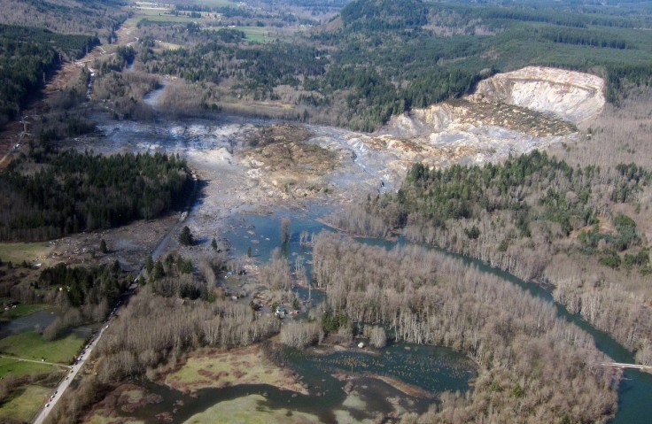
“The large landslide that occurred in March near Oso, Washington was unusually mobile and destructive.”

Source: www.usgs.gov

There are several reasons for landslides–some are purely a result of physical geography and others are related to land use patterns.  The landslide in Washington state last year was a combination of the two (see on map) and it is a good teaching moment to discuss the environmental impacts of land use patterns and resource extraction projects.  As seen in this interactive, the river was cutting at the base of the hill, while loggers were clear-cutting at the top of the mountain.  Trees help prevent erosion as the roots hold the soil in place–a critical piece to the puzzle in a very rainy climate.  With $1 million worth of timber on the slope, logging companies persisted despite objections from the Department of Natural Resources and some restrictions (but in hindsight, those restrictions clearly were not enough).  Watch a simulation of the landslide here.  

View the impact in ArcGIS online: Before and After Swipe, LiDAR I and II, and Imagery.

Questions to Consider: Other than economic worth, what other ways are there to value and evaluate the environment?  How could this landscape have been protected and managed better or was this landslide inevitable?   


Tagspolitical ecology, resources, environment, environment modify, industry, physical, geomorphology, erosion, landforms.

35 maps that explain how America is a nation of immigrants

Take a tour through America’s immigrant heritage — at its most and least welcoming

American politicians, and Americans themselves, love to call themselves “a nation of immigrants”: a place where everyone’s family has, at some point, chosen to come to seek freedom or a better life. America has managed to maintain that self-image through the forced migration of millions of African slaves, restrictive immigration laws based on fears of “inferior” races, and nativist movements that encouraged immigrants to assimilate or simply leave.

But while the reality of America’s immigrant heritage is more complicated than the myth, it’s still a fundamental truth of the country’s history. It’s impossible to understand the country today without knowing who’s been kept out, who’s been let in, and how they’ve been treated once they arrive.

Tagsmigration, map.

Source: www.vox.com

2015 Summer Leadership Institute: Middle East in Transition

The Choices Leadership Institute is an opportunity to immerse yourself in the Choices Program’s award-winning curriculum materials and approach, and to plan strategies for introducing the Choices Program to your colleagues.  Participants will examine strategies for engaging secondary students in the study of contested international issues, share best practices with other dedicated teachers, and explore methods for conducting effective professional development.  The Institute will be held July 13-17, 2015 in Providence RI and the deadline to apply will be March 16, 2015Click here to apply.

Source: www.choices.edu

Why Map Projections Matter

Source: www.youtube.com

This is a clip from the TV show West Wing (Season 2-Episode 16) is a classic–how often does cartography plays a key role in the plot of a TV show?  In this episode the fictitious (but still on Facebook) group named “the Organization of Cartographers for Social Justice” is campaigning to have the President officially endorse the Gall-Peters Projection in schools and denounce the Mercator projection.  The argument being that children will grow up thinking some places are not as important because they are minimized by the map projection.  While a bit comical, the cartographic debate is quite informative even if it was designed to appear as though the issue was trivial. 

Questions to Ponder:  Why do map projections matter?  Is one global map projection inherently better than the rest?  

Tags: Mapping, video, visualization, map projections, cartography, perspective.

Human Development Index (HDI)

“This map shows Human Development Index (HDI) for 169 countries in the World. The HDI is a comparative measure of life expectancy, literacy, education, and standard of living for countries worldwide. The HDI sets a minimum and a maximum for each dimension, called goalposts, and then shows where each country stands in relation to these goalposts, expressed as a value between 0 and 1, where greater is better. The Human Development Index (HDI) measures the average achievements in a country in three basic dimensions of human development: health, knowledge and standard of living.”


Tags: development, statistics, worldwide.

Source: chartsbin.com

Blog at WordPress.com.

Up ↑