Search

GEOGRAPHY EDUCATION

Supporting geography educators everywhere with current digital resources.

Tag

mapping

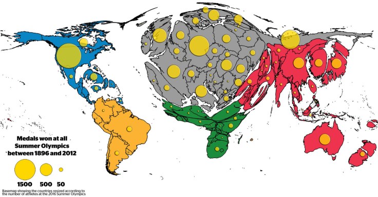
Cartograms of the Olympic Games

The distribution of medals shows the existing Olympic inequalities: The overall patterns are a reflection of wealth distribution in the world, raising the question whether money can buy sporting success. Besides investment in sports by those countries who can afford it, the medal tables also reflect a battle for global supremacy in political terms.


Tags: sport, popular culture, mapping, historical, cartography.

Source: geographical.co.uk

Trailer: One Day on Earth

//cdn.embedly.com/widgets/media.html?src=https%3A%2F%2Fplayer.vimeo.com%2Fvideo%2F26378195&wmode=opaque&url=https%3A%2F%2Fvimeo.com%2F26378195&image=http%3A%2F%2Fi.vimeocdn.com%2Fvideo%2F215566910_1280.jpg&key=359ed8ab27db4f02a128049b1f89d6a1&type=text%2Fhtml&schema=vimeo

One Day on Earth is a unique global movement, community media creation platform, and collaborative film production engine. We invite you to join our international community of thousands of filmmakers, hundreds of schools, and dozens of non-profits, and contribute to this unique global project (with a map of all participants). Many future filming events will be announced in the coming year. One Day on Earth is a community that not only watches, but participates.”


Tagsvideo, mapping, social mediaplaceculture.

Source: vimeo.com

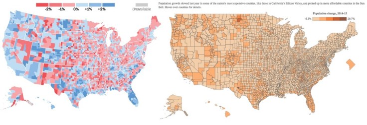
The dirty little secret that data journalists aren’t telling you

How to tell two radically different stories with the same dataset.

Source: www.washingtonpost.com

Mapping matters, but that doesn’t mean that maps convey an objective truth.  They are rhetorical devices used to convince and persuade.  So approach maps critically because while they can convey great spatial patterns, they can conceal patterns just as easily.  


Tagsstatisticscartography, visualization, mapping.

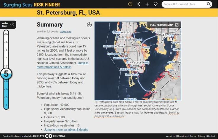
Surging Seas Interactive Map

Global warming has raised global sea level about 8″ since 1880, and the rate of rise is accelerating. Rising seas dramatically increase the odds of damaging floods from storm surges.

Source: sealevel.climatecentral.org

This interactive map from Climate Central dramatically shows what locations are most vulnerable to sea level rise.  You can adjust the map to display anywhere from 1 to 10 feet of sea level rise to compare the impact to coastal communities.  This dynamic map lets to view other layers to contextualize potential sea level rise by toggling on layers that include, population density, ethnicity, income, property and social vulnerability.   


Tags: physical, weather and climate, climate change, environment, resources, watercoastalmapping, visualization, environment depend, political ecology.

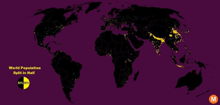
Half the World Lives on 1% of Its Land, Mapped

“Data viz extraordinaire Max Galka created this map using NASA’s gridded population data, which counts the global population within each nine-square-mile patch of Earth, instead of within each each district, state, or country border. Out of the 28 million total cells, the ones with a population over 8,000 are colored in yellow.”


Tags: population, density, mapping, visualization.

Source: www.citylab.com

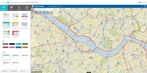
What’s New in ArcGIS Online

“ArcGIS Online has just been updated (June 2016) with the following new features and enhancements. This release includes updates and new capabilities for smart mapping, item pages, improvements to the map viewer and scene viewer, updated content, and more. For additional details see the what’s new help topic.”


TagsmappinggeospatialESRI, edtech.

Source: blogs.esri.com

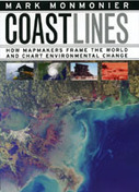
Coast Lines

In the next century, sea levels are predicted to rise at unprecedented rates, causing flooding around the world, from the islands of Malaysia and the canals of Venice to the coasts of Florida and California. These rising water levels pose serious challenges to all aspects of coastal existence—chiefly economic, residential, and environmental—as well as to the cartographic definition and mapping of coasts. It is this facet of coastal life that Mark Monmonier tackles in Coast Lines. Setting sail on a journey across shifting landscapes, cartographic technology, and climate change, Monmonier reveals that coastlines are as much a set of ideas, assumptions, and societal beliefs as they are solid black lines on maps.

Source: www.press.uchicago.edu

I haven’t yet had the chance to look at this book, but it is currently being offered as a free e-book; I’m very excited to look it over.   


Tagsmappingcoastal, cartography, textbook.

GeoInquiries – Grade 4 Interdisciplinary

“GeoInquiries are designed to be fast and easy-to-use instructional resources that incorporate advanced web mapping technology. Each 15-minute activity in a collection is intended to be presented by the instructor from a single computer/projector classroom arrangement. No installation, fees, or logins are necessary to use these materials and software.

The Elementary, Grade 4 GeoInquiry collection is under-development.

Source: edcommunity.esri.com

ESRI has produced GeoInquires for Earth Science, US History, Environmental Science, AP Human Geography, and has just recently released an interdisciplinary set of GeoInquiries designed for fourth graders.     These include:

TagsmappinggeospatialESRI, K12, edtech.

VIDEO: Saving the art of mapmaking

“If you’re heading out on the road for your vacation this year, you’ll probably get directions from a GPS or navigational system. Does that mean that the traditional map is a relic of the past? Mark Albert hits the road to find out.”

Source: www.cbsnews.com

This video is designed for a general news audience and it nicely shows the public how cartography is not rendered unimportant in the era of digital maps, but has become all the more useful.  I could see this video as useful resource to share with parents who are worried that studying geography won’t lead to careers.  


Tags: GIS, video, mapping, cartography, geospatial, technology.

Create a free website or blog at WordPress.com.

Up ↑