Search

GEOGRAPHY EDUCATION

Supporting geography educators everywhere with current digital resources.

Tag

mapping

The Language of Maps Kids Should Know

The vocabulary and concepts of maps kids should learn to enhance their map-skills & geography awareness. Concise definitions with clear illustrations.

Source: kidworldcitizen.org

I really like this article because it briefly shares the language needed for students to able to successfully use maps in the classroom…plus it’s highly adaptable for virtually any grade level.   


Tagsmapping, K12, scale, location.

Lies Your World Map Told You: 5 Ways You’re Being Misled

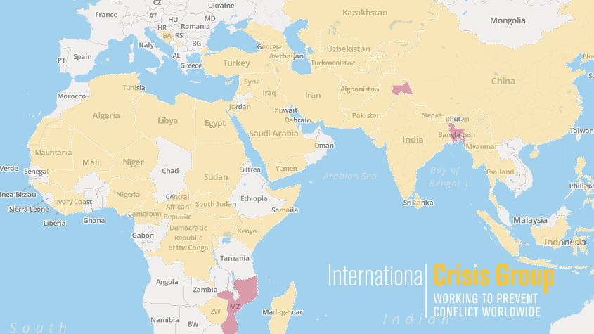
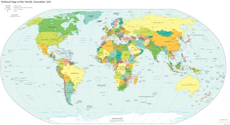
“Unfortunately, most world political maps aren’t telling you the whole story. The idea that the earth’s land is cleanly divvied up into nation-states – one country for each of the world’s peoples – is more an imaginative ideal than a reality. Read on to learn about five ways your map is lying to you about borders, territories, and even the roster of the world’s countries.”

Source: www.polgeonow.com

This is a nice article to get students to look past the officialness of a world map to explore some of the complexities that make contemporary political geography so compelling.  In a nutshell, this article discusses 5 major themes:

  1. Missing countries
  2. Incomplete control
  3. Undefined borders
  4. Disputed territories
  5. Territorial seas

Tags: bordersmapping, political, territoriality, sovereignty.

The Invasion of America

This interactive map, produced by University of Georgia historian Claudio Saunt to accompany his new book West of the Revolution: An Uncommon History of 1776, offers a time-lapse vision of the transfer of Indian land between 1776 and 1887. As blue “Indian homelands” disappear, small red areas appear, indicating the establishment of reservations (above is a static image of the map; visit the map’s page to play with its features).

Source: www.slate.com

In the past I’ve shared maps that show the historic expansion of the United States–a temporal and spatial visualization of Manifest Destiny.  The difference with this interactive is that the narrative focuses on the declining territory controlled by Native Americans instead of the growth of the United States.  That may seem a minor detail, but how history is told shapes our perception of events, identities and places.


Tags: USA, historicalmapping, visualization

CrisisWatch: The Monthly Conflict Situation Report

Mapping global conflict month by month.

Source: crisisgroup.be

You and your students can browse through this interactive map for an update on conflict situations around the world.  The International Crisis Group is an independent, non-profit, non-governmental organization committed to preventing and resolving deadly conflict; they’ve created this interactive map to help us stay informed about the most important conflict issues around the world.  I’m placing this on my list of favorite resources as this is one worth returning to on a regular basis.

Tagsconflict, political, geopolitics, best of the best.

CrisisMap

High-School Dropouts and College Grads Are Moving to Very Different Places

Cities like Washington and San Francisco are gaining the highly skilled but losing their less-educated workforce.

Source: www.citylab.com

This article, with its charts and interactive maps, is worth exploring to show some of the important spatial patterns of internal migration.  It’s not hard to realize that larger, cosmopolitan metro areas will have an advantage in attracting and keeping prospective college graduates; the question that we should be asking our students is how will this impact neighborhoods, cities and regions?    

Tags: migration, USA, mappingcensus, education.

Why Map Projections Matter

This is a clip from the TV show West Wing (Season 2-Episode 16) where cartography plays a key role in the plot.  In this episode the fictitious (but still on Facebook) group named “the Organization of Cartographers for Social Justice” is campaigning to have the President officially endorse the Gall-Peters Projection in schools and denounce the Mercator projection.  The argument being that children will grow up thinking some places are not as important because they are minimized by the map projection.  While a bit comical, the cartographic debate is quite informative even if it was designed to appear as though the issue was trivial.

Questions to Ponder:  Why do map projections matter?  Is one global map projection inherently better than the rest?

Tags: Mapping, geospatial, video, visualization.

See on www.youtube.com

Strange Things in Google Maps

This site “Map of Strange” is dedicated to showing strange things that can be seen in Google Maps. Displayed here is a beach that I loved to go to growing up in San Diego.  Coronado is written in large stones on this part of the beach right next to the red roof of the famous Hotel Del Corondo.

See on Scoop.itGeography Education  See on www.mapofstrange.com

10 Places You’re Not Allowed to See on Google Maps

Via Scoop.itGeography Education

Google maps brings the world to your desktop – well, most of it, anyway. Here are 10 locations that governments and other entities have blurred or removed from satellite photos.

A user of geospatial technologies is not free to explore all places of the Earth with equal levels of specificity. Why?  Where? How come?

Via mashable.com

A Cartographic Rendering of Panem.

Via Scoop.itGeography Education

The Hunger Games fascination is at a high-water mark, and this dystopian Young Adult novel is set in a futuristic, post-apocalyptic, North America. While much of what was written isn’t geographically accurate, the capital and the districts that serve as its hinterland have numerous clues that connect with the current (and actual) geography of North America. Why not try to map it? While not an “accurate” project, this can be a fun way to infuse geography into an English class or vice versa. What would your map of Panem look like? How come?

Via aimmyarrowshigh.livejournal.com

Blog at WordPress.com.

Up ↑