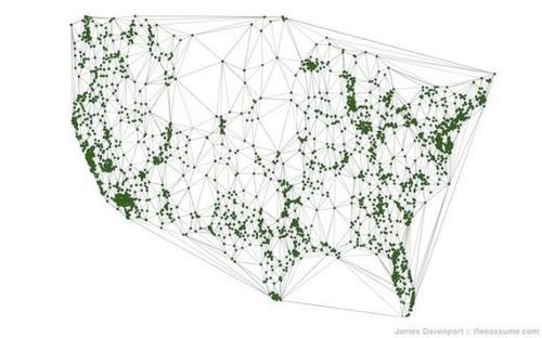
The green dots on this map representing Starbucks locations which are obviously clustered in major metropolitan centers. Cross-referencing this Starbucks address location with population data, Davenport explains his mapping technique: “By counting the number of people who live within a given distance to each Starbucks, we can measure how well centered Frappuccinos are to the US citizenry. In other words: draw a 1-mile circle around every store, then add up the % of the population living within the circles. Repeat for 2, 3, 4….100 miles.” The result of this data is a fabulous logrithmic S-curve which explains much about the American population distribution.
Tags: statistics, density, consumption, mapping, visualization, urban.
See on www.theatlanticwire.com


Leave a comment