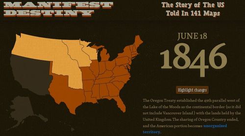
This data visualization project is a great way to demonstrate the geographic expansion of the United States. This is much more interactive than the typical time lapse video since you can scroll through the maps and explore each map through the interactive features.
Tags: historical, USA, visualization, mapping.
See on michaelporath.com


November 5, 2012 at 11:18 am
What I took away from this map was how the civil war caused a rapid end and reversal in the nature of expansion, but after the civil war was resolved the United States formed relatively quickly. Also parts of the western US were just admitted about 100 years ago, Rhode Island has been around since 1790.
November 5, 2012 at 11:19 am
I enjoy seeing history portrayed as maps. Personally, I think it’s the best media to portray this kind of information. People try and show history on a large scale when it’s necessary to take a step back and go small scale
November 5, 2012 at 11:42 am
I like this portrayal of United State’s territorial history better than the fast-paced GIF-style one. It is kind of amazing that the USA has stayed the same (territorial-wise) 53 years when it changed so much in a little under 200 years.