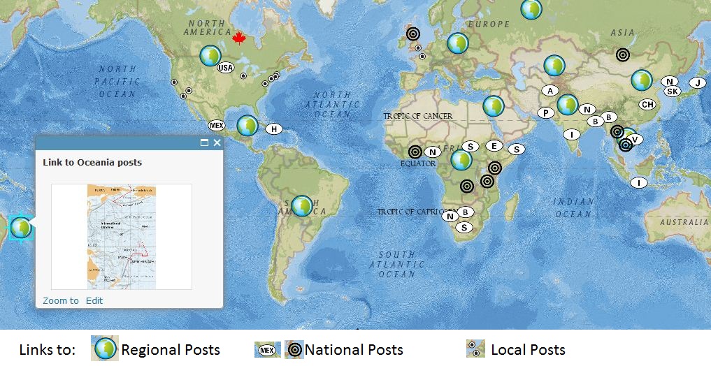
I’m pleased to announce that for GIS Day, I created a map that has hyperlinks to regionally specific posts that I put on ‘Geography Education.’ This map was created using ArcGIS Online (here’s a free tutorial on how to to use ArcGIS Online tailored for K-12 educators). This is just another way to search for materials on this site. Feel free to embed this map on your webpage or share the link. Happy GIS Day!
See on www.arcgis.com


November 19, 2012 at 11:20 am
Perhaps the icons could be placed in country capitals to better serve as a geography education tool. Also the icons could be size specific based on the countries land size or population size.
November 19, 2012 at 11:31 am
Good:The map provides a lot of information via the links in each point. It is also arranged in a way that people should understand. The map also covers a major part of the world.
Bad: Icon duplication, Icon diversity, lack of information in map. There are many icons that duplicate (ie same letters). The diversity of icons is also confusing. And I believe there should be more information listed on each point rather than just an image that links. For the icons, possibly use country flags? Would require a lot of work, but would be beneficial
November 19, 2012 at 11:51 am
i like this map but there is a lot going on and seems to be not very visually appealing. There are many countries which with the same abbreviations. My suggestion would be to import different symbols and customize these symbols. I also believe that the symbol for Canada should be changed because it makes it look like this country is more important than the rest of the countries. I have also noticed that this symbol is larger than the other countries icons. The different icons like the bulls eye and the country abbreviations and the major cities points I am not sure where you were going with all the different icons and symbols because there is not much for specifications and why you used different symbols.
November 19, 2012 at 11:57 am
Good: Map provides a good amount of links which provide information to the observer therefore they know what the purpose of this map is. Also, pinpoint various different places which is always good for a broader perspective.
Bad: Too many icons are the same, not really representative of the actual place it is supposed to highlight. If possible try to find icons that specifically highlight those areas.
November 19, 2012 at 12:03 pm
The things I liked about this map were the feature of being able to click an icon with a visual and a website link. I also liked that the map wasn’t only demonstrating images and information from the United States it was a worldwide map. Lastly I liked how the icons were organized and similar to one another, they weren’t each different.
The things I found a concern with this map was not finding current articles to match the icons. For example, when I clicked Kiribati and Climate Change the link brought me to scoop it from scoop it to read more about the article, the website said the article didn’t exist. Another concern was that all articles go to the scoop it website and then the reader needs to look for the article on that page. Lastly I found the graphic symbols are limited.
November 19, 2012 at 5:27 pm
I liked that this map had the clickable labels, with attached data, right over the specific country the data corresponds to, although I didn’t find it easy to read and navigate through the labels. This is because the initials labeling each country are not the full, correct initial labels.
I liked that you incorporated and labeled all of the large populated areas, but I think you could have included more prominent places in the West, because there seems to be a high concentration of labels in the Middle East region.
And, I liked the world globe icons that were used, but the target symbol icons make the reader come to think that they represent areas of turmoil or natural disasters.