A showcase of creative experiments programmed in JavaScript, HTML5, and WebGL
Seth Dixon, Ph.D.‘s insight:
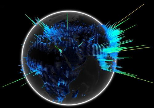
Pictured above is a still image of an interactive digital globe with population density data with colored bar graphs to symbolize the data. This is a great open-source platform for geographic data visualization. There are not many data layers currently, but possibly there will be more in the future (best viewed in Google Chrome).
Tags: population, demographics, unit 2 population, visualization, mapping.
See on www.chromeexperiments.com


Leave a comment