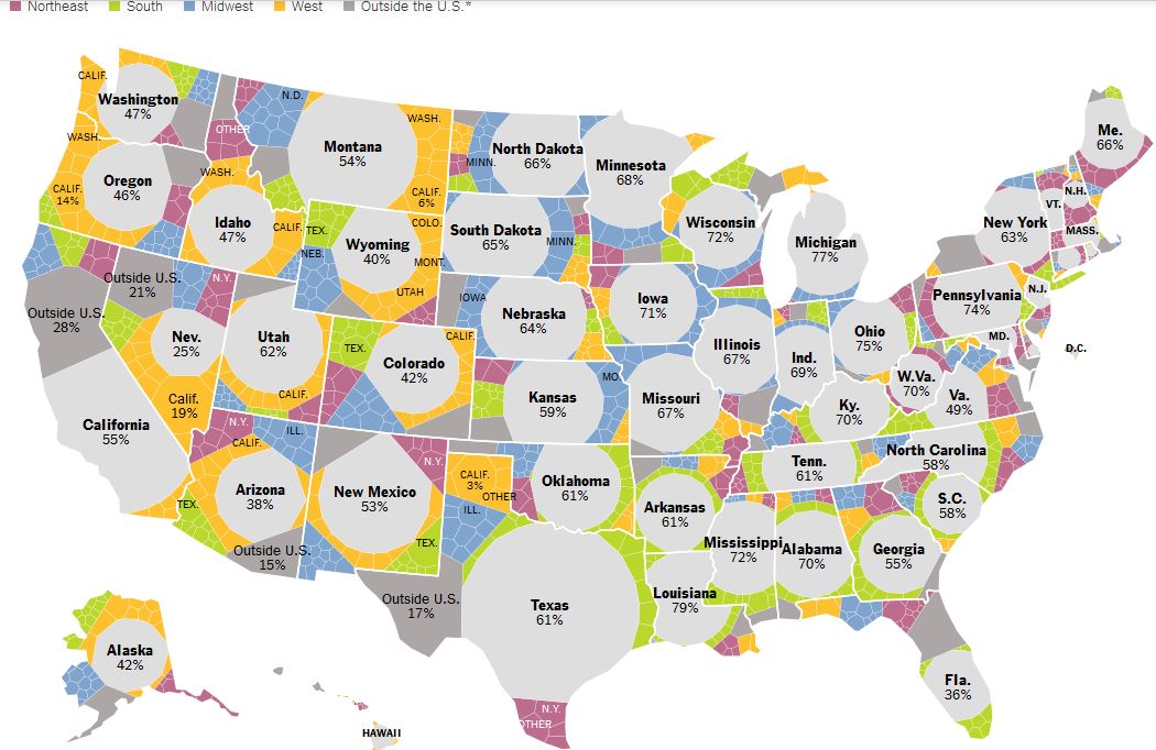
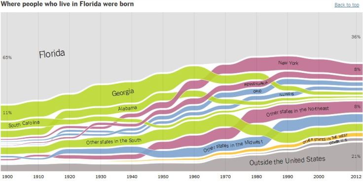
Charts showing how Americans have moved between states for 112 years.
Source: www.nytimes.com
This incredible series of interactive charts from the New York Times show where the residents of every U.S. state were born and how that data has changed over time (update: now available as an interactive map). This graph of Florida shows that around 1900, most people living in Florida were from the South. Around the middle of the 20th century more people from other parts of the U.S. and from outside the U.S. started moving in. What changes in U.S. society led to these demographic shifts? How has demographics of your state changes over the last 114 years?
On the flip side, many people have been leaving California and this article charts the demographic impact of Californians on other states.
Tags: migration, USA, visualization, census, unit 2 population.


Leave a comment